Laurence Cossé: Le Coin du Voile

Laurence Cossé’s 1996 novel Le coin du voile (A corner of the veil) describes the effects of a new and irrefutable proof for the existence of God. A priest who had resigned his calling to spend months in prayer and abstinence submits the proof for publication in Outlooks, the lay journal of the French Casuists. All those who read it are completely convinced. On seeing its effects, the Provincial of the Casuists decides to keep the proof secret until its effects can be more clearly understood. Finally, the Secretary of State at the Vatican arranges for all those who had read the proof to retire from any contact with the public and for the proof to be kept hidden. The proof becomes a pontifical secret – “a piece of information the Holy Father must not learn under any circumstance.”  

The novel, published by Gallimard in 1996, received generally positive reviews, and won several French literary prizes. Readers were charmed by the story but had some difficulty deciding on its basic nature: was it a philosophical fable, a religious thriller, a gentle satire, or an outright farce? The book touches lightly on serious matters: Burns. (1999) called it “casually profound” and Dumort (1997) considered it an “un opéra-bouffe sans la musique.” Cobb (2005, p 156) complimented the author for her “insightful reflections on the moral springs that move real human beings.” Some critics would have preferred more depth (Eder, 1999; McInerny, 1999), but this seems akin to wishing that Voltaire wrote like Diderot.

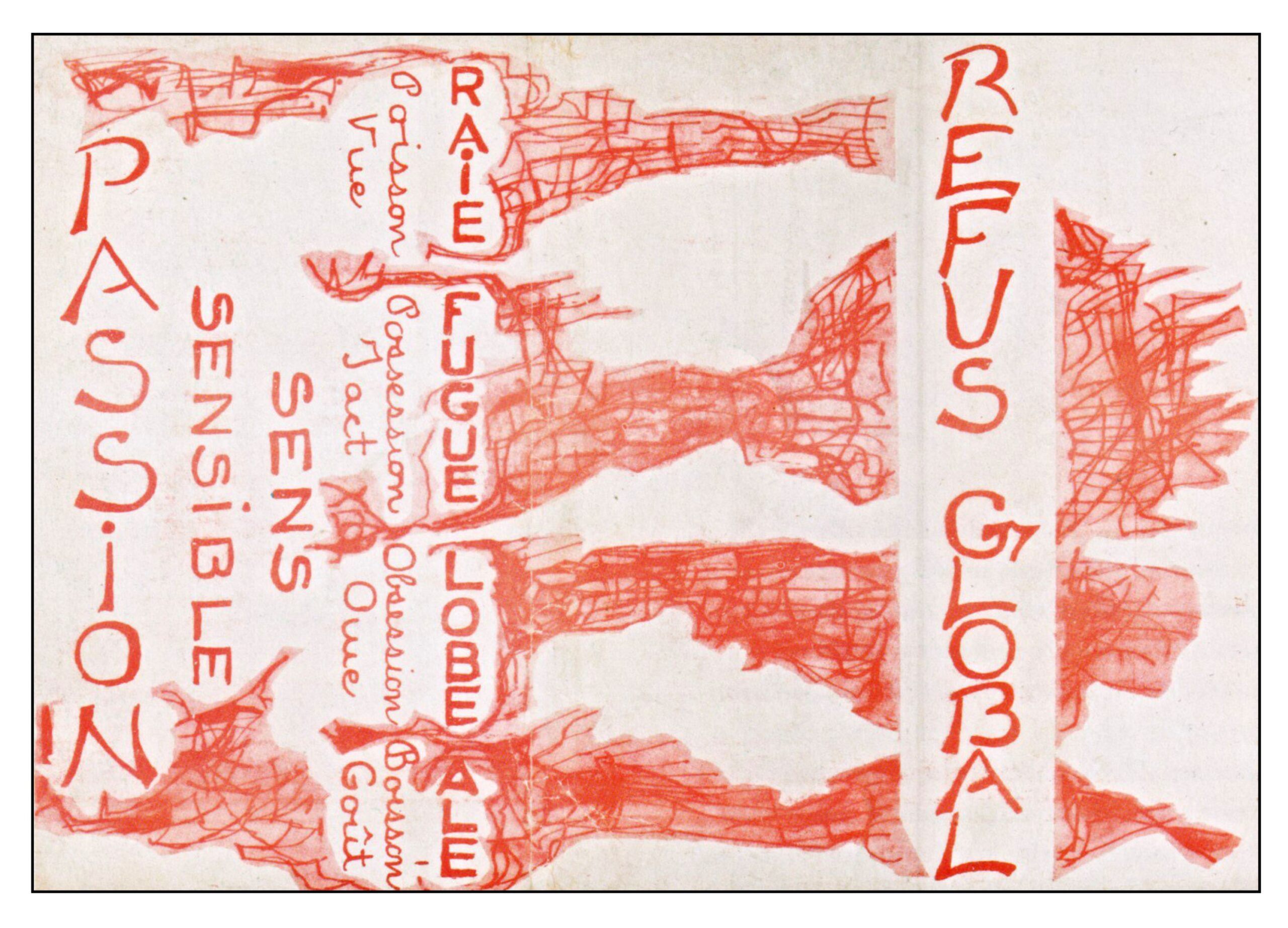
The book has been translated into English (A Corner of the Veil), German (Der Beweis, The Proof), Italian (La sesta prova, The Sixth Proof; La prova nascosta, The hidden proof) and Spanish (La punta del velo). The following illustration shows some of the covers. The French paperbacks use details from paintings by Paul Gauguin (Self Portrait with the Yellow Christ, 1891) and Michelangelo (Separation of the Earth from the Waters, Sistine Chapel, 1512). The cover of the English translation shows the ceiling of a gothic cathedral (Exeter) with a corner being pulled back to reveal the radiance of heaven.

The Casuists

The Novel begins one evening with Father Bertrand Beaulieu, editor of the Casuist journal Regards (translated as Outlooks by Linda Asher), going through his correspondence. The Casuists are clearly the Jesuits, and the journal is clearly the publication Études, established in 1856 by the French Jesuits.

The Society of Jesus was founded in Paris in 1534 by the Spanish nobleman Ignatius of Loyola and six fellow students at the University of Paris. The largest of the Catholic religious orders, it is widely involved in education, missionary work, and humanitarian activities.

Soon after the order was established, the Council of Trent (1545-1563) revised the Catholic Church’s position on the Sacrament of Penance and the process of confession. Sinners were no longer able to purchase indulgences to escape the consequences of their sins. Instead, priests listened to sinners’ confessions, assessed their remorse, provided absolution, and outlined appropriate acts of penance to make amends. This led to a need for more sophisticated moral reasoning, since many human acts cannot easily be judged according to the commandments available in the scriptures. Several Jesuits contributed extensively to the new moral philosophy, most especially Antonio Escobar y Mendoza (1589–1669) who treatise Summula casuum conscientiae (1627) outlined how moral judgments could be made on a case-by-case basis by applying knowledge of the law, ethics, and scripture. This approach came to be known as casuistry, and the Summula became the confessor’s handbook.

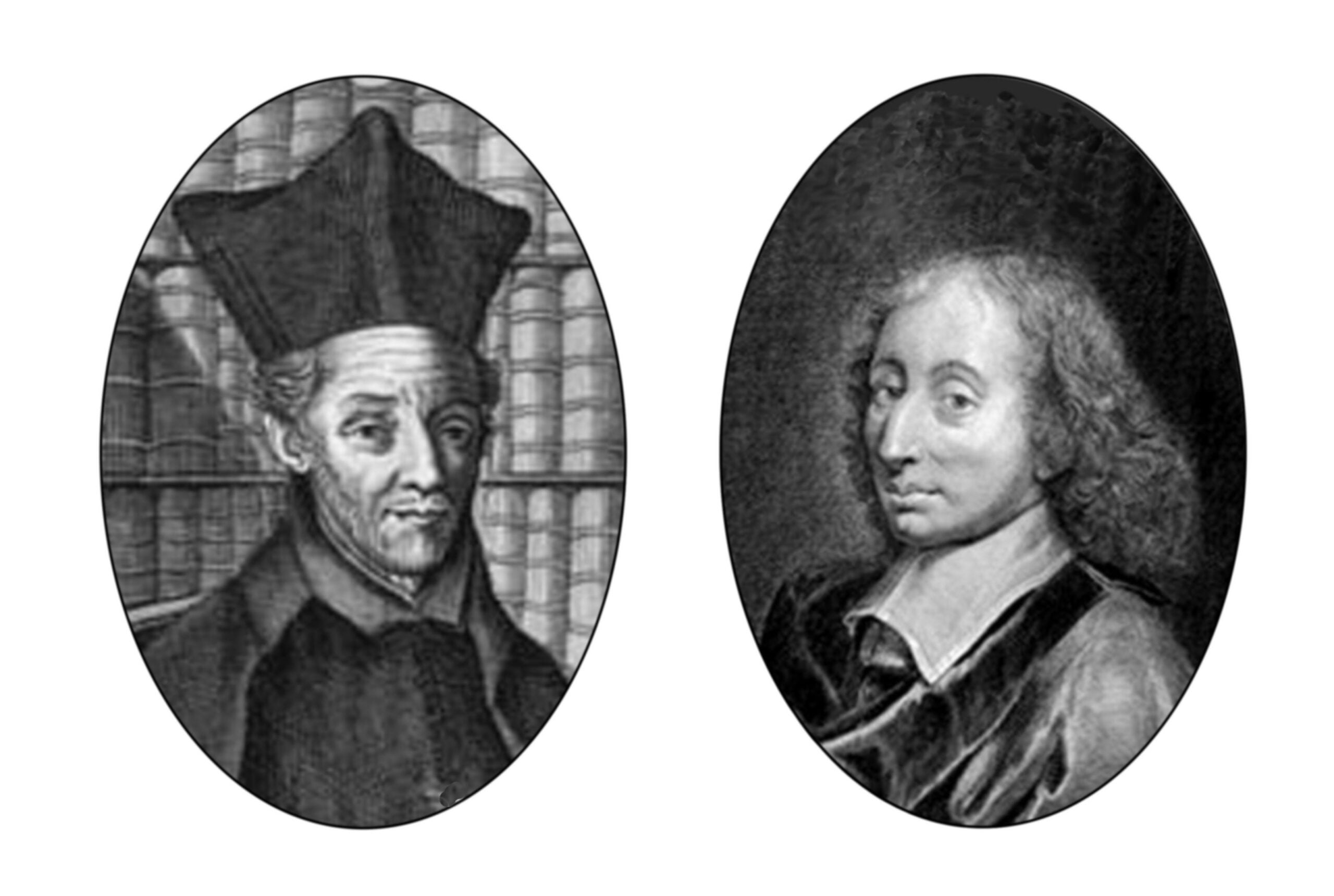
Unfortunately, some of the casuist proposals, most particularly concerning the differentiation between intentions and acts, could easily lead to moral laxity. Sinners could be excused for the bad consequences of their acts because their intentions had been good. Escobar was a strict adherent to the Jesuit rules of poverty, chastity and obedience, but sinners found it easy to abuse his moral reasoning. Thus it was said that Escobar “purchased heaven dearly for himself, but gave it away cheap to others.” Blaise Pascal (1623-1662) took Escobar to task in his Lettres Provinciales. For example, he pointed out that the casuist could reason that although it is wrong to kill someone because of hatred, one could do so blamelessly if one professed fear for one’s own safety. Escobar’s logic was no match for Pascal’s wit. “Casuistry” soon came to mean the use of clever but unsound reasoning to excuse moral culpability; indeed, “Jesuitical” took on the same connotation The following illustration shows Escobar on the left and Pascal on the right:

Nowadays, however, casuistry has returned to favor as a way to approach complex moral decisions (Jonson, 2005).

Six Pages in a Brown Envelope

In his pile of correspondence, Father Beaulieu recognizes the crazy writing on a cheap brown envelope. The sender had written to him multiple times before, each time with a different proof for the existence of God, each time failing to convince anyone. Beaulieu puts the envelope at the bottom of the pile, but later that evening finally opens it, and dutifully reads the contents:  

Dix heures vingt-cinq. Enfin. Il ne restait plus que la lettre brune. Beaulieu l’ouvrit, exaspéré d’avance. Mon Dieu, le nombre de cinglés que Vous mettez au monde. L’écriture était effrayante, une espèce de broderie ne laissant pas la moindre marge à droite ni à gauche, pas plus qu’en haut ni en bas. Il n’y avait que six feuillets, ce soir, moins que les autres fois. Beaulieu prit un carré de chocolat dans le tiroir de son bureau et commença à lire.
Six pages plus loin, il tremblait. Cette fois la preuve n’était ni arithmétique, ni physique, ni esthétique, ni astronomique, elle était irréfutable. La preuve de l’existence de Dieu était faite.

[Ten twenty-five. Finally. Only the brown letter left to go. Beaulieu opened it, already exasperated. Dear God, the number of madmen You put into the world. The handwriting was dreadful, a kind of embroidery that left no margin right or left, top or bottom. There were only six sheets tonight, fewer than the other times. Beaulieu took a square of chocolate from the desk drawer and started reading.
Six pages farther, he was trembling. This time the proof was neither arithmetical, nor physical, nor esthetical, nor astronomical; it was irrefutable. The proof of God’s existence had been achieved. (p 15)]

Beaulieu is overwhelmed. He prostrates himself on the floor as he did on the day of his ordination. After an hour he rises and visits his friend Hervé Montgaroult, a Jesuit professor whose specialty is cataphatic ontology. “Cataphatic” (from Greek cata an intensifier and phanai speak) deals with the affirmative description of the divine (e.g., God is love) as opposed to “anaphatic” (apo other) which uses negative descriptions (e.g., God is unknowable).


Proof for the Existence of God

When Beaulieu presents the professor with the proof, Montgaroult protests that “No proof of the existence of God has ever held up,” and begins to review all the historical proofs. Beaulieu finally stops him, and leaves his with the six handwritten pages, insisting that he just read.

The most famous of the historical proofs for the existence of God are the Five Ways of Thomas Aquinas (1225-1274), an Italian Dominican who taught at the University of Paris (Pasnau, 2024). These five proofs are included in both his Summa Theologica and in his Summa contra Gentiles.

Aquinas’ first proof, which argues for God as the “prime mover,” derives from Aristotle. Things are in motion; whatever is in motion must have been put into motion by something else, which itself must have been moved by something else, and so on. Since this chain of events cannot go on forever, there must be a prime mover that can move things without being moved. This must be God.

Aquinas therefore contradicted the claims of Ibn Rushd (1126-1198, also known as Averroes), a Muslim commentator on Aristotle, who argued that the chain of events does go on forever, and that God created a world that is eternal (Ben Ahmed & Pasnau, 2025; Dales, 1990, p 45). In 1484 painting by Benozzo Gozzoli, The Triumph of Thomas Aquinas, now in the Louvre, celebrates Aquinas’ victory over Averroes:

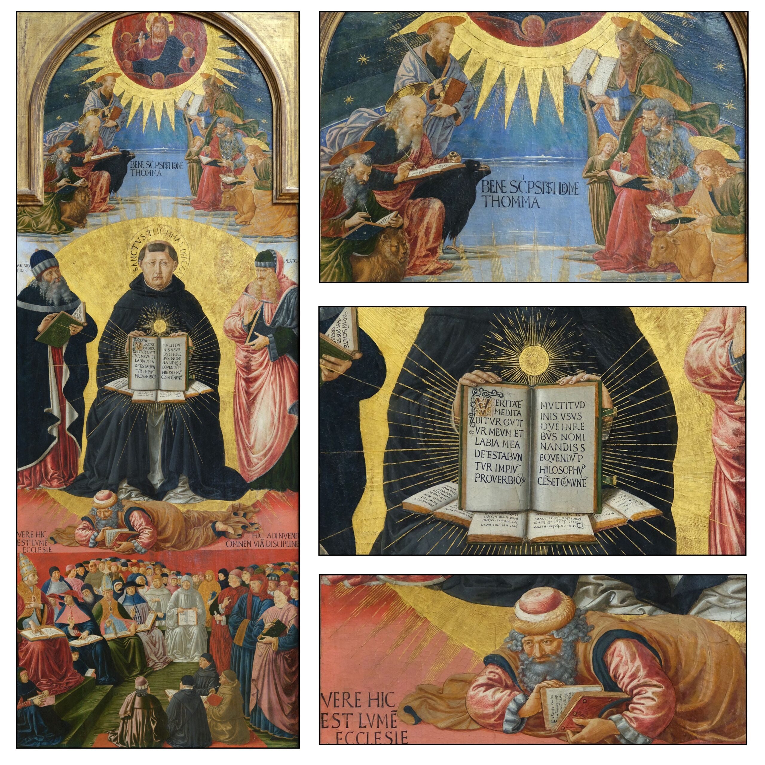
The painting derives its iconography from an earlier work probably painted in about 1330 by Lippo Memmi (Polzer, 1993) to celebrate the canonization of Thomas Aquinas in 1323.  

The upper section of the painting shows God blessing those that have revealed the truth: the Apostle Paul with the sword, Moses with the tablets and the four Evangelists who wrote the gospels, each with their symbolic creature (angel, lion, ox, eagle). Gods states:

Bene scripsisti de me, Thomma [You have written well about me, Thomas].  

In the center of the painting Thomas Aquinas, flanked by Aristotle and Plato, holds his Summa contra Gentile, which begins with an epigraph from Proverbs 8:7:

Veritatem meditabitur guttur meum et labia mea de testabuntur impium. [For my mouth shall speak truth; and wickedness is an abomination to my lips]

The first words of the Summa are

Multitudinis usus, quem in rebus nominandis sequendum philosophus censet, com muniter” obtinuit, ut sapientes dicantur qui res directe ordinant et eas bene gubernant [The usage of the multitude, which, according to the Philosopher (Aristotle) is to be followed in giving names to things, has commonly held that they are to be called wise who order things rightly and govern them well.]

The books below the central book show quotations from the Summa Theologica (see Polzer, 1993, p 43, for details).

Below Aquinas lies the vanquished Averroes. His book states:

Et faciens causas infinitas in primum librum Aristotelis physicorum [And making infinite causes in the first book of Aristotle’s Physics]

Below him is written

Vere hic est lumen ecclesie [Truly this is the light of the church]

And below this, Pope Pius II and his clergy teach the revelations of Aquinas to the assembled believers.

Aquinas is right and Averroes is wrong. Not because of logic, but because Aquinas’ conclusions fit with the teachings of the Church.

The other four proofs of Aquinas are:

Causality: God is the first cause that prevents an infinite chain of cause and effect.

Contingency: God is the necessary being from which all other derive

Degree: God is the criterion by which one can determine what is good, beautiful and true.

Teleology: God is the ultimate end to which the universe is progressing.

Another famous proof for God, which Aquinas disputed, is the Ontological Proof of Anselm of Canterbury (1033-1109). Since everyone can conceive of a being than which no greater can be thought, such a being must exist since existence is necessary to greatness.

Many other logical proofs for the existence of God have been proposed (Restivo, 2021, pp. 99-112). In a recent novel, Rebecca Goldstein (2010) considered 36 different arguments for the existence of God. 

However, it is doubtful that anyone has ever been convinced to believe in God because of logical argument. Rather such proofs are a put together subsequent to belief:

A proof of God’s existence ought really to be something by means of which one could convince oneself that God exists. But I think that what believers who have furnished such proofs have wanted to do is give their “belief” an intellectual analysis and foundation, although they themselves would never have come to believe as a result of such proofs. (Wittgenstein, 1980, 85e)

Nevertheless, after Beaulieu leaves, the skeptical Montgaroult reads the six pages, and is instantly convinced. He spends the night wandering around the streets of Paris in a mystical daze. He is particularly happy about how the new proof solves the age-old problem of evil.

God was no longer mysterious. Evil was no longer a mystery. God was no longer either heart-breaking or heartbroken, and the question that for centuries had woken men in the night would no longer arise, the hideous question of whether He had or had not a role in evil. (p 29)


Religious Qualms

The next morning, Beaulieu and Montgaroult meet with Hubert Le Dangeolet, the Provincial of the Casuists in France. He is skeptical. His first impression is that his two visitors have lost their minds. He decides not to read the proof, and locks it up in his safe. He arranges for two other Casuists, internationally known theological experts, one from Belgium and one from Switzerland, to come to Paris the next day to assess the proof. 

Beaulieu visits Martin Mauduit, the author of the proof. The name “Mauduit” is not far removed from maudit (cursed or damned). Once a priest, Martin had resigned his vocation because he felt that he could discover a new understanding of God through thought. He realized that his first attempts at new proofs for the existence of God, which he had submitted to the journal Outlooks, were abject failures. But then, after weeks of prayer and abstinence, he had woken one morning to find on his floor a six-page proof that he had no memory of writing. The proof had not been reasoned out; it had simply been revealed.   

Mauduit is described as

A small man in his sixties, frail and bald. His smile and his eyes, the assurance and joy in these features alone, recalled someone—Bertrand remembered whom almost instantly: Bishop Gaillot. The churchman about whom every French person, even his warmest supporters, had wondered in 1995 whether he was Saint Francis of Assisi or Narcissus. (pp 60-61)


Bishop Jacques Gaillot (1935-2023) was Bishop of Évreux from 1982 to 1995, at which time he was removed from his position by Pope John Paul II because of his unorthodox and outspoken positions on abortion, immigration, homosexuality, and Palestine. He came to be known as the ‘Red Cleric.’


The next day, the two experts come to Paris, read the proof, are completely convinced, and weep tears of joy. Le Dangeolet realizes that the proof is real but still remains cautious.

I’ve got to keep a cool head and a free mind. The people who have read the proof are immediately possessed by it. They no longer have the slightest objectivity. I’ve seen four of our colleagues topple over, one after the other. We can’t have our whole Casuist province in France slipping into a way of life that is positively Franciscan, and the ecstatic branch at that. (p 112)

He contacts Waldemar Waldenhag, the Father General of the Jesuit Order.


Political Upheavals

Secrets are hard to keep. Before long the government becomes aware that the Casuists possess a new proof for the existence of God. The Prime Minister of France, Jean-Charles Petitgrand, pays a clandestine visit to Le Dangeolet. He is shown the proof. He does not read it, but is completely convinced of its veracity simply by being in its presence. He decides to change his life. He retires from politics:

For the ten or fifteen years he had left to live, he would praise the Eternal One, simply, through love for his roses, for his wife, and for his fellow man. (p 107)

He issues a press release describing his resignation as due to “a sudden irruption of meaning into my life” (p 261). An advisor summarizes for the cabinet ministers what the future might hold:

Within six months, within a year, we have to imagine France as one huge monastery. Everything that today is the motivating force of the advanced liberal societies—the spirit of enterprise, the quest for wealth, the concern for efficiency, the work ethic . . . briefly, what others might call the every-man-for-himself, the activism, the copycat greed, money as guiding light—at the announcement of the proof that God exists, all of that will no longer seem important to our fellow citizens. God becomes a certainty in our midst. How do we react? We spend all our time on Him. We just about cease to work. We earn much less money, but what does it matter? We no longer yearn to change apartments, go off on vacation, send our children to American business schools. We no longer chase after money. If we do work, it’s just enough for what we need to eat and be clothed, to have a roof over our heads. Most of our time we spend meditating, praying. We study Scripture. We succor the poor, we comfort the lonely. We gaze on nature. We feel we’re opening our eyes for the first time. We breathe. (pp 146-147)

The ministers are aghast; the reader is amused. However, this description of a society concerned only with God is not an exaggeration. It must give us pause. Whatever our religious beliefs, do we really wish to put an end to human striving?

Other problems are also considered. The proof was given to the Christians, and apparently the God whose existence is now verified is the Christian God. What will those who profess belief in other Gods think of this?

The politicians confer with Le Dangeolet. A decision is made to keep the new proof secret until the Church and the State can assess its possible effects.  


A Visit to Rome

Le Dangeolet, Mauduit, and the four casuists who have read the proof travel to Rome to meet with Father General Waldemar Waldenhag. He is cautious about the proof.

Doubt about the existence of God was the only formula viable for mankind. People who wanted to believe could believe; those who preferred not to didn’t have to. No greater certainty for the one than for the other. A mutual respect—except for the periods of certainty. Certainty, on whichever side, breeds fanaticism. That’s not all it breeds, but it never fails to breed that. Look at the Crusaders, the Inquisitors, as well as the atheist revolutionaries: all of them slashed and burned and guillotined, completely confident they were doing the right thing. In the end, doubt is the only counterweight to human madness. It’s reason, that’s what doubt is. (pp 232-233)

Nevertheless, Waldenhag ultimately decides to read the six pages. He really wishes to know if the proof might solve the age-old problem of evil. How does a priest explain to someone subject to undeserved suffering how an omnipotent and benevolent God has allowed this to happen?  

I want to know why, how, and in the name of what superior plan the good and all-powerful God of the Gospel lets nations tear each other’s guts out, lets the earth crack open in the middle of cities, and lets children die of hunger. I’ve ‘explained’ it a thousand times, using those enormously sophisticated arguments inherited from Thomism that you know as well as I do, and I’ve done it with such assurance that I must have convinced people sometimes. But for me, the mystery of evil sticks in my craw. (p 237)

And after reading the pages he is as convinced as the others. The problem of evil in the universe appears to be explained

The Problem of Evil

When we consider the arguments for and against the existence of God, the problem of evil (and the suffering that it causes) is generally the atheist’s most effective argument (Mackie, 1982; van Inwagen, 2006; Speak, 2014; Perrine, 2025). If God is omniscient, he cannot be unaware of our suffering; if He is omnipotent, he must be able to intervene in the world; if He is omnibenevolent, he should act to prevent our suffering. If we accept these characteristics of God, the very fact that there is suffering in our world is incompatible with His existence. If he truly were omniscient, omnipotent and omnibenevolent, there would be no suffering.

In his Dialogues Concerning Natural Religion (1779), David Hume described the problem of evil by referring back to ancient Greek philosopher Epicurus (341-270 BCE)

Epicurus’s old questions are yet unanswered. Is he willing to prevent evil, but not able? then is he impotent. Is he able, but not willing? then is he malevolent. Is he both able and willing? whence then is evil? (Hume, 1779, part X)

Over the years theists have proposed many different arguments for the existence of evil. These justifications (or exonerations) of God go by the name of “theodicies.” None of these are convincing (Picton, 2013, pp 361-364). Ultimately, one is left with the idea that God operates at levels beyond human comprehension. We are not able to see the grand scheme of things. Nevertheless, He has assured us through scripture that he knows what is best, and that he will take care of us.


Panentheism

The next morning Waldenhag tells Le Dangeolet some snippets of what was in the six pages proving the existence of God. This is the only time in the book that the reader is given any idea of what is in the proof:

With the world God created totality of being.

Everything that is has no other meaning but being.

Through the Creation, God explores in Himself the free play of being, of all being: good, evil, sense and nonsense, splendor and horror mixed.

What is, is nothing else but God in the process of being.

We are grounded in God, each person for what he is.

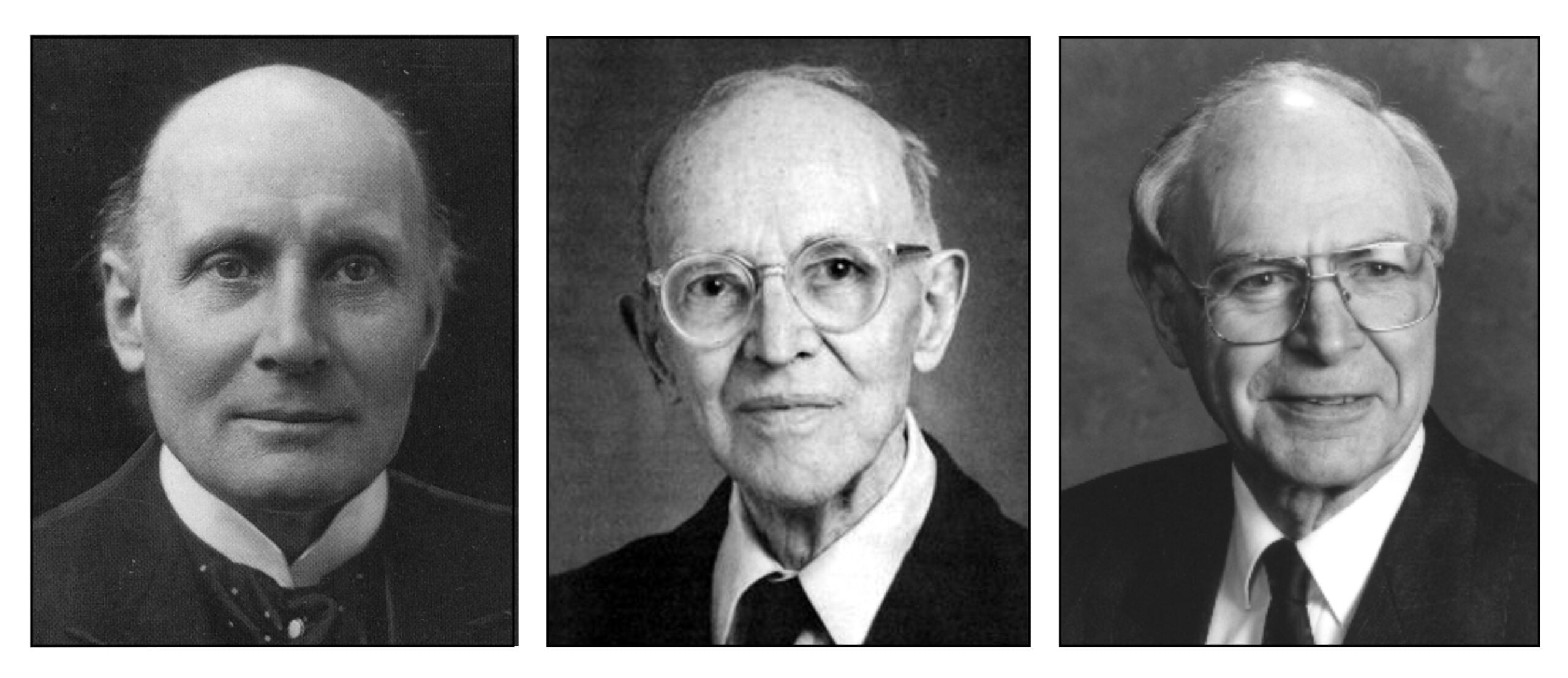
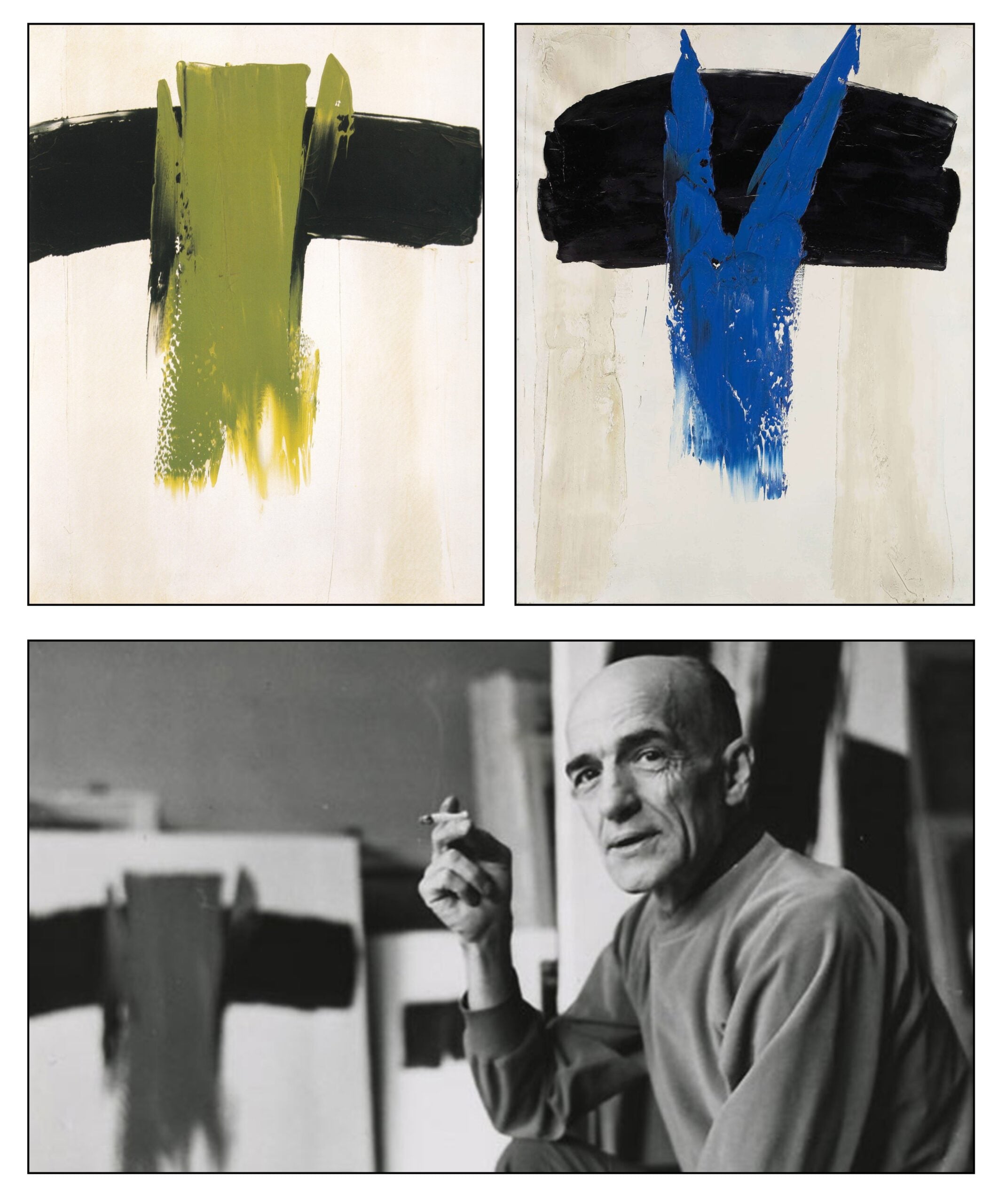
These principles are closely related to the process theology of Alfred North Whitehead (1861-1947) and to the panentheism of Charles Hartshorne (1897-2000) and Arthur Peacocke (1924-2006) – illustrated from left to right in the following figure.

The main idea of process theology is that God is the universe becoming itself. This occurs through an outpouring of God’s love and goodness into the world. Since the process is intelligible  rather than mysterious, science becomes the study of God in all his manifestations. Process theology also provides a way of reconciling the existence of God with the presence of suffering in the world. God and the universe are in the process of becoming. Evil and suffering are present to the extent that this process is as yet incomplete. The following quotation is from Whitehead’s Process and Reality (1929, p 532):

There are thus four creative phases in which the universe accomplishes its actuality. There is first the phase of conceptual origination, deficient in actuality, but infinite in its adjustment of valuation. Secondly, there is the temporal phase of physical origination, with its multiplicity of actualities. In this phase full actuality is attained; but there is deficiency in the solidarity of individuals with each other. This phase derives its determinate conditions from the first phase. Thirdly, there is the phase of perfected actuality, in which the many are one everlastingly, without the qualification of any loss either of individual identity or of completeness of unity. In everlastingness, immediacy is reconciled with objective immortality. This phase derives the conditions of its being from the two antecedent phases. In the fourth phase, the creative action completes itself. For the perfected actuality passes back into the temporal world, and qualifies this world so that each temporal actuality includes it as an immediate fact of relevant experience. For the kingdom of heaven is with us today. The action of the fourth phase is the love of God for the world. It is the particular providence for particular occasions. What is done in the world is transformed into a reality in heaven, and the reality in heaven passes back into the world. By reason of this reciprocal relation, the love in the world passes into the love in heaven, and floods back again into the world. In this sense, God is the great companion — the fellow-sufferer who understands.

Panentheism is a type of pantheism wherein God exists both within and beyond the world (Clayton & Peacocke, 2004, Attfield, 2019; Culp, 2023). Evil exists but only to the extent that the universe is as yet incompletely actualized. Burns (2019) proposes that God exists in two ways – one as the force that causes the actualization of the universe (“God the World”) and the second as the force that maximizes the good in the world (“God the Good”). This approach provides some purpose to the world and to human striving. Everything moves towards the good. Without this aspect process theology can become heartless. To return to Hume we might have a very pessimistic view of our world:

Look round this universe. What an immense profusion of beings, animated and organised, sensible and active! You admire this prodigious variety and fecundity. But inspect a little more narrowly these living existences, the only beings worth regarding. How hostile and destructive to each other! How insufficient all of them for their own happiness! How contemptible or odious to the spectator! The whole presents nothing but the idea of a blind Nature, impregnated by a great vivifying principle, and pouring forth from her lap, without discernment or parental care, her maimed and abortive children! (Hume, 1979, part XI)

The Biblical text justifying process theology and panentheism comes from Paul’s sermon on the Hill of Mars in Athens

God that made the world and all things therein, seeing that he is Lord of heaven and earth, dwelleth not in temples made with hands;

Neither is worshipped with men’s hands, as though he needed any thing, seeing he giveth to all life, and breath, and all things;

And hath made of one blood all nations of men for to dwell on all the face of the earth, and hath determined the times before appointed, and the bounds of their habitation;

That they should seek the Lord, if haply they might feel after him, and find him, though he be not far from every one of us:

For in him we live, and move, and have our being; as certain also of your own poets have said. (Acts 17:24-28)

In A Corner of the Veil, Waldenhag interprets what he has read in terms of the God the Father and God the Son

The Father accepts everything, since He is the source of everything. But He suffers everything. There is no distance between the suffering of man and the suffering of God. And the Father risks everything in His creation. Because it is totality, creation carries within itself the germs of its own destruction. The Father is at stake there. The Son saves not only mankind, but in some way He also saves the Father. He justifies the Father’s creation. (pp 254-255)

Although convinced by the proof, he still has concerns

Man informed of the proof will finally be free, his consciousness much elevated and his actions disinterested. On the other hand, knowing that God is in everything carries the risk of legitimizing any and all behavior. . . . the brute may be confirmed in his brutality, the sadistic husband confirmed in his sadism, and so on. Amorality could take hold of mankind. (p 255)

This concern might perhaps be alleviated if we agree with Burns’ concept that God is both the world becoming itself and the world becoming good.


Epilogue

At the end of the book, the Casuists present the proof to the Secretary of State for the Vatican. The final decision is not the publish the proof. All those who have read the proof will be enjoined not to repeat it to anyone. The marvelous new proof will become a pontifical secret:

Qu’est-ce qu’un secret pontifical? — C’est une information que le Saint-Père ne doit connaître sous aucun prétexte.

[What is a pontifical secret? A piece of information the Holy Father must not learn under any circumstances. (p 269)]


References

Attfield, R. (2019). Panentheisms, creation and evil. Open Theology, 5(1), 166–181.

Ben Ahmed, F. & Pasnau, R. (2025). Ibn Rushd [Averroes]. The Stanford Encyclopedia of Philosophy.

Burns, E. (1999). Apocalypse now. New York Times Book Reviews. August 1, 1999

Burns, E. D. (2019). How to prove the existence of God: an argument for conjoined panentheism. International Journal for Philosophy of Religion, 85(1), 5–21.

Clayton, P., & Peacocke, A. R. (Eds). (2004). In whom we live and move and have our being: Panentheistic reflections on God’s presence in a scientific world. William B. Eerdmans.

Cobb, K. (2005). The Blackwell guide to theology and popular culture. Blackwell 

Cossé, L. (1996). Le coin du voile. Gallimard.

Cossé, L. (translated by Asher, L., 1999). A corner of the veil. Scribner.

Culp, J. (2023). Panentheism. The Stanford Encyclopedia of Philosophy

Dales, R. C. (1990). Medieval discussions of the eternity of the world. E.J. Brill.

Dumort, J. (1997), Le coin du voile. La Jaune et la Rouge. No 523.

Eder, R. (1999). A Corner of the Veil: Proof of God in a Small Brown Envelope. New York Times. (18 July)

Goldstein, R. (2010). 36 arguments for the existence of God: a work of fiction. Pantheon Books.

Hume, D. (1779, reprinted 2006). Dialogues Concerning Natural Religion. Dover Publications.

Jonsen, A. R. (2005). Practical reasoning and moral casuistry. In Schweiker, W. (Ed.) The Blackwell companion to religious ethics. (pp 53-60). Blackwell.

Mackie, J. L. (1982). The miracle of theism: arguments for and against the existence of God. Clarendon Press.

McCombie, (1999). A Question of Faith: A new French novel slyly probes the limits of faith in our modern world. The Free Library (September, 1, 1999).

McInerny, R. (1999). End Notes: Martyrum Candidatus Laudat Exercitus. Crisis Magazine (February 1, 1999).

Pasnau, R. (2024). Thomas Aquinas. The Stanford Encyclopedia of Philosophy

Perrine, T. (2025). Humean arguments from evil against theism. Internet Encyclopedia of Philosophy.

Picton, T. W. (2013). Creature and Creator: intersections between science and religion. Picton.

Polzer, J. (1993). The “Triumph of Thomas” panel in Santa Caterina, Pisa. Meaning and date. Mitteilungen Des Kunsthistorischen Institutes in Florenz, 37(1), 29–70.

Restivo, S. P. (2021). Society and the death of God. Routledge.

Speak, D. (2014). The problem of evil. Polity Press.

Van Inwagen, P. (2006). The problem of evil. Oxford University Press.

Whitehead, A. N. (1929). Process and reality, an essay in cosmology. Macmillan.

Wittgenstein, L. (translated by P. Wench & edited by Wright, G. H. von, 1980). Culture and value. University of Chicago Press.


Paul-Émile Borduas: Le Refus Global

Paul-Émile Borduas (1905-1960) was a Quebec artist who became world-famous in the 1950s for his striking abstract paintings. In the early 1940s he had founded Les Automatistes, a group of artists interested in Surrealism. In 1948, he and his colleague had published the Refus Global (Total Refusal), a manifesto urging his fellow Québécois to throw off the oppressive authority of the Union Nationale Party and the Catholic Church. His call to freedom antagonized those in power. After being fired from his teaching position, he left Canada to work in New York and Paris. Shortly after his death in February 1960, the Liberal Party defeated the Union Nationale in the Provincial Election in June, 1960, and La Révolution Tranquille (Quiet Revolution) began to modernize Quebec society.     

Apprentice

Borduas was born in Mont Saint Hilaire about 40 km east of Montreal in the valley of the Richelieu River which flows from Lake Champlain into the St Laurent River. The mountain arises abruptly from a surrounding plain famous for its apple orchards.

In his teens, Borduas became apprenticed to Ozias Leduc (1864-1955), a painter from the same region, and helped him at his work as a church decorator. Leduc was a talented representational artist with a modernist sensibility (Lacroix, 2019). The following illustration shows his Green Apples (1915), Open Window (1900), and a photograph from 1936.

Leduc arranged for Borduas to have art lessons in Sherbrooke, and in 1923 supported his admission to the newly opened École des Beaux-Arts de Montréal. After he graduated Borduas spent a year of further study in Paris. On his return, he became an art teacher in the Catholic school system. In 1935, he married Gabrielle Goyette and settled down to family life in Mont Saint Hilaire. In 1937, he was appointed professor at the École du meuble de Montréal, which the government had just established to provide training for workers in the province’s furniture industry. The following illustration shows a Self-Portrait from 1928 and a Portrait of Madame Gagnon from 1941.


Les Automatistes

In the late 1930s Borduas became intrigued by ideas of André Breton and the Surrealists. He began to experiment in painting by instinct rather than by reason. Breton, in Le Manifeste du Surréalisme (1924), had defined surrealism as

Psychic automatism in its pure state, by which one proposes to express — verbally, by means of the written word, or in any other manner — the actual functioning of thought. Dictated by the thought, in the absence of any control exercised by reason, exempt from any aesthetic or moral concern.

The following illustration shows one of Borduas’s early abstract paintings: Green Abstraction (1941). He described it as his “first totally non-preconceived painting” (Gagnon, 1988, p 166).  

Borduas soon put together a set of 45 gouaches painted using the principles of surrealism for a solo exhibition in Montreal in 1942 (Gagnon, 2013, pp 117-135). At the time he described his artistic technique as follows;

I begin with no preconceived idea. Faced with the white sheet, my mind free of any literary ideas, I respond to my first impulse. If I feel like placing my charcoal in the middle of the page, or to one side, I do so with no questions asked, and then go on from there. Once the first line is drawn, the page has been divided and that division starts a whole series of thoughts which proceed automatically. When I use the word “thoughts” I mean painterly thoughts: thoughts having to do with movement, rhythm, volume and light, not literary ideas. Once the drawing has been completely worked out, the same steps are followed with colour. As with the drawing, if my first impulse is to use yellow, I don’t hesitate. And the first colour determines all the others. It’s at the stage of colour that the problems of light and volume present themselves. (quoted in Nasgaard & Ellenwood, 2009, p 12).

Two of the gouaches are illustrated below: Number 6 and Number 33. Some appeared to represent something – Number 6 soon became known as Le Chantecler (Rooster). Others, like Number 33, seemed completely abstract.  

Another important influence on Borduas was Marie-Alain Couturier (1897-1954). Between 1940 and 1944, the French Franciscan Father lived in North America in exile from occupied France. He spent some time in Quebec, encouraging artists to explore the new freedoms of modern art, and urging the church to support their new sense of beauty. Couturier had originally trained as a stained-glass artist, and went on to become an editor for the journal Art Sacré (Lion, 2010). Borduas had met him during his time in France, and the two interacted again when Couturier was a visiting lecturer at the École du meuble. The following is from one of Couturier’s essays published in Quebec:

It takes an effort of pure intuition to assure the birth and development of a work of art, a total abandonment to a certain obscure sense of the absolute. And, to tell the truth, there needs to be an absolute risk, which implies a state of constant insecurity for the artist. This is psychologically very difficult, often even anguishing, as it is entirely foreign to the stable order of certitudes that rule over and guarantee all other human activities. (Couturier, 1944, quoted in Warren, 2017, p 23).

Over the next few years, Borduas assembled about him a group of talented young painters who were trying out the new modernist approaches to art. They had their first exhibition in 1947 at the house of his friend Claude Gauvreau, a poet and playwright, and brother of the painter Pierre Gauvreau. A journalist described the group as Les Automatistes from Borduas’s titles: for example, Automatisme 1.47 which later came to be known as Sous le vent de l’île (Leeward of the Island) (Nasgaard & Ellenwood, 2009; Gagnon, 2020). The following illustration shows Borduas at the exhibition in front of this painting and Automatisme 2.47 or Le Danseur.

The painting Sous le vent de l’île is impressive:

The canvas is cleanly divided into two registers. The first, consisting of broad horizontal brush strokes, corresponds to the background. A wide expanse beginning at the bottom of the picture and receding to infinity as the viewer’s gaze rises is flanked on the right by what could be interpreted as a sea meeting its shore. The space created in this way appears traversed “as if by a wind blowing from west to east:” On this background, without any apparent connection to it, a group of small red, green, black, and white blotches have been laid with a palette knife, like the pieces of a vertical veil blown about by the wind. The remarkable thing in this painting with respect to its predecessors is the extraordinary impression of depth it gives. The island, seen from above, at a height never before experienced in a Borduas work, takes on the dimensions of a continent and even the objects hanging in space remain at a certain distance from the viewer (they do not touch the edge of the canvas). (Gagnon, 2013, pp 192-193).


Le Refus Global

In 1948, Les Automatistes published a small manifesto entitled Le Refus Global (Total Refusal). Borduas was the lead author, and Jean-Paul Riopelle (1923-2001) designed the cover and frontispiece. Thirteen other artists also signed the manifesto, among them Marcelle Ferron (1924-2001), Claude Gauvreau (1925-1975), Fernand Leduc (1916-2014), and Françoise Sullivan (1923- ). Four hundred typescript copies were printed and only about half of these were sold (at a dollar apiece). Below is the frontispiece, which incorporates a poem by Claude Gauvreau about how information from the sensory world can be directly transformed into creative passion. The letters of the manifesto’s title are used to suggest the senses (raie for the light rays, fugue for tactile sensation, lobe for the earlobe, and ale for taste)

Borduas’s manifesto began with a rambling history of Quebec and its people and how they hade been exploited and kept in ignorance and by the Catholic Church:

Son exécrable exploitation, maintenue tant de siècles dans l’efficacité au prix desqualités les plus précieuses de la vie, se révélera enfin à la multitude de sesvictimes: dociles esclaves d’autant plus acharnés à la défendre qu’ils étaient plus misérables. L’écartèlement aura une fin. La décadence chrétienne aura entrainé dans sa chute tous les peuples, toutes les classes qu’elle aura touchées, dans l’ordre de la première à la dernière, de haut en bas.

[A loathsome exploitation, effectively maintained for centuries at the cost of the best things in life, will be exposed at last to a multitude of victims, docile slaves whose eagerness to defend their servitude has been in direct proportion to their wretchedness. The torture will end. Christian decadence in its collapse will drag down all the peoples and classes it has touched, from first to last, from top to bottom.] (translation of this and following passages by Ray Ellenwood, Borduas, 1985)

Borduas then called for a break with the past:

D’ici là notre devoir est simple. Rompre définitivement avec toutes les habitudes de la société, se désolidariser deson esprit utilitaire. Refus d’être sciemment au-dessous de nos possibilitéspsychiques. Refus de fermer les yeux sur les vices, les duperies perpétrées sous lecouvert du savoir, du service rendu, de la reconnaissance due. Refus d’uncantonnement dans la seule bourgade plastique, place fortifiée mais faciled’évitement. Refus de se taire — faites de nous ce qu’il vous plaira mais vousdevez nous entendre — refus de la gloire, des honneurs (le premier consenti): stigmates de la nuisance, de l’inconscience, de la servilité. Refus de servir, d’être utilisables pour de telles fins. Refus de toute intention, arme néfaste de la raison. À bas toutes deux, au second rang! Place à la magie! Place aux mystères objectifs! Place à l’amour! Place aux nécessités! Au refus global nous opposons la responsabilité entière.

[We must break with the conventions of society once and for all, and reject its utilitarian spirit. We must refuse to function knowingly at less than our physical and mental potential; refuse to close our eyes to vice and fraud perpetrated in the name of knowledge or favours or due respect. We refuse to be confined to the barracks of plastic arts — it’s a fortress, but easy enough to avoid. We refuse to keep silent. Do what you want with us, but you must hear us out. We will not accept your fame or attendant honours. They are the stigmata of shame, silliness and servility. We refuse to serve, or to be used for such purposes. We reject all forms of intention, the two-edged, perilous sword of reason. Down with both of them, back they go! Make way for magic! Make way for objective mysteries! Make way for love! Make way for necessities! Counterbalancing this total refusal is our complete responsibility]

And invited the reader to join in the new creative freedom:

Au terme imaginable, nous entrevoyons l’homme libéré de ses chaines inutiles, réaliser dans l’ordre imprévu, nécessaire de la spontanéité, dans l’anarchie resplendissante, la plénitude de ses dons individuels. D’ici là, sans repos ni halte, en communauté de sentiment avec les assoiffés d’un mieux-être, sans crainte des longues échéances, dans l’encouragement ou la persécution, nous poursuivrons dans la joie notre sauvage besoin de libération.

[Within a foreseeable future, men will cast off their useless chains. They will realize their full, individual potential according to the unpredictable, necessary order of spontaneity — in splendid anarchy. Until then, we will not rest or falter. Hand in hand with others thirsting for a better life, no matter how long it takes, regardless of support or persecution, we will joyfully respond to a savage need for liberation.]

The public paid little attention. However, the reaction of the church and government was swift. A month after the manifesto was published, Borduas was fired from his position at the École du meuble. The reason given in the official government letter was

*His writings and the manifestos he publishes, as well as his state of mind, make him unsuitable for the kind of teaching we wish for our students. (quoted by Ellenwood in his introduction to Borduas, 1985)

Borduas was devastated. He continued to paint and began to make abstract wooden sculptures, but he soon began to experience financial difficulties. His marriage came under great strain. In 1951 and Gabrielle finally took the children and left her husband. In 1953, Borduas abandoned Canada, moving for a few months to Provincetown on Cape Cod, and then on to New York.


New York

New York in 1953 was abuzz with the new Abstract Expressionism. Borduas was impressed with the “action painting” of Jackson Pollock, and created a series of his own drip paintings using watercolors. The following is Gerbes légères (Light Sheaves) from 1954:

Borduas was also intrigued by the abstract calligraphy of Franz Kline, the monumental color fields of Clyfford Still, and the powerful simplicity of Robert Motherwell. He began to apply paint in broad strokes or taches using a palette knife. His painting suggested multicolored knots of color in a thick white fabric. A striking painting from this time was Blue Drops, 1955:   

Paris

In 1955 Borduas moved to Paris. His palette became more restricted: paintings of black shapes on a white background became his iconic images. These paintings convey a deep sense of winter. They recall some of the paintings by his early master Ozias Leduc. The following illustration compares Leduc’s Grey Effect (Snow) from 1914 with Borduas’s Ardente from 1957:

The following is a quotation from Herta Wescher introducing an exhibition of his new abstract paintings in Paris in 1959:

his first burst of activity produced dynamic compositions swirling with movement in a range of shimmering tones. In later works, however, the elements were condensed and reduced in number, forming dark constellations within light grounds. White has become Borduas’ predominant colour, and he is capable of imbuing it with the most subtle of modulations. He covers his canvases with huge luminous expanses of white, at the edges of which very severe black shapes seem to terminate the space. Slowly, the jagged contours position and align themselves, and the internal structures of the compositions fall into place. Never, though, are the surfaces monotonous or schematic. Borduas applies the pigment with broad knives, and the movement of his hand leaves its mark both on the smooth areas and on those that are riddled with nervous streaks. (quoted by Gagnon 1988, p 399)


The following illustration shows Borduas’s most famous painting: L’Étoile Noire (Black Star) from 1957, now in the Montreal Museum of Fine Arts:

The painting is large – 1.62 meters high and 1.30 meters wide. Larger than anything he had painted before. It demands respect. 

The painting is very difficult to reproduce accurately. There are subtle shades of white, and patches of dark brown coalesce with the black. The edges of the taches are elevated forming lines of force throughout the image.

The following are comments on the painting by Gagnon (1988, p 202):

The use of dark brown in the three main spots towards the bottom adds considerably to the ambivalence of these dark areas. Where are we to place them? They appear both to be moving away towards infinity (black) and to be floating on the surface like blood coagulated on the skin (brown). The spots, on their own, thus encompass all positions in space, and the white is freed for other functions. It should be noted, in particular, how the white invariably covers the edges of all the dark spots with an over-lapping lip. It is thus not a background on which the spots stand out (which would be a Gestaltist reading). Might it not be a true colour field in which these black and brown spots are embedded? It is not really that either, for, as we have seen, the spots still keep their illusionistic power to evoke the abyss, the infinity of the cosmic night. In fact, the white acts as a screen. It serves to conceal some-thing from view and, like all screens, it is interesting to look at in itself If we follow the folds in the white, the edges that it forms around the spots, we will see that it encloses them in a network of lines as structured as those in a Mondrian painting. But what we have here is a Mondrian shot through with the tremor of life — in sharp contrast to the exclusively spiritual character sought by the great Dutch artist in his own works. In Borduas’ painting, the spirit is never divorced from the material; it reveals itself as much in the recesses of the paint as in the rigour of the composition.

Another painting from this time is Magnetic Silence (1957). This has the same imposing size as Black Star. The black shapes at the top of the painting appear to be attracted toward each other, whereas those at the bottom appear to display repulsion. The white background on which the black shapes exist shows the energy with which Borduas created his image. The edges between the various color areas rise up with the force of their interaction. Tectonic plates come forcefully to mind.  

Another style that Borduas explored in Paris placed simple calligraphic shapes in black and in color on a white background. Perhaps an attempt to decode the infinite. The following illustration shows two of these paintings and a photograph from 1959:

Borduas was not well. He was depressed about his exile from Canada, and his heart was starting to fail. His mental and physical and stresses found their way into this painting:

Ma peinture deviant de plus en plus sévère, noir et blanc, simplifiée; je n’y plus rien; c’est ma “fatalité.” [My painting is becoming more and more severe, black and white, simplified; I have nothing left; it is my “fatality.”] (quoted by Lambert 2015, p 94)

He died of a heart attack in February 1960. At his death, Borduas left on his easel a large black and white painting (later titled Composition 69):


His friend the poet Jean-Paul Filion described the painting

Une seule masse noire et immense couvrant la surface presque totale de la toile, avec, dans le haut, un mince horizon de blanc dans lequel baigne un soupçon de vert limpide et où le peintre a piqué deux petites formes noires rectangulaires, créant ainsi une perspective fascinante vers l’espace. Que viennent faire ces deux blocs, ces deux masques, ces deux fantômes comme des bouts de linceul, et qui persistent à prendre toute la place dans un espace réduit de lumière inaccessible, le tout placé comme en exergue au sommet d’un haut mur de charbon luisant? Ce qui m’entraîne à voir dans cette oeuvre limite l’illustration d’une sorte de désespoir vécu aux confins du cosmos. Ai-je tort d’imaginer cela? (quoted in Lambert, 2015, p 97).

[One immense black mass covering almost the entire surface of the canvas. At the top, a thin white horizon with a hint of limpid green, in which the painter has stuck two rectangular black shapes, thus creating a fascinating view out into space. What are they doing there, these two blocks, these two masks, these two ghosts like bits of shroud, stubbornly taking up all the room in a cramped space of inaccessible light, sitting like an epigraph atop a high wall of glistening coal? I am led to see this final work as the illustration of a sort of despair experienced at the limits of the cosmos. Am I wrong in imagining that?]


La Révolution Tranquille

While Borduas was in self-imposed exile, the political landscape of Quebec was beginning to change. Since 1936, the province had been governed by the conservative Union Nationale party led by Maurice Duplessis, except for a brief period during World War II when the Liberal Party had won an election by promising to prevent conscription. The Union Nationale had close ties to the Catholic Church, and had hung a crucifix over the speaker’s chair in the National Assembly when they first came to power in 1936. One of their recuring slogans was Le ciel est bleu; l’enfer est rouge (Heaven is blue and Hell is red, a play on the colors of the two parties – blue for the Union Nationale and red for the Liberals). The Union Nationale was vehemently anti-union, and provided little if any support for education or social security, which were controlled by the church. The government supported a strictly capitalist economy, wherein the natural resources of the province were exploited by rich foreigners.   

In late 1959, Duplessis died. In the election of June 1960, a brief four months after the death of Borduas, the Liberal Party under Jean Lesage were victorious. The Liberals instituted many reforms: the nationalization of the power companies to form Quebec Hydro, the establishment of a Quebec pension, increased support for education which now came under government rather than church control, and recognition of the unions even in the civil service. These came to be known as La Révolution Tranquille (Quiet Revolution), and the preceding period when the province was controlled by the Union Nationale came to be known as La Grande Noirceur (Great Darkness). These terms were those of the victors. In actuality, the Union Nationale period was not as dark as they believed, and the revolution turned out to be not as quiet as they wished (Bouchard, 2005).  

After 1960, there were tremendous changes in Quebec society. Most importantly, the birth rate and the frequency of attendance at church declined precipitously. It is tempting to attribute these changes to the Liberal election. However, both a declining birth rate and an increasingly secular society occurred at the same time in the rest of Canada and in Western Europe. Other more global factors were at play: the availability of contraceptive medication and a burgeoning economy. 

Whatever the actual causes, Borduas would have been pleased with the new Quebec. His Refus Global had called for these new freedoms and new responsibilities. Although his manifesto was rejected at the time it was published, the ideas that it promoted germinated and were finally acted upon. 


References

Borduas, P.-É. (1948). Refus global. Mithra-Mythe Éditeur. Text of Borduas article is available. English translation available.

Borduas, P.-É. (translated by R. Ellenwood, 1985). Total refusal. Exile Editions.

Bouchard, G. (2005). L’imaginaire de la grande noirceur et de la révolution tranquille: fictions identitaires et jeux de mémoire au Québec. Recherches Sociographiques, 46(3), 411–436.

Breton, A. (1924, translated by R. Seaver and H. R. Lane, 1969). Manifestoes of Surrealism. Ann Arbor Paperbacks (University of Michigan Press)

Gagnon, F. M. (1988). Paul-Émile Borduas. Montreal Museum of Fine Arts.

Gagnon, F. M. (2014). Paul-Émile Borduas life & work. Art Canada Institute

Gagnon, F. M. (2013). Paul-Émile Borduas: a critical biography. McGill-Queen’s University Press.

Gagnon, F. M. (trans. D. Winkler, 2020) Jean Paul Riopelle and the Automatiste Movement, McGill-Queen’s University Press.

Lacroix, L. (2019) Ozias Leduc: life and work. Art Canada Institute

Lambert, P. (2015). Borduas: le rebelle de Saint-Hilaire. Marcel Broquet, la nouvelle édition.

Lion, A. (2010). Art sacré et modernité en France: le rôle du P. Marie-Alain Couturier. Revue de l’histoire des religions, 1|2010, 109-126.

Nasgaard, R., & Ellenwood, R.  (2009). The Automatiste revolution: Montreal, 1941-1960. Douglas & McIntyre.

Warren, J.-P. (translated by S. Urquhart, 2017). Living art: individual and collective creativity: becoming Paul-Émile Borduas. Exil


Black Square: The Russian Avant-Garde

At the Last Futurist Exhibition of Paintings 0,10 in Petrograd in 1915, Kazimir Severinovich Malevich (1879-1935) presented a set of Suprematist paintings. Among them was a small (80 cm square) canvas showing a black square on a white background. The painting was the final step in the rebellion against representational art: pure form without content. Black Square became emblematic of the Russian Avant-Garde, a modernist movement in Russian art, which predated the Russian Revolution, and then enthusiastically celebrated the new world brought forth by that revolution. However, the new politics did not embrace the new art. In the 1920s, the Avant-Garde was criticized as “formalist,” and replaced by the more politically amenable art of Socialist Realism.

The Modernist Revolution

In the years leading up to the outbreak of World War I, artists turned away from representational art toward abstraction. The most significant of the various movements was Cubism, which began in 1907 with Picasso and Braque. Cubism changed our ideas of perspective: multiple points of view and multiple degrees of focus were presented together. This was soon followed in 1909 by the Futurism of Marinetti and Boccioni. Futurism represented experiences from multiple times simultaneously. The Fauvism of Derain and Matisse began to use of color to portray emotion rather than reality, and the Orphism of Robert and Sonia Delaunay attempted to reach harmony through color independently of form.

Artists and collectors in Russia closely followed these developments in modernism. The cloth merchant Sergei Shchukin and the textile manufacturer Ivan Morozov each put together important and extensive collections of modernist art. Shchukin opened his home on Sundays to allow the public to view the work of Picasso and Matisse. Artists travelled to France and Italy and brought the ideas of Cubism and Futurism back to Russia. The literary group Hylaea founded the Russian Futurist movement in 1912 with a manifesto entitled A Slap in the Face of Public Taste (Markov in Ioffe & White, 2012, pp 21-84). They repudiated the art and literature of the past; they celebrated the beauty of speed and machines. Some of the artists of Russian Futurism pushed toward complete abstraction, founding a small movement known as Rayonism, which depicted rays of colored light. T

he interactions between the various movements in modern art were represented in a diagram that Alfred Barr used as a cover to his 1935 book Cubism and Abstract Art:


Victory over the Sun

In 1913, the Russian Futurists presented an opera in Petrograd entitled Victory over the Sun. The libretto was written by Aleksei Kruchonykh, the music was composed by Mikhail Matyushin, and the stage settings and costumes were designed by Kazimir Malevich. In the opera, the sun, representative of the decadent past, is torn down from the sky to make way for a new world created by man’s technological expertise. The following illustration shows Malevich’s design for the costumes of the new men of the future, a sketch for the backdrop for Act II, and a poster for a later production of the opera by El Lissitzky. Malevich’s sketch of a square partially eclipsed in black is a precursor of his later painting Black Square. The Lissitzky poster shows some of the imaginary technology used by the men of the future. The title (Победа над Cолнцем, Pobeda nad Solntsem) is presented, and the banner reads (in a hybridized language) All is well that begins well and has not ended.


Last Futurist Exhibition of Paintings 0,10

The Last Futurist Exhibition of Paintings 0,10 opened in Petrograd on December 17, 2015. As its title proclaimed, the exhibition was designed to mark the end of all representational art, even that of Futurism. The meaning of the numbers “zero-ten” has never been clear (Shatskikh, 2012, pp 101-102). “Zero” likely represented the end of everything and perhaps “ten” indicated the number of artists scheduled for the exhibition, although 14 artists were ultimately included in the catalogue. Together with the exhibition, Malevich published From Cubism and Futurism to Suprematism: The New Painterly Realism (Bowlt, 1976, pp 116-135). Like all of Malevich’s writings, the thoughts tend more to ecstasy than logic:  

I have transformed myself in the zero of form and have fished myself out of the rubbishy slough of academic art. I have destroyed the ring of the horizon and got out of the circle of objects, the horizon ring that has imprisoned the artist and the forms of nature. This accursed ring, by continually revealing novelty after novelty, leads the artist away from the aim of destruction.

Only dull and impotent artists veil their work with sincerity. Art requires truth, not sincerity. Objects have vanished like smoke; to attain the new artistic culture, art advances toward creation as an end in itself and toward domination over the forms of nature.

Malevich’s Suprematist paintings were displayed in one of the rooms of the exhibition. In these paintings, simple shapes float in a white space, seeking out equilibrium and sometimes moving in front of each other. The painting entitled Black Square was mounted high in the corner of the room, in the position where one might display a religious icon: The following illustration shows a photograph of the original exhibition and a replica of the room (missing the chair and the labels) put together by the Chinese-American artist John Diao in 1985:

The original Black Square has not aged well: the black paint has crackled significantly and the white paint is scuffed and dirty. Visual and radiographic examination shows that the square was painted over other shapes, as though Malevich had come to a sudden realization that even those simple shapes should be eclipsed:

The following illustration shows two of Malevich’s more complex Suprematisms, the left one having been part of the 1915 exhibition and the right one dating 2016.

Among the artists presenting at the 1915 exhibition was Lyubov Popova (1889-1924). She had been painting in a Cubist style, but after the exhibition moved to more complete abstraction. The following is her Painterly Architectonic (1918) and Spatial Force Construction (1920);

Another artist in the exhibition was Vladimir Tatlin (1885-1953; Baier, 2012). He had denied the need for painting of any kind. Instead, he put together assemblages of materials or “counter-reliefs,” one of which is shown in the following illustration (left). He founded a movement called Constructivism, which used the new technology and materials to build things that could be used rather than admired (Lodder in Ioffe & White, pp 227-249). In 1919, he designed a spiral tower to commemorate the Third International. This was to have been made of steel and glass and to have reached a height of over 400 m. It was never constructed. The illustration (below, right) shows a model from 1920.

The Russian Revolution

Deaths in battle and shortages of food during the first years of World War I precipitated widespread unrest in Russian society. In March 1917, Tsar Nicholas II was forced to resign. The provisional government was then itself overthrown by Vladimir Lenin and the Bolsheviks in November 1917. Russia then entered into a prolonged Civil War fought mainly between the Communist Red Army and the White Army composed of those loyal to the Russian Empire. To prevent any hope that the Tsar be reinstated, Nicholas II and his family were murdered in July 1918. The Civil War finally ended in 1922 with the establishment of the Soviet Union. During the war and for many years afterward, the country was wracked by widespread famine, as communism imposed its principles upon the economy. After Lenin died in 1924, Josef Stalin became the leader of the Soviet Union.

The Suprematists and the Constructivists enthusiastically assisted in the birth of the new society, founding schools to teach arts and crafts to the workers. Malevich continued to produce his Suprematist paintings. One important painting – White on White (1918) – seemed to celebrate the revolution. The principles of the past have been swept away, leaving an almost empty canvas though which we can just discern the future.  

Other Malevich paintings from the early years after the revolution tended toward the mystical.  The following illustration shows Eight Red Rectangles, one of the paintings from the 1915 exhibition, and Mystic Suprematism from 1920. Though Malevich had rejected his Catholic upbringing, the idea that one might approach the divine through art persisted (Mashek, 2023). The term “Suprematism” contains within itself the idea of some ultimate power that the artist is attempting to perceive.


UNOVIS

In 1919 Malevich joined the School of Art in Vitebsk, a small town in the western region of the Russian Empire (now Byelorus), and a significant center of Jewish culture. In 1920, Malevich succeeded Marc Chagall as the artistic director of the school, and gathered around him a group of artists that called themselves UNOVIS: Utverditeli Novogo Iskusstva or “Champions of the New Art” (Lampe, 2012; Scheijen, 2024, pp 237 248)). The following illustration shows work by two of Malevich’s students: Georgii Riazhsky (1920) and David Yakerson (1920) 

Two other students were Kliment Redko (1921) and Ilya Chashnik (1923):

One of Malevich’s colleagues in Vitebsk was El Lissitzky (1890-1941), who produced propaganda posters supporting the new Red Army. The poster urges the “Red wedge” (Клином красным, Klinom krasnym) to “beat the whites” (бей белых, bey belykh):

El Lissitzky produced many Suprematist paintings that he called prouns. The word is likely a contraction of Pro-Unovis (Clark,1999, p 231). Probably his most famous proun is that painted as a memorial for Rosa Luxemburg, the communist revolutionary who participated in the failed Spartacist uprising in Berlin in 1919, and was summarily executed thereafter by the German military. In the original proun (left below, 1920) a black square, perhaps signifying death, obscures the faded name Rosa Luxemburg written in Cyrillic (Роза Люксембург) on a red circle that probably represents the communist revolution. A later version of the proun (1924, right) no longer showed Luxemburg’s name and used the more generic title Project for Progress.

The following are comments by T. J. Clark (1999, p 251)

I shall treat the elements in the gouache as fourfold. There is a red circle and a black square “on top” of it. There is a universe of smaller, more random Suprematist elements at the picture’s edges, most of the elements being segments of circles as if answering the shape of the central red planet. And then, written into the square and the circle — seemingly half-inscribed into them, but with color seeping back into the lines of lettering — the words ROSA LUXEMBURG, in formal script, complete with period. The effect, as I say, is simple. The symbolism is more or less transparent. Red = wor1d = revolution. Black = death = matter = nothing. (The last two terms in the series would have had, for someone under Malevich’s influence in 1920, a strong positive valency.) The arrows and aeroliths are the various forces, some of them maybe still hostile, about to be brought into the orbit of world revolution. None of this is exactly disturbed by the final inscription of Rosa Luxemburg’s name, but I do think that the presence of writing energizes and complicates the picture’s whole economy.

UNOVIS also attempted to provide art for the everyday life of the revolution. The following illustrations show a ration card designed by Aleksandr Tseitlin in 1920, and a set of cups designed by Malevich and produced in 1923:


Kandinsky

In 1913 and 1914 Wassily Kandinsky (1866-1944), a Russian painter and theorist working in Munich produced some completely abstract paintings. In 1914 he was commissioned to paint four panels for Edwin Campbell, the founder of Chevrolet Motors, to adorn the entrance foyer of his Park Avenue apartment (Roethel & Benjamin, 1979, pp 112-115). World War I delayed the transfer of the paintings to New York and they were later moved to Campbell’s house in Palm Beach. Following his divorce, the paintings were sold off for a pittance, but ultimately made their way to the Museum of Modern Art in New York. Two of the panels are shown below. They are completely free of any real-world representation. If anything, they appear as music transposed into line and color.   

When World War I broke out, Kandinsky returned to Russia, leaving his long-term partner Gabriele Münter, and settling back into his family home in Moscow. He exhibited his paintings together with Malevich, Popova and others, and in early 1917 married Nina von Andreevskaia. After the Russian Revolution he participated in the newly formed NKP (People’s Commissariat for Enlightenment), and later taught at the Institute of Artistic Culture (INKhUK), founded in 1920. However, he never felt comfortable in the new Communist Society and in 1922, he moved back to Germany to join the newly formed Bauhaus in Weimar (Poling, 1983).

Kandinsky and the Suprematists represented two extremes in abstraction: the ecstatic and the austere. However, Kandinsky was clearly affected by the work of Malevich and his colleagues. His paintings became more restrained and he began to use simple geometric shapes. The following illustrations show Multicolored Circle (1921) from his time in Moscow, and Yellow, Red and Blue (1925) one of the masterpieces from his Bauhaus years. The left side of the latter could pass for a Suprematist painting (cf the Riazhsky painting previously illustrated).

AKhRR

Russian abstract art soon elicited a backlash. In 1922, a group of disaffected artists, among them Yevgeny Katsman, Alexander Grigoriev and Sergey Malyutin, formed the Association of Artists of Revolutionary Russia (Assotsiatsia khudozhnikov revolutsionnoi Rossii, AKhRR; Scheijen, 2024, pp 323-343). They proposed that artists should support the revolution with art that the people could easily understand. The following is from their manifesto (Bowlt, 1976, p 266):  

The Great October Revolution, in liberating the creative forces of the people, has aroused the consciousness of the masses and the artists-the spokesmen of the people’s spiritual life.

Our civic duty before mankind is to set down, artistically and documentarily, the revolutionary impulse of this great moment of history.

We will depict the present day: the life of the Red Army, the workers, the peasants, the revolutionaries, and the heroes of labor.

We will provide a true picture of events and not abstract concoctions discrediting our Revolution in the face of the international proletariat.

In 1924 Lenin died and Stalin took over the leadership of the Soviet Union. He sided with the AKhRR and abstract art fell completely out of favor. Socialist Realism became the art of the people (Groys in Ioffe & White, 2012, pp 250-276; Bown et al, 2012; Glomshtok, 2011). Abstract art was considered meaningless “formalism.”


Farewell to an Era

The Russian Avant-Garde did not last long: a mere ten years occurred between the foundation of Russian Futurism and the fall from grace of Suprematism and Constructionism. Nevertheless, it was a decade of intense creativity wherein artists explored the limits of their art. One must recognize that they tried to bring about a revolution in our ideas of aesthetics. Boris Groys (in Ioffe& White, 2012, p 252) remarks that the Russian Avant-Garde

is often regarded in an aestheticized, purely formal, stylistic light, although such a view is opposed to the objectives of the Russian avant-garde, which sought to overcome the traditional contemplative attitude toward art. While today, the works of the Russian avant-garde hang in museums and are sold in galleries like any other works of art, one should not forget that Russian avant-garde artists strove to destroy the museum, to wipe it out as a social institution, ensuring the idea of art as the “individual” or “hand-made” production by an artist of objects of aesthetic contemplation which are then consumed by the spectator. As they understood it, the artists of the Russian avant-garde were producing not objects of aesthetic consumption but projects or models for a total restructuring of the world on new principles, to be implemented by collective actions and social practice in which the difference between consumer and producer, artist and spectator, work of art and object of utility, and so on, disappeared.

Though they failed in their goal of destroying the museum, they did bring to us new ways of viewing that which cannot be represented (Golding, 2000). Abstraction continued and we can see the influence of the Russian Avant-Garde in the Abstract Expressionism of the mid 20th Century. Kandinsky led toward Pollock and Malevich toward Rothko. Mark Rothko (1903-1970) was born in the Russian Empire but came as a child to the United States. His No. 1 White and Red (1962) uses a similar palette to Malevich and tries in its simplicity to understand the mystery of experience:   

References

Baier, S. (2012). Tatlin: new art for a new world. Hatje Cantz.

Barr, A. H. (1936). Cubism and abstract art. Museum of Modern Art.

Bowlt, J. E. (1976). Russian art of the avant-garde: theory and criticism, 1902-1934. Viking Press.

Bown, M. C., Balakhovskaia, F., & Lafranconi, M. (2012). Socialist realisms: Soviet painting, 1920-1970. Skira.

Clark, T. J. (1999). God is not cast down. In Farewell to an idea: episodes from a history of modernism. (pp 224-297). Yale University Press.

Costakis, G., Rudenstine, A. Z., & Starr, S. F. (1981). Russian avant-garde art: the George Costakis Collection. Abrams.

Douglas, C. (1991). Malevich: artist and theoretician. Flammarion.

Drutt, M. (2003). Kazimir Malevich: suprematism. Guggenheim Museum.

Elliott, D. (1986). New worlds: Russian art and society 1900-1937. Thames & Hudson.

Golomshtok, I. (translated by Chandler, R., 2011). Totalitarian art: in the Soviet Union, the Third Reich, Fascist Italy and the People’s Republic of China. Overlook.

Golding, J. (2000). Paths to the Absolute: Mondrian, Malevich, Kandinsky, Pollock, Newman, Rothko, and Still. Princeton University Press.

Ioffe, D. G., & White, F. (Eds.). (2012). The Russian avant-garde and radical modernism: an introductory reader. Academic Studies Press.

Kovtun, E. (2007). Russian avant-garde. Parkstone International.

Lampe, A. (2018). Chagall, Lissitzky, Malevich: the Russian avant-garde in Vitebsk, 1918-1922. Centre Pompidou.

Lodder, C. (2018). Celebrating Suprematism: new approaches to the art of Kazimir Malevich. Brill.

Masheck, J. (2023). Faith in Art: Religion, Aesthetics, and Early Abstraction. Bloomsbury.

Poling, C. V. (1983). Kandinsky: Russian and Bauhaus years. Solomon R. Guggenheim Museum

Roethel, H. K., & Benjamin, J. K. (1979). Kandinsky. Hudson Hills Press.

Scheijen, S. (2024). The avant-gardists: artists in revolt in the Russian Empire and the Soviet Union 1917-1935. Thames & Hudson.

Shatskikh, A. S. (translated by M. Schwartz, 2012). Black square: Malevich and the origin of suprematism. Yale University Press.


Sakura Hanami: Cherry Blossom Viewing

Sakura Hanami (桜 花見, cherry blossom viewing), an age-old tradition in Japan, derived from the Chinese practice of enjoying wine and poetry beneath plum blossoms. In Japan cherry trees were more common and by the Heian period (794–1185) Japanese emperors held sakura hanami parties for the court. The custom soon spread to the samurai, and later to the common people. In the early 18th Century, the shogun Tokugawa Yoshimune planted cherry trees in Asukayama park in the northern reaches of Tokyo, and opened up the park to its citizens. Nowadays thousands of people visit this and other parks to enjoy the blossoms, drink sake and feast on dumplings and cakes. In many places, temporary paper lanterns are hung to allow yozakura (夜桜, night sakura).

Japanese Cherry

Japanese cherry trees are members of the genus Prunus (plums, peaches, almonds, cherries, apricots, etc.), subgenus Cerasus. The trees of this genus have been widely cultivated either for their fruit or for their spring flowers. Most Prunus trees blossom before the leaves emerge, a phenomenon that facilitates wind pollination.

The most common species of ornamental cherry in Japan are Prunus serrulata (Japanese cherry), Prunus jamazakura (mountain cherry), and Prunus speciosa (Oshima cherry). The trees bloom in early springtime with the blossoms lasting between 1 and 2 weeks. The blossoming begins in January in Okinawa and reaches Kyoto and Tokyo by late March or early April. The flowers, with five petals and multiple stamens, typically arise in umbels (clusters arising from a single point like the ribs of an umbrella). The petals are white with a variable shading of pink. The blossoms have a mild fragrance of vanilla, related to the coumarin that they contain. The Japanese word sakura (桜) can mean either the tree or the blossom.

The following illustrations show the blossoms in a woodblock print by Utagawa Hiroshige from the 1830s and a modern photograph. Blue – be it silk or sky – is the preferred background for sakura.

The Floating World

Sakura blossoms provide clear evidence of spring’s new life. However, their brevity tells of its transience and bring to mind mono no aware (物の哀れ, the pathos of things, equivalent to the Latin lacrimae rerum). Cherry blossoms became a frequent topic of haiku poems and a common subject for woodblock printing: ukiyo-e (浮世絵, pictures of the floating world, Harris, 2011; Newland & Uhlenbeck, 1990). The term for ukiyo (浮世, floating world) is homophonous with the Buddhist term ukiyo (憂き世world of sorrow and grief). However, the stylishness, eroticism and beauty of ukiyo-e run counter to this allusion. The following is a ukiyo-e print of Utagawa Hiroshige from about 1840 showing sakura hanami in the park at Asukayama:

The following illustration shows three more of Utagawa Hiroshige’s ukiyo-e prints depicting sakura hanami in different parts of Tokyo. The one on the left shows Asukayama (1860), the middle is from the embankment of the Sumida River in Tokyo (1858) and the right is from Suijin Temple, now known as Sumidagawa Shrine (1856).

The middle print shows elegantly dressed geisha out to view the blossoms. Not to be outdone by the trees, they are arrayed in their most beautiful kimonos. The triptych prints below are by Utagawa Kunisada. They depict beauties amid the blossoms at daytime (1840) and at night during yozakura (1848):

In modern times there are almost as many visitors to Asukayama in spring as there are blossoms on the trees. An 1819 haiku by Kobayashi Issa remarks on the conviviality of sakura hanami:

A second haiku by Issa reminds us that love and beauty go together:


Sakura Sakura

As well as food and sake, sakura hanami is often accompanied by music. A famous folksong from the early Edo period (1603-1868) describes blossoms as far as the eye can see.

The following is a performance of the song by Aiko Shimada accompanied by Elizabeth Falconer on koto;

Temple Bells

Buddhist monks planted cherry trees near their temples. The transience of the blossoms illustrated the impermanence of worldly things. Over the years an association has grown between the fleeting of the cherry blossoms and the tolling of the temple bells. Both resonate with our sense of beauty. The following is a haiku from 1688 by Matsuo Basho:

And a woodblock print of Chionin Temple Gate (Kyoto) from Eight Scenes of Cherry Blossoms (1935) by Hiroshi Yoshida. Yoshida was a leading artist of the shin hanga (new prints) movement, which combined the techniques of ukiyo-e with a sensitivity to light and color that derived from French Impressionism: 

Another haiku about the cherry trees on the temple grounds is by Yosa Buson (1769):


Mountain Cherry Trees

Mount Yoshino is located in Nara Prefecture about 70 km south of Kyoto. Buddhist monks planted cherry trees on the mountain in the early Heian period. Most of the trees are Prunus jamazakura (mountain cherry) In spring the mountain is covered with blossoms:

The following illustration shows a ukiyo-e print of the village of Yoshino by Katsushika Hokusai (1833). As in the song Sakura, Sakura, it is difficult to distinguish the blossoms from mist.

The following is a haiku from Santoka Taneda (1882-1940) about the mountain cherry. Santoka composed haiku that did not exactly follow the syllabic conventions of earlier poets.

Envoi

Nothing is more peaceful than to stare up into blue sky through a screen of cherry blossoms:  

This experience is best accompanied by a little sake, and some cello music by Julian Lloyd Webber with Jason Kouchak accompanying on piano:

And a haiku about blossoms passing by Onitsura Uejima (1661-1738), an early haiku poet who stressed the importance of makato (truth, sincerity) in his poetry (Crowley, 1995):

References

Blyth, R. H. (1949, republished 1981). Haiku. Volume I. Eastern Culture. Heian International.

Blyth, R. H. (1950, republished 1981). Haiku. Volume II. Spring. Heian International.

Blyth, R. H. (1963). A history of haiku. Volume I From the beginnings up to Issa. Hokuseido Press.

Blyth, R. H. (1964). A history of haiku. Volume II From Issa up to the present. Hokuseido Press.

Crowley, C. (1995). Putting makoto into practice. Onitsura’s Hitorigoto. Monumenta Nipponica, 50(1), 1–46.

Haldane, M. (2006). Haiku. (website)

Harris, F. (2011). Ukiyo-e: the art of the Japanese print. Tuttle.

Lanoue, D. G. (2019). A taste of Issa: Haiku. David Lanoue. (also website)

Miyashita, E. & Watsky, P. (with photographs by H. Inoue, 2006). Santoka: a translation with photographic images. PIE Books,

Newland, A., & Uhlenbeck, C. (1990). Ukiyo-e to Shin Hanga: the art of Japanese prints. Brompton Books.

Reichhold, J. (2013). Basho: the complete haiku. Kodansha USA.

Resig, J. (2025). Ukiyo-e Search (website)

Saito, T. & Nelson, W. R. (2006). 1020 Haiku in Translation: The Heart of Basho, Buson and Issa. BookSurge

Trotter, E. (2022). Haiku master Onitsura. Peach Blossom Press.

Shirane, H. (2015). The rise of haikai: Matsuo Bashō, Yosa Buson, and Kobayashi Issa. In H.Shirane, T. Suzuki & D. Lurie (Eds.) The Cambridge History of Japanese Literature. (pp. 403–414). Cambridge University Press.

White, J., & Sato, K. T. (2019a). 5-7-5: the haiku of Buson. The Buddhist Society Trust

White, J., & Sato, K. T. (2019b). 5-7-5: the haiku of Issa. The Buddhist Society Trust.


Robert Davidson: Serigraphs

Robert Davidson, one of Canada’s greatest artists, is one of the Haida people, whose ancestral territories are in the Haida Gwaii archipelago off the coast of British Columbia and the southern half of Prince of Wales Island in Alaska. His Haida name is G̲uud San Glans, which means “Eagle of the Dawn.” Davidson is a talented carver of argillite, jewelry and totem poles, a creator of striking masks, and a master of silkscreen printing (serigraphy).    

Life

Robert Davidson was born in Hydaburg (“Haida city”) Alaska in 1946. His father, Claude Davidson, was a fisherman from the village of Dadens on Haida Gwaii, and an important carver in argillite, a black stone found in Slatechuck Mountain in the southern part of Moore Island. Robert’s maternal great-grandfather was Charles Edenshaw (1839-1920), a renowned carver from Masset (Wright & Augaitis, 2013). In 1947, the Davidson family moved back to Masset, where Robert spent his childhood and adolescence. In 1965 he attended high school in Vancouver. When he began carving argillite sculptures in 1966, he met Bill Reid (1920-1998; Shadbolt, 1986) and worked in his studio for 18 months.

Davison began experimenting with silk screen printing in 1968 at the Gitanmaax School of Northwest Coast Indian Art in Hazelton, in the interior of British Columbia. He produced several prints in unnumbered editions in 1969, among them, Sea Bear Box Back and Sea Bear Box Front. Later in 1969 he carved a new totem pole for the village of Masset, sending out invitations to the potlatch and pole-raising adorned with a silk screen print that combined Eagle and Raven figures (see above). Eagle and Raven are the two main moieties of the Haida lineage. Davidson continued to carve totem poles throughout his life. In the 21st Century he produced some large aluminum sculptures of Haida design forms.

In 1970, Davidson moved back to Vancouver and published his first limited edition serigraph, Killer Whale. Since then, he has continued to produced serigraphs, usually at a rate of several per year. Wyatt (2022) documents over 150 prints between 1968 and 2022.

The designs of the early serigraphs were based on old Haida paintings and carvings. In the 21st Century, Davidson began to use more abstract designs, though still using original Haida art forms. These formed the basis of his exhibition Abstract Impulse (Brotherton et al, 2013). At about this time, he also began to base his serigraph designs on original acrylic-on-canvas paintings rather than preparatory drawings.    

The following illustrations show the location of Haida Gwaii, and a photograph by Ulli Steltzer of Robert Davidson on Old Masset beach in 1978.


Bentwood Boxes

Haida artists painted on the walls of their houses, on their furniture, and on bentwood boxes. Their designs were often supplemented by carving. Many old bentwood boxes have survived. The following illustration shows the technique of making these boxes. Specially measured grooves – kerfs – are cut in a cedar plank; the plank is then steamed to make it pliable and bent into box form; the free edges are joined by glue, sewing or pegs:

The following is a famous 19th-Century bentwood box attributed to Charles Edenshaw, now in the Canadian Museum of History:

The central section shows a high-relief carving of a beaver. The box is large (142 by 58 cm) and only carved one side. MacDonald (1996) suggests that it may have initially been constructed as a burial chest, to be displayed at the top of a mortuary totem pole.  

Another famous box – called the Great Box – was collected in 1884 and is now in the Pitt Rivers Museum in Oxford. In 2014, modern Haida carvers Jaalen and Gwaii Edenshaw constructed a replica of this box. The design represents a sea monster, a mythical being perhaps related to the Orca. The monster has double eyes; its upper limbs have fingers and its lower limbs are flippers. The sea monster was meant to protect the contents of the box. The following illustration shows the original and the replica:

A Vocabulary of Forms

From studying the designs on bentwood boxes and other carvings, scholars have identified a basic vocabulary of forms used by Haida artists for representation and decoration (Holm, 1965; Holm & Reid, 1975; Stewart, 1979a; Gilbert &Clark, 1999, 2002).

A basic feature of Northwest Coast art is the “formline.” This is used to construct the basic design and to outline the anatomy of the subject being represented. The formline is typically black, but occasionally red. The formline varies in thickness, often tapering at junctions between major parts of the overall form.

The spaces within the formline can be filled with various forms that represent details, such as eyes and mouths, or that simply fill in the outlined spaces. These forms can be black or red depending on the importance of the detail. Sometimes a third color (usually blue-green) or cross-hatching is used for forms of lesser importance. Some spaces may be outlined by thin lines.

Various forms are shown below. Probably the most important form is the ovoid. Various theories have been proposed for the original source of this form. My preferred idea is that it represents a salmon egg resting on a surface. The U-Form is likely derived from one half of the ovoid.  The trigone probably comes from extending the U-Form out into a third point. The bottom of the illustration shows examples of how and an eye and a feather can be composed from the simpler forms. The thin lines in the eye represent the eyelids.

One common complex form is called the “salmon trout head.” Its derivation and various examples are illustrated below. The print of the steelhead salmon (also known as a salmon trout) was made in 1900 by Sherman Denton. Although it can represent an actual salmon head, the form is also used for other structures such as the joints of limbs, the palms of hands and the fins of fishes.  

Three general rules are often (but not always) used in the overall design. The first rule is to fill the space, be it a rectangular box, or a circular drum. The second rule is to keep the forms symmetrical. The third is to include forms within forms in a recursive manner.   

Robert Davidson closely studied the forms and designs on some of the old bentwood boxes. Two of his early serigraphs from 1969 were Sea Bear Box Front and Sea Bear Box Back. These designs do not represent a specific bentwood box, but rather illustrate the general idea of such boxes. The following illustration below (right) shows Sea Bear Box Back. In the belly of the monster can be seen an upside-down Kugann Jaad, or mouse woman, with two large eyes and a smiling mouth. The previously described Great Box also shows this feature. Kugann Jaad, who is able to shape-shift between mouse and woman, acts as an intermediary between human beings and the supernatural, and makes sure things happen as they should (e.g. Harris & Tait, 1976). Features of Kugann Jaad are also shown at the top of the Davidson’s design between the two ears of the monster. The illustration compares the Davidson print (on the right) to an actual bentwood box in the Canadian Museum of History:

The Davidson print shows the monster with hands on its forelimbs and flippers (with salmon-head centers) on its hind limbs. Within each ear is a representation of a human face seen in profile: eyebrow, eye, nostril and mouth.

In 1975 Davidson published the following print in bentbox format: Raven with a Broken Beak. A famous Haida story tells how the great shape-shifter Raven, when playing in the form of a salmon, was captured on a fisherman’s hook, and broke his beak trying to escape (Reid & Bringhurst, 1984).

The break in the beak is shown by the circle in the center of the print. The Raven, like many supernatural being has double eyes. In the bottom corners of the print are the Raven’s wings with the joint between wing and body represented by a variant of the salmon trout head. In the Raven’s mouth are representations of human faces: the Raven is able to talk to human beings.  

For the opening of the Bent Box Gallery in Vancouver in 1978, Davidson produced a print entitled Bent Box Design. The central section of the serigraph is effectively a self-portrait. The outer persona is represented in black formlines. In the lower body the inner artist is outlined in red formlines.


Four Circles

In 1977, Davidson brought out a set of four small (20 by 20 cm) prints: Raven, Eagle, Whale, and Frog. Each print portrayed the essential features of the creature within the bounds of the circular form.

Raven is the great transformer, able to change between bird and human forms. In the print this is shown by the small human face at the top of its head. Another characteristic of Raven is the broken beak that it suffered when, in the form of a salmon, it was hooked by fishermen. In the print the broken beak lies between the two wings.

Eagle is seen in profile. In the print the characteristic down-curved beak is placed between the head and wing. The ovoid in the upper beak represents the bird’s nostril.

Whale is depicted with its large mouth between the head and the two pectoral fins. At the right, the large circle represents the blowhole. Unlike the other prints of this set, this is composed mainly in black.

The lower half of the frog print shows the face of Frog, with its large toothless mouth, big eyes and nostrils. The upper half shows the body in black and the limbs in red.


Raven Stealing the Light

One of the most famous stories of Raven is that he stole the sun and the moon from the Old Man, who kept them hidden in a box for his daughter to play with. The curious Raven transformed himself into the form of a young boy and became part of the Old Man’s household. The Ravenchild asked the Old Man if he could hold the lights, but for a long while the Old Man refused. When at last the Old Man relented, Raven stole the bright lights, flew through the smokehole of the Old Man’s house, and ultimately released the sun, moon and stars into a world that had before been completely dark. The Old Man was upset over the loss of his precious lights, but he looked around

and for the first time saw his daughter, who had been quietly sitting during all this time, completely bewildered by the rush of events. The old man saw that she was as beautiful as the fronds of a hemlock against a spring sky at sunrise, and he began to feel a little better. (Reid & Bringhurst, 1984, p 17).

In 1977 Davidson created a print that told the story: Raven Stealing the Moon (Stewart, 1979a, p 37). The print shows Raven releasing the moon; the sun is already in the sky at the upper right. It is difficult to be sure of what is represented by the human figure on the lower right. This may be the Old Man, a chief of the Haida people, who stand to benefit from Raven’s thievery, or a human watchman observing the supernatural happenings.


Reflections

In 1975, Davidson printed a small (10 by 22 cm) Christmas card entitled Negative and Positive (below left) The upper image of a human face in profile was inverted and repeated on a red background below. In 1977 he reworked the earlier image to make a larger (32 by 57 cm) print entitled Reflections (below right) The face was made more detailed: the eye has taken on eyelid forms, and there are more teeth. The most intriguing aspect of the new print is the split-U form that is overprinted in red on the black center of the print. The fold between object and representation, between reality and imagination. This subtle addition is almost impossible to see on reproductions:


Eagle

In 1979, the University of British Columbia Museum of Anthropology presented Cycles, an exhibition of Davidson’s graphic work. Davidson produced a special print Eagle for the exhibition. An outer black Eagle contains an inner red Frog. These two are interconnected: the red beak of the Eagle forms the hindlimbs of the Frog and the red tail of the Eagle forms the mouth of the Frog.

The following is Marjorie Halpin’s description of the print (Halpin, 1979, p10) with a quotation from Davidson in italics:

The eagle, shown in the outer black segment of the circle, is his outer person, his social self, that part of him that the world sees. In-side, the red middle circle. is the frog. The inner self, the heart, the gut reaction. Love. This is the first time I allowed the feeling to show, to help the outside. Without the inner frog, the eagle isn’t complete. If you take the frog away, the eagle has no mouth.

Although, at first look, the black outer eagle and the red inner frog seem sharply separated from each other, totally separate and distinct, there is continual interaction between them expressed by interpenetrating elements of each in the other. This is most obvious in the eagle’s mouth, which is totally red and in the frog circle, but it occurs at even more subtle levels as well. The narrow black formline that connects the frog’s eyes and completes the red circle, for example, is repeated in a white or negative formline in the black ovoid of the outer circle. These and other interpenetrations can be read as symbols of integration, of the combination of opposites, into a new unity or wholeness. We might call it a Haida yin/yang.


Forms within Forms

The interpenetration of forms is clearly evident in a set of large prints from 1983. In Ti-Silii-AA-Lis (Raven Finned Killer Whale), the details of Raven are placed in the form of the dorsal fin of a Killer Whale. At the bottom is a human hand (perhaps the human aspect of Raven) that could also be the pectoral fin of the whale.

Wolf Inside Its Own Foot uses a recursive design. The large wolf is located within the overall black form of its foot. And a smaller red wolf is located within the form of the large wolf’s foot:

Thunderbird

The Thunderbird is a supernatural being common to the myths of many North American indigenous people. This all-powerful deity created thunder by flapping its wings and lightning by flashing its eyes. The Thunderbird has a large crest (often coiled) on the top of its head, which gives it power. Early in his career, Davidson produced a beautiful traditional print of Thunderbird (1979). Within the body of the Thunderbird is represented a Woodpecker in red formlines (below left). In 2006, Davidson created a large acrylic painting of Hiilang (Thunderbird). The design is stripped to its essentials; the crest on the head, the eye, the wing, the body, leg and talons (below right). The representation has become almost abstract. When the canvas was stretched the lower edge which had been painted green became part of the image (Wyatt, 2022, p 19). The green stripe provided a gentle ground for the stark image, and was maintained for the serigraphic reproductions.   


Bird in the Air

Over the past twenty years, Davidson’s prints have become more and more abstract. The print Bird in the Air (2016) places an ovoid representation of an eagle within a large yellow trigone form that may represent the eagle’s beak, the ovoid being the nostril (below right). The illustration below shows the print together with two photographs of the eagle:


Davidson has been intrigued by the concept of “Bird in the Air” and how this seems to encapsulate the spirit of the Haida. The following illustration shows a recent small aluminum sculpture entitled Bird in the Air (2013, 28 cm high) by Davidson, and compares it to the 19th Century silver bracelet carved by Davidson’s great-grandfather Charles Edenshaw (Wright & Augaitis, 2013, p 144).


The Recent History of the Haida People

In the late 18th Century, it is estimated that the Haida population was somewhere between 10,000 and 15,000 people. The first recorded encounter between the Haida and Europeans was in 1774 when the ship of the Spanish explorer Juan Perez anchored outside Haida Gwaii and was visited by Haida canoes. In 1787, the British captain George Dixon traded with the Haida for sea-otter furs. He named the islands after Queen Charlotte, the wife of Goerge III. Subsequently, the Haida interacted with European whalers and fur traders. In this way the Haida came into possession of European tools and weapons. Shortly after gold was discovered on Haida Gwaii in 1850, the Canadian government annexed the Queen Charlotte Islands.

In 1862, a passenger infected with smallpox arrived in Fort Victoria on Vancouver Island. This center for the fur trade later became city of Victoria, British Columbia. The disease spread rapidly through the indigenous people of the Northwest, many of whom had travelled to Vancouver Island to trade. Although the white colonizers protected themselves by vaccinations and quarantine procedures, the government did not make these measures available to the indigenous people. Instead, they burned indigenous settlements where the infection had broken out, and forced the Haida to retreat back to Haida Gwaii. By 1881, the Haida population had been reduced to below 1000 people (Macdonald, 1996, p 223, estimates that it may have been as low as 500 by 1900).  

In 1876, Christian missionaries arrived on Haida Gwaii. They thought the totem poles represented idols rather than family histories and urged the Haida to destroy them or risk not going to heaven. Together the church and the government outlawed the Potlatch ceremonies (Davidson& Davidson, 2013), and set up the Indian Residential School System. 

The first photographs of the Haida Gwaii settlements were taken by George Dawson in 1878.  Even at that early date many of the buildings were unoccupied, and many of the poles were mortuary poles rather than simple totems. By the time of Chicago World Fair in 1893, only a few buildings remained. One building and several totem poles from Skidegate were dismantled and taken to the fair, Several Haida artists were commissioned to make models of the other houses at Skidegate (Wright 2024). These models remain; the original buildings are no more. The following illustration show two of Dawson’s original photographs of Skidegate, and a modern photograph of one of the house models that was displayed at the fair:

Despite ravaging disease and cultural genocide, the Haida people have survived. In 2010 the islands reverted to their indigenous name Haida Gawai (Islands of the Haida). Today the Haida form a thriving cultural community. The population is now about 5000.

The survival of Haida culture is in part due to the tenacity and creativity of their artists. In 1969, Robert Davidson erected the first new pole in Masset in over 90 years: the 12-meter Bear Mother Pole. In 1978 Bill Reid erected the 16-meter Dogfish Pole in Skidegate. The following illustration shows on the left a totem in front of a derelict house in Kayung as photographed by Richard Maynard in 1884. The remaining people from Kayung on the east side of Masset Inlet had by then moved to the nearby village of Masset. The pole is presently in the British Museum. The middle totem is the Bear Mother Pole from 1969 and the right is the Dogfish Pole from 1978.

The serigraph technique initially used by Robert Davidson to present Haida designs, has become widespread among Haida artists. Their prints provide an easy way for the Haida to preserve the images of their culture, and to proclaim its beauty to the rest of the world.

Some sense of the Davidson’s determination can be found in an address that he gave on Haida Culture in 1991 (reprinted in Augaitis, 2006, pp 48-55). The following paragraphs are from the beginning and the end of that address:

We call ourselves Xaadaa 7Iaa Isiss, “The Good People.” The common derivative has become “Haida People.” We are the survivors of a once proud and prosperous nation who enjoyed the fruits, beauty, and magic of the place we call Haida Gwaii. Our philosophy has been to be generous and hospitable to the new people who we came to call the Yaats Xaadee, “Iron People.” The arrival of outsiders began a time of great change in our history, our values and our outlook on life. We have suffered great losses since the arrival of the Yaats Xaadee, of our population, cultural knowledge, and especially our self-esteem, our sense of identity; members of a whole generation were denied their own cultural values. There have been many changes, some of them good, and some from which we are still recovering. …

The next thing we need to reclaim is our language. Language holds insights and philosophies of our culture. It will add to the foundation we are rebuilding, as a nation, from the frustrations that came through my parents’ generation, from the experiences they lived through as children. It can come only from us as Haida People. The benefits we gain can only come from the efforts we put into reclaiming our ancestral values. Our forefathers had a position in the world, they had an understanding of their universe through generations of development. It is now time for us to regain our place in the world. It has been over two hundred years since the Yaats Xaadee first arrived on the shores of Haida Gwaii. This is a very short time in our development as a people. We have experienced many changes to date, we have suffered great losses, we have survived many obstacles, we have gained many new insights, but through it all our spirit is still alive. We cannot carry the burdens of confusion, self-abuse and lost identity anymore. It is our responsibility to pick up the pieces and mend them, to become whole again as a healthy, progressive, contributing and developing people.


A Man of Many Talents

This essay has focused on Robert Davidson’s serigraphs. He is also renowned for his carvings in argillite, silver jewelry, masks and carved poles (Stewart, 1979b; Thom, 1993; Steltzer, 1994; Rhyne, 1998; Davidson website). The following illustration shows an argillite carving with figures of bear, raven and eagle from top to bottom (height 18 cm), a silver bracelet with Beaver design, a Bear mask and the 1989 pole Breaking the Totem Barrier (height 6 meters).


Hope

We can conclude with a recent print entitled Hope (2024). This has become almost completely abstract although one can sense the feathers (below). It represents an idea rather than a creature. The print may refer to the poem by Emily Dickinson, written around 1861:


References

Augaitis, D. (2006). Raven travelling: two centuries of Haida art. Vancouver Art Gallery.

Bringhurst, R. (1999). A story as sharp as a knife: the classical Haida mythtellers and their world. Douglas & McIntyre.

Brotherton, B., Farr, S., Haworth, J. (2013). Robert Davidson: abstract impulse. Seattle Art Museum.

Davidson, S. F., & Davidson, R. (2018). Potlatch as pedagogy: learning through ceremony. Portage & Main Press.

Gilbert, J., & Clark, K. (volume 1, 1999; volume 2, 2002). Learning by designing: Pacific Northwest Coast Native Indian art. Raven.

Halpin, M. M. (1979). Cycles: the graphic art of Robet Davidson, Haida. Museum Note 7. UBC Museum of Anthropology.

Harris, C., & Tait, D. (1976). Mouse woman and the vanished princesses. McClelland & Stewart

Holm, B., (1965). Northwest coast Indian art: an analysis of form. University of Washington.

Holm, B., & Reid, B. (1975). Indian art of the Northwest coast: a dialogue on craftsmanship and aesthetics. University of Washington Press.

MacDonald, G. F. (1996). Haida art. Douglas & McIntyre.

Reid, B., & Bringhurst, R. (1984). The raven steals the light. Douglas & McIntyre.

Rhyne, C. (1998). Expanding the circle: the art of guud san glans, Robert Davidson. Douglas F. Cooley Memorial Art Gallery, Reed College.

Shadbolt, D. (1986). Bill Reid. Douglas & McIntyre.

Steltzer, U. (1994). Eagle transforming: the art of Robert Davidson. Douglas & McIntyre.

Stewart, H. (1979a). Looking at Indian art of the Northwest Coast. Douglas & McIntyre.

Stewart, H. (1979b). Robert Davidson: Haida printmaker. Douglas & McIntyre.

Thom, I. M. (1993). Robert Davidson: eagle of the dawn. Vancouver Art Gallery.

Wright, R. K. (2024). Skidegate house models: from Haida Gwaii to the Chicago World’s Fair and beyond (Hlg̲aagilda naa gii niijing.a k’ad.dala k̲wan: X̲aayda Gwaay.yaay sdaa uu Chicago Tllgaay K̲’aaysguux̲an gud ad is). University of Washington Press.

Wright, R. K & Augaitis, D. (2013). Charles Edenshaw. Blackdog Publishing.

Wyatt, G. (2022). Echoes of the supernatural: the graphic art of Robert Davidson. Figure.1.


Rembrandt: Self-Portraits

Rembrandt Harmenszoon van Rijn (1606-1669) was one of the greatest painters of the Dutch Golden Age, that century following the establishment of the Dutch Republic free of Spanish rule. Among his many works were about 80 self-portraits – about 40 paintings, 30 etchings and 7 drawings – far more than any other painter before him. These works were created for several purposes: to provide examples of his art for prospective buyers, to work out techniques for visually representing emotions and ideas, and to record the passage of his own life. The illustration shows a small self-portrait from 1630, painted on copper: the discerning gaze.

Life

Rembrandt was born in Leiden, located between the cities of Amsterdam and The Hague. His surname “Harmenszoon van Rijn” means son of Harmen from the Rhine. As a young man, Rembrandt was apprenticed to Jacob van Swanenberg and later to Pieter Lastman, both of whom had spent time in Italy and were aware of the new baroque painters, such as Caravaggio, who painted with sharp contrasts between light and dark. Though he opened a studio in Leiden in 1625, Rembrandt moved in 1631 to Amsterdam to find a more wealthy clientele. There he became a sought-after portraitist for the rich and famous. He also painted large group portraits such as The Night Watch (1642). In 1634 Rembrandt married Saskia van Uylenburgh, and moved into a series of evermore luxurious residences. Four children were born but only the last – a son, Titus, born in 1641 – survived infancy. After Saskia died in 1642, Rembrandt had relationships with his housekeeper, Geertge Dircx, and with Hendrickje Stoffels, with whom he had a daughter, Cornelia, in 1654. Despite his continued success, Rembrandt’s taste for the good life – a fine residence furnished with beautiful objets d’art – led to bankruptcy in 1656. Though his financial difficulties persisted, Rembrandt continued to paint both portraits and large commissioned works, such as The Anatomy Lesson of Dr Deijman (1656) and The Syndics of the Drapers’ Guild (1662) and until his death in 1669. One of his last paintings was The Return of the Prodigal Son.   

Self-Portraits

Artists have always produced self-portraits (Hall, 2014; Rudd, 2021). Medieval illuminators included miniatures of themselves at work. Artists of the early Renaissance included images of themselves in the background of their history paintings. As the Renaissance flourished, artists became recognized as divinely gifted individuals, and representations of the actual artist became as valuable as his representations of the world. Another factor contributing to the rise of self-portraits was the developing technology for manufacturing mirrors of glass to replace those of polished metal.

In the 17th Century, the market for portraits expanded beyond the aristocracy to the growing middle class. A major purpose of the self-portrait was thus to demonstrate to prospective buyers how well the artist could capture the true likeness of a person. Buyers could see for themselves both the image and its subject. Furthermore, if the artist were famous, a self-portrait would become valuable in itself. Buyers could then obtain a portrait of a person more famous than themselves.

The self-portrait also provided the artist with a means to examine how best to depict the inner life of a subject. The artist could try to capture in paint the way that he knew he was feeling. The exercise would also allow him to recognize such feelings in others and become a better portraitist.

A final purpose of the self-portrait would be to increase the artist’s awareness of his own identity. Rembrandt made many more self-portraits than any other artist before him. These images provide a record of how he appeared as he grew older. More importantly, they provide a record of how he felt.

Why did Rembrandt show such an untiring interest in his own features? It is true that in the beginning his face often served as a convenient model for studies in expression. Thus he may have come into the habit of looking at himself with a painter’s eye. But this reason alone cannot explain the tremendous quantity and the deep significance of his self-portrait production …. Rembrandt seems to have felt that he had to know himself if he wished to penetrate the problem of man’s inner life. The phenomenon of the soul attracted him as strongly in his own personality as it did in that of others, and such profound self-realization was, it seems, indispensable for his access to the spiritual and the transcendental. (Rosenberg, 1964, pp 37).

This idea that self-portraits were a means of self-realization (see also Chapman, 1990, and Osmond, 2000) has been criticized as anachronistic (see van der Wetering’s essay in White & Buvelot. 1999). Such a purpose might be appropriate to those of us living after the Romantic Revolution and Freudian Psychoanalysis, but would have seemed foreign to an artist in the 17th Century. In those days one thought about the salvation of one’s soul rather than the improvement of one’s self. Nevertheless one might be skeptical of this skepticism. Human beings have always sought to understand themselves better. It seems to me that Rembrandt was certainly intrigued by how he was changing, and how his inner self was reacting to the changes. Painting these effects could help him to know himself.

Rembrandt’s self-portraits may have also allowed him to invent himself as well. In his various costumes and guises, he could see how he might be at a different time, or in a different context:

No one demonstrates better than Rembrandt that self-portraiture is more invention than reflection. This is evident not just in his imaginary, romantic, and historical guises but in every way that he chose to present himself. However, if his self-portraits are not pure reflection they are also emphatically not fiction. For whatever the, element of invention (and justification, compensation, even delusion, all of which must be operative but which I, for the most part, would not presume to analyze), conviction stands behind each of Rembrandt’s images. The seventeenth-century individual, however much engaged in self-fashioning and self-cultivation, was sustained by belief in the authenticity of his personality (Chapman, 1990, p 7).


Tronies and Portraits

Many of Rembrandt’s early self-portraits can be considered tronies (Hirschfelder, 2000). The Dutch term tronie, derived from the Gaulish word trugna for nose, means a depiction of a bust, head or face, especially one with a definite expression or in a particular costume. The primary purpose of such a picture was not to portray the sitter, but rather to represent an idea (the transience of life, the beauty of youth, etc), illustrate an emotion (anger, humor, etc), or display a particular fashion (Renaissance dandy, noble warrior, etc). Tronies probably developed from the practice of painting heads with particular characteristics for insertion into larger historical compositions (Schwartz, 1989). After a while, however, tronies became sought after as “character studies” independently of any larger painting. Many of Rembrandt’s tronies used himself as a subject. The following are two etchings from about 1630, one demonstrating surprise and the other anger:

Schwartz (1988) remarks that the sitter for a portrait presents himself to the painter in a particular way whereas the anonymous sitter for a tronie is asked by the painter to represent something. The painter of the tronie is in control not the subject. Rembrandt worked extensively with tronies in his early years in Leiden. This experience helped him in his portraits to depict the inner emotions as well as the outward presentation of his subjects:

a crucial aspect of Rembrandt’s new and seemingly unprecedented portrait style is the direct result of his transposing certain elements of the tronie mode onto that of the portrait. From his work in Leiden, Rembrandt arrived at a system or vocabulary of physiognomic characterization that comes directly from the face paintings and …was at odds with the other portraiture of the time in important ways. While it would be superficial psychologizing to claim that Rembrandt painted “character,” “inner man,” or “the human soul” —a persistent myth from which we have not yet fully escaped— it is nonetheless clear that Rembrandt’s portraits used many of the same techniques that create the centripetal quality tronies in order to suggest a general sense of “inwardness.” If he did not paint specific “character,” Rembrandt had learned pictorial strategies by which to allude to character in general, to “passion” with a minimum of “action.” (Schwartz, 1988, p 104)

Slowly the tronies began to morph into real self-portraits. The following illustration shows an etched self-portrait from about 1630 and one of the first of his painted self-portraits from 1628. Here we have the young artist with his smoldering eyes and unruly hair: the very portrait of an unrecognized genius. The background of this portrait and of the one at the beginning of this essay are light colored. Backgrounds generally became darker as he grew older. Perhaps he became more aware of Caravaggio’s paintings; perhaps life itself became darker.   

Standard-Bearers

The Eighty-Years’ War (1568-1648) was the prolonged revolt of the Dutch people against Spain, which since 1482 had controlled the Netherlands as part of the Hapsburg Empire. The conflict brought out a tremendous sense of patriotism. Every district in every town established its own civil guard, led by a captain and his lieutenant. The company’s standard-bearer or ensign was the person selected to carry the standard into battle. Ensigns were bachelors, since their duty was to defend the standard with their lives. Typically, these young men dressed themselves in finery, cutting as dashing a figure as possible to display of their company’s ardor.

In 1636, Rembrandt painted himself in the role of a standard-bearer (Bikker, 2024). It is a bravura painting (left below). Rembrandt stands with his right arm akimbo, its silken sleeve jutting defiantly out of the picture plane. The ensign’s drooping moustache balances the jaunty plume of his cap. The lighting comes strikingly from the left, and shadows cloud the right side of the painting. Many years later in 1654, Rembrandt painted a more subdued portrait of a real standard-bearer, the wealthy Amsterdam bachelor Floris Soop (right, below).

In Praise of the Renaissance

Rembrandt was far more interested in the fashions and flamboyance of the Renaissance than he was in the costumes and reticence of his own age. His portraits of others often showed his sitters in somber black, their faces highlighted by pure white collars. But not his self-portraits. The lower part of the following illustration shows an etching (1639) and a painting (1640) of himself with his elbow resting upon a window sill or balustrade.

Rembrandt’s pose is clearly adapted from Titian’s 1509 portrait of a man, at one time considered to be the poet Ariosto (upper left). Rembrandt probably saw this painting, which in 1639 was in the collection of Alfonso Lopez, an art dealer in Amsterdam. He was likely also aware of Dürer’s 1498 self-portrait in a similar pose, perhaps by way of a print. Rembrandt’s etching would have been reversed in the printing process so that in the etching Rembrandt is looking to his left rather than to his right.

Rembrandt as Painter

One of the most intriguing of Rembrandt’s self-portraits (1652) shows the artist in a simple brown robe, likely his work-attire, staring defiantly at the viewer with his arms on his hips. Hall (2014, p 157) notes that the pose is the same as that in Holbein’s famous portrait of Henry VIII of England (1540). However, the styles of the two portraits are completely different. Rembrandt’s focus is on the face whereas Holbein’s is on the costume. Rembrandt’s face shows clear emotions – curiosity, pride, confidence – whereas Henry’s face is passive:

The following comments on Rembrandt’s self portrait are from Chapman (1990, p 87):

he wears a brown painter’s smock, belted with a sash, over a black jerkin and a collarless white shirt. Instead of the brimmed hat he has the more customary black artist’s berry. His drab brown garb, his muted hands, and the overall dark tonality of the painting focus our attention on his face and his direct, authoritative gaze. The aggressive informality of this portrait must have seemed shocking at the time. With a disarming sense of real presence, Rembrandt stands frontally, his arms akimbo, his thumbs tucked under his belt. His proud, confrontational worker’s stance conveys a self-assurance matched only in a few of the late paintings. In short, Rembrandt presents himself with unprecedented inner authority.


A Fall from Grace

When Saskia died in 1642, Rembrandt employed Geertge Dircx as a nurse and housekeeper. Their relationship soon became intimate but ended acrimoniously when Rembrandt began an affair with Hendrickje Stoffels in 1849. Geertge sued Rembrandt for breech of promise and was awarded alimony. Rembrandt never married Hendrickje, probably to ensure that Titus would inherit something from Saskia’s family. The church was sufficiently upset with this common-law arrangement that they investigated Hendrickje for “fornication.” Thus the decade of the 1640s was for Rembrandt a period of anxiety (White, 2022, pp 118-121). One way to handle this was the defiance evident in the self-portrait that we just considered.

As the 1650s began, financial difficulties began to add to Rembrandt’s family problems. Never one to skimp when he wanted something, Rembrandt began to lose money when the first Anglo-Dutch War (1652-54) caused an economic depression and patrons no longer had money to spend on portraits. In 1656, he was declared bankrupt and his possessions were auctioned off to pay his creditors (White, 2022, pp 162-175). Rembrandt moved to a small rented house. He continued to paint.

In 1658, Rembrandt painted his largest self-portrait. This painting, now part of the Frick Collection in New York, is unusual in many aspects. The artist is dressed in what appears to be an artist’s smock, but one that is bright gold in color and unmarked by any paint. The smock is tied at the waste with a red sash. This outfit may have been one of the costumes left over from previous paintings of oriental potentates. The colors, the rough brushwork, and the frontal pose are reminiscent of those used by Titian and other Venetian painters (Clark, 1964, p 130). Chapman (1990, pp 88-95) also notes that the main colors of the painting – black, white, yellow and red – are those chosen by the great Greek painter Apelles, the “Prince of Painters.”  

In the portrait, Rembrandt holds a baton in his left hand. This may simply be a painter’s mahlstick, a rod with a padded leather ball at its end, held against the painting to support and steady the brush hand. However, in the painting, it gives the impression of a royal scepter. Indeed, the whole painting seems to depict a “Philosopher King” (Clark, 1964, p 130), serenely unaffected by the vicissitudes of the world. Undoubtedly, this is what Rembrandt wished he could be at that time.

The two portraits that follow the Frick portrait, both from 1659, the larger one in London and the smaller in Edinburgh, both use the same costume: a dark coat with a turned-up collar and Rembrandt’s by now trademark beret. They show an artist coping with his problems, bordering on despair but ultimately not giving in. His collar is turned up against life’s cold.

The Kenwood Portrait

After Hendrikje died in 1663. Rembrandt spent the last years of his life alone. During this time, he made several self-portraits. Most of these show a highlighted face upon dark background. One self-portrait differs strikingly from the others: the large self-portrait in the Iveagh Bequest at Kenwood House on Hampstead Heath.

Rembrandt is dressed with a red smock and a white shirt, but has also put on a coat with fur collar. Perhaps the studio is cold. He wears a bright white cap like an artist’s halo. He holds in his left hand a palette and mahlstick. Radiographic examination of the painting shows that it initially represented the painter’s left hand in the act of painting. Rembrandt was right-handed and this right left reversal would have resulted from seeing himself in a mirror (White & Buvelot, 1999, p 220). Rembrandt revised the painting to show the artist’s left hand holding the palette. The artist’s right hand is lost in the darkness. Self-portraits find it hard to represent the hand that paints the portrait.   

The background is light in color and shows two large circles. The nature of these circles is a matter of much dispute (Porter, 1988; White & Buvelot, 1999; Gerson, 1968, p 130). One idea is that they might represent the outlines of a map showing the world in two hemispheres. However, the circles are further apart than usual in such representations. Another explication considers a famous story about Giotto. Thinking to hire the young painter, Pope Benedict IX sent one of his courtiers to obtain some evidence of Giotto’s painterly abilities. Giotto took a brush and quickly drew a perfect red circle on a piece of paper without moving his arm and without using a compass. This small piece of paper convinced the pope. Perhaps Rembrandt is claiming his two perfect circles as evidence of his own ability.  Another idea is that the two circles represent in abstract form the ideas of theory and practice, with Rembrandt standing as the artistic genius who mediates between the two.

John Fowles’ novel Daniel Martin (1977) concludes with its protagonist Daniel standing before Rembrandt’s self-portrait in Kenwood House. He had just said farewell to Jenny, his young girlfriend, and was about to return to Jane, his old love:

The sad, proud old man stared eternally out of his canvas, out of the entire knowledge of his own genius and of the inadequacy of genius before human reality. Dan stared back. The painting seemed uncomfortable in its eighteenth-century drawing-room, telling a truth such decors had been evolved to exclude. The supreme nobility of such art, the plebeian simplicity of such sadness; an immortal, a morose old Dutchman; the deepest inner loneliness, the being on trivial public show; a date beneath a frame, a presentness beyond all time, fashion, language; a puffed face, a pair of rheumy eyes, and a profound and unassuageable vision.

Dan had been working as a script-writer in Hollywood. Although he had always wanted to write a novel, he has not had the will power to leave his easy job and devote himself to more meaningful writing. 

Dan felt dwarfed, in his century, his personal being, his own art. The great picture seemed to denounce, almost to repel. Yet it lived, it was timeless, it spoke very directly, said all he had never managed to say and would never manage to say—even though, with the abruptness of that dash, he had hardly thought this before he saw himself saying the thought to the woman who would be waiting for him on the platform at Oxford that evening; telling her also what had gone before, a girl and a past walking into winter trees, knowing she would understand. He had lied a little to Jenny, to make it easier for her. But that was his secret now, his shared private mystery; which left him with the imagining of the real and the realizing of the imagined. Standing there before the Rembrandt, he experienced a kind of vertigo: the distances he had to return. It seemed frightening to him, this last of the coincidences that had dogged his recent life; to have encountered, so punctually after a farewell to many more things than one face, one choice, one future, this formidable sentinel guarding the way back.

Dan finds solace in the portrait. He must make the necessary decisions and he must choose his path for the right reasons.

He could see only one consolation in those remorseless and aloof Dutch eyes. It is not finally a matter of skill, of knowledge, of intellect; of good luck or bad; but of choosing and learning to feel. Dan began at last to detect it behind the surface of the painting; behind the sternness lay the declaration of the one true marriage in the mind mankind is allowed, the ultimate citadel of humanism. No true compassion without will, no true will without compassion.

Daniel Martin found much to see in the portrait (Horlacher, 2018, Vieth, 1991). So, we presume, did John Fowles, since much of the novel is based on his personal experience. Other viewers may find other messages in the portrait, depending on the context their own lives. The great genius of Rembrandt’s self-portraits is their ability to communicate to us what we need to know. 

An Infinite Regress

In a review of some of Rembrandt’s portraits, T. J. Clark (2014) remarked that

what we are looking at in a self-portrait is the image a painter saw in a mirror. It seems to follow that the kind of attention we are shown is special, not to say exotic: the look of someone looking is at himself looking. The trouble is that we can only decide where to put an end to that final phrase by pure fiat.

The end of this infinite regress might come when we become part of the looking, share some part of the artist’s self, see some part of ourselves in the image, and come face to face with Rembrandt.


A Lifetime of Self-Portraits

We do not know why Rembrandt painted so many self-portraits. Susan Osmond (2000) considered various reasons: as an exercise in representing faces and their emotions, in response to a demand from patrons for images of the famous artist, and to try out for himself a new persona. She concluded

Perhaps, knowing all too well that a single portrait can convey only certain selected aspects of a person at a particular point in his life, he wanted, as an artist, to take at least one subject through a lifetime, and the one he could explore most intimately was himself. Every painting has to have some unifying mood or theme, so in this respect Rembrandt had to approach each self-portrait with some sort of “programme,” but this does not rule out self-searching and examination in the process. It only limits its scope – and that probably left the artist hankering for more. In his early years, he likely knew that using himself as a model for tronies would help his face become a household item and increase his reputation. As time went on, while a ready market remained for his self-portrayals, his internal motivation may have altered or at least broadened. At times, he used the self-portrait as a forum to broadcast a persona. At others, in showing himself playing a role such as the prodigal son, a potentate, or an artist of the past, he could by allusion make comments about aspects of his inner state or his status in the flow of history. In most of the late works, contemplation of himself as an individual and as a representative of humanity seems to have played a major part.


Website

Website Rembrandt Van Rijn: life, paintings, etchings, drawings & self portraits  contains images and documentation for self-portraits and etchings


References

Bikker, J. (2024). Rembrandt van Rijn: The Standard-Bearer. nai010 publishers

Chapman, H. P. (1990). Rembrandt’s self-portraits: a study in Seventeenth-Century identity. Princeton University Press.

Clark, K. (1966). Rembrandt and the Italian Renaissance. Murray.

Clark, T. J. (2014). World of faces. London Review of Books (December 4, 2014)

Fowles, J. (1977). Daniel Martin. Little, Brown.

Hall, J. (2014). The self-portrait: a cultural history. Thames & Hudson.

Hirschfelder, D. (2000) Tronie und Porträt in der niederländischen Malerei des 17. Jahrhunderts. Berlin: Gebr. Mann Verlag

Horlacher, S. (2018). “The sad, proud old man stared eternally out of his canvas…”: media criticism, scopic regimes and the function of Rembrandt’s “Self-Portrait with Two Circles” in John Fowles’s novel Daniel Martin. Anglia, 136(4), 705–732.

Osmond, S. F. (2000). Shadow and substance – Rembrandt self-portraits. The Free Library.

Porter, J. C. (1988). Rembrandt and his circles: self portrait at Kenwood House. In Fleischer, R. E., & Scott, S. C. (Eds) The Age of Rembrandt: studies in seventeenth-century Dutch painting. (pp 188-212). Pennsylvania State University.

Rosenberg, J. (1964). Rembrandt: life and work. Phaidon.

Rudd, N. (2021). The self-portrait. Thames & Hudson.

Schwartz, F. (1989). The motions of the countenance: Rembrandt’s early portraits and the tronie. RES: Anthropology and Aesthetics, 17/18, 89-116.

Vieth, L. S. (1991). The re-humanization of art: pictorial aesthetics in John Fowles’s “The Ebony Tower” and “Daniel Martin.” Modern Fiction Studies, 37(2), 217–233. 

White, C. (2022). Rembrandt (3rd edition). Thames & Hudson Ltd.

White, C., & Buvelot, Q. (1999). Rembrandt by himself. National Gallery Publications


Leading Ladies: Sarah Bernhardt, Eleonora Duse, Ellen Terry

In the latter half of the 19th Century three actresses ruled supreme in the hearts of theatre-goers: the French Sarah Bernhardt (1844-1923), the Italian Eleonora Duse (1858-1924), and the English Ellen Terry (1847-1928). They played all parts: from the classics of Shakespeare and Racine, through the romantics such as Dumas and d’Annunzio, to the new naturalists such as Ibsen. They toured the world but acted only in their mother tongue. Their emotional intensity and stage presence communicated with their audiences even when their words were not understood. They were the first superstars: idolized by their public, celebrated by artists, and honored by poets.    


Beginnings

Both Ellen Terry and Eleonora Duse were born to parents who were travelling players, and both began acting in childhood. Eleonora Duse and her father continued acting after the death of Eleonora’s mother in 1875. In 1879, Eleonora received her first rave reviews for her performances as Ophelia in Hamlet and Elettra in Oreste at the Teatro dei Fiorentini in Naples. She married a fellow actor in 1881 and had a daughter Enrichetta before the two separated.

Although five of her siblings became professional actors, Ellen Terry was initially disillusioned with the theater. At the age of 16 years, she married the painter George Watts who was 30 years her senior. The marriage was unhappy, and Ellen left after a year to live with the architect Edward Godwin, with whom she had two children, Edith and Edward, who later used the fictitious surname, Craig, and who both became renowned theater-directors. Godwin encouraged Terry to act again and she was acclaimed as Portia in The Merchant of Venice in 1875, a role that she reprised many times over her career (Holyroyd, 2008, p 102).   

Sarah Bernhardt was the illegitimate daughter of a Jewish courtesan, and only came to the theater after finishing her education at a convent school. The Duc de Mornay, the half-brother of Napoleoon III and a patron of her mother, suggested that she audition for Le Conservatoire national de musique et de declamation. With his influence she was accepted, and studied there between 1860 and 1862. After leaving the conservatoire she acted at the Odéon theater but her initial roles were not successful. Though she continued to act, her main support over the next decade came from her life as a courtesan. She counted among her many lovers a Marshall of the French army, a Spanish banker, and a Turkish ambassador (Gottlieb, 2010, p 44). She likely had an affair with Victor Hugo when he directed his play Ruy Blas at the Comédie Française in 1872 (Gottleib, 2010, p 61). Though some 40 years her senior Hugo was still susceptible to female charms. Bernhardt had her first major triumph as Maria, Queen of Spain in Ruy Blas, and followed this by an acclaimed Phèdre in Racine’ tragedy in 1874.


The Acting Companies

Bernhardt’s subsequent successes at the Comédie Française allowed her to obtain backers for her own company in 1880. She put on La dame aux Camélias by Alexandre Dumas fils, and then took her company on tour to London and the United States. She had affairs with her leading actors and was briefly married to a Greek diplomat. She attracted the attention of Victorien Sardou who wrote several plays for her, notably Fédora (1882), Théodora (1884), La Tosca (1887) and Cléopâtre (1890). She arranged with Alphonse Mucha to produce magnificent art-deco posters for her shows:

Bernhardt became friends with artists and celebrities: Gustave Doré, the illustrator of Dante, the portraitist Georges Clairin, Edward VII of England when he was Prince of Wales, and Louise Abbéma, an impressionist painter and prominent lesbian. It is unclear how many of her friends were also lovers.   

In 1899, the theater built by Baron Haussmann on the Place du Châtelet in Paris was renovated and renamed the Théâtre Sarah-Bernhardt, a name it retained until the German occupation in 1941 when it was called the Théâtre de la Cité because of Bernhardt’s Jewish ancestry (Gottlieb, 2010, p 139).

Duse formed her own acting company in 1885. She had a prolonged affair with Arrigo Boito, who was later to serve as Verdi’s librettist for Otello and Falstaff.  Boito provided her with the play Cleopatre, a translation of Shakespeare’s Anthony and Cleopatra in 1887. The illustration below shows the competing Cleopatras of Duse and Bernhardt (Rader, 2018, pp 83-84):

In 1895 Duse had an affair with the poet and playwright Gabriele d’Annunzio. He wrote the play La Gioconda (1899) for her. However, later in 1899 when he sent his masterpiece La città morta, based on Ancient Greek tragedies, to her rival Sarah Bernhardt, Duse ended their affair. Nevertheless, she later performed in both this play and in d’Annunzio’s Francesca da Rimini (1901) about the tragic love affair between Francesca and her brother-in-law Paolo Malatesta, as told in Canto 5 of Dante’s Inferno.

When Duse toured Russia in 1891, she impressed the young Anton Chekhov. Duse was to become the model for Irina Arkadina in The Seagull (1895). During her tour of Russia, Duse presented Ibsen’s A Doll’s House. She was particularly fond of the role: Nora, the name of the heroine, is a diminutive of her own name (Rader, 2018, p 103). She later included other Ibsen plays in her repertoire, and visited the playwright in Oslo in 1904. After 1910, Duse had a long relationship with Lina Poletti, a poet, playwright and open Lesbian, but this was likely no more than friendship (Weaver, 1984, pp 286-290).

In 1878 Henry Irving and Ellen Terry formed a partnership to reopen the Lyceum Theatre in London. For the next 20 years, they acted together to great acclaim. Their repertoire centered on Shakespeare – Hamlet, The Merchant of Venice, Rome and Juliet, Macbeth, and Much Ado about Nothing – but they also presented other plays – Becket by Tennyson, Olivia by W. G. Wills derived from The Vicar of Wakefield, and King Charles I by William Havard. It is not known whether their relationship extended beyond the theater. Below are woodcuts of Irving and Terry by Terry’s son Edward Craig from about 1895.

Terry kept up a long epistolary relationship with Bernard Shaw, who found her an intelligent and witty correspondent. Despite the many letters, however, they only met occasionally. Terry played Lady Cicely Waynefleete in Shaw’s Captain Brassbound’s Conversion in 1906, one of her last important roles. In 1958 a set of eighteen unsigned love poems to Ellen Terry went on auction. Though attributed to Shaw (Werner, 1980), these poems were probably written by Christabel Marshall, who was Terry’s secretary for several years. Christabel ultimately changed her name to Christopher Marie St John, and became the romantic partner of Terry’s daughter Edy Craig (Holroyd, 2008, pp 321-330).    


Portraits

Bernhardt, Duse and Terry were the beauties of their day. They were the subject of glamorous portraits such as Michele Gordigiani’s 1896 portrait of Duse and Georges Clairin’s 1876 portrait of Bernhardt:

The following are portraits of Sarah Bernhardt as Cleopatra by Georges Rochegrosse (1890), of the young Ellen Terry by her husband George Watts (1864) and of Eleonora Duse by Giovanni Boldini (1895):


Ilya Repin made a striking charcoal sketch of Duse during her tour of Russia in 1891:


Photographs

Nicéphore Niéce took the first photograph in 1822. By the middle of the 19th Century photography had become widespread. Felix Nadar, the first genius of photographic portraiture, produced several images of the young Sarah Bernhardt in the early 1860s.  

The following is Adam Begley’s description of the portraits:

Loosely wrapped in a white burnoose, or in a shiny black velvet cloak, both garments voluminous, their folds teasingly suggestive, she leans on a truncated fluted column—a vulgar prop Nadar would have laughed at a decade earlier. It doesn’t matter: the eyes are otherwise occupied, caressing her flawless skin, her calm pensive face, her untamed hair. It’s not just that she appears to be naked under her wrap—the portraits carry an erotic charge that’s complicated and enhanced by the withdrawn, private ex-pression and a whisper of melancholy. The air of mystery is especially strong when she’s wearing the black velvet and looking off to her right, almost in profile; the focus is slightly blurred, her bright eyes distant and enigmatic. Her sole ornament, a cameo earring, less a decoration than an echo in miniature, draws attention to her elfin ear, deliberately exposed and adding to the impression of nakedness. (Begley 2017, p 110)

Richard Howard’s poem Hommage to Nadar – Sarah Bernhardt (2004) celebrates both the photographer and his subject:

Often enough you were naked under the cloak
            in those days; gentlemen drank
and waited, murmuring deprecations

            till the cloak dropped and your arms
which would dishevel the world – those white serpents,
            Hugo called them – were exposed,

thin as your legs, thin and white, but rusted here,
            then here, the rest white and hard . . .
Not yet:  you have not yet had success on the stage,

            and if you were a mother two
years back, Maurice never knew his father –
            did you? A nun, you wanted

to be a nun, and became a sculptor, one
            craning female torso sent
each year to the Salon, ardent clay ladies

            in postures of possession.
Mortal will is already your mode, undressed,
            uncombed, probably unwashed –

you are the child he wrote in French for, Oscar
            who understood your crying
need and overheard, just thirty years too late,

            the voice of Salome, pure
gold bangles on a tin wire pulled to breaking,
            and of course the wire did break.

You seem to be regarding, on cue but still
            offstage, in the studio,
the resonant hells your talent sanctified

            for decades of unbelievers.
and taught your century its lesson, dying
            in La Gloire, your last relâche

attended by a house of fifty thousand:
            dazed Paris, unforgiving,
relented for your farewell tour of duty

            which was to doubt if either
the Heavenly City or that wan shade of it
            our dreams have perpetuated

can function, flourish or even form unless
            it include its opposite,
unless in heaven there is hell. Divine Sarah.

The poem mentions that Bernhardt was also a competent sculptor. Oscar Wilde wrote Salomé in French expressly for Bernhardt although she never played the role. La Gloire is likely a late performance in d’Annunzio’s La gloria which had been translated into French. The theatrical term en relâche is used to describe the days when a play is not performed so that the actors can rest. The English idiom is that the theater is “dark.” Bernhardt continued working until a few days before her death. “Fifty thousand” is the estimated number who attended her funeral in 1923.

Terry and Duse were also photographed extensively. The following illustration shows a portrait of Ellen Terry by Julia Margaret Cameron taken in 1864, and a portrait of Eleonora Duse by Edward Steichen taken in 1903. The latter was taken using a soft focus, a style popular at the beginning of the 20th Century but eschewed by later photographers.


Costumes

Bernhardt, Terry and Duse all revelled in their costumes. Those of Ellen Terry were particularly striking. Edward Burne-Jones designed her outfits for Guinevere and Lawrence Alma-Tadema for Imogen. The most memorable of her costumes was the “beetle-dress” that she wore as Lady Macbeth. The gown, designed by Alice Laura Comyns-Carr and made by Ada Cort Nettleship, is embellished with green iridescent beetle wing-cases that shimmer under stage lighting. The dress has recently been restored. The illustration below shows the dress and a painting of Terry as Lady Macbeth by John Singer Sargeant (1888).


Lithographs

Lithography was invented in 1796 and come to prominence over the following century as a means for producing inexpensive color prints. William Nicholson published a set of Twelve Portraits in 1899: lithographic reproductions of hand-coloured woodcuts. Among those represented was Sarah Bernhardt. Eleonora Duse was included in a second set of portraits which came out in 1902.These portraits are shown below. In 1906 Nicholson produced for the Ellen Terry Jubilee Banquet a lithographic scroll showing all the major roles from her career. The middle section shows Ellen Terry as Lady Teazle from The School for Scandal (1877), Olivia from Olivia (1878), Ophelia from Hamlet (1878), Queen Henrietta Maria from King Charles I by William Havard (1879), and Portia from The Merchant of Venice:


Audio Recordings

In the early years of the 20th Century, it became possible to record the sounds of voices. Both Ellen Terry and Sarah Bernhardt were recorded. Although the recordings are noisy and the studio recordings very different from an actual performance, the listener can get some sense of how they sounded on the stage.

The recording of Ellen Terry giving Portia’s speech about mercy was taken in 1911. The words of the speech follow together with a painting by George Baldry of Terry as Portia in an 1895 production. Terry’s presentation is restrained but convincing:


I could not find any audio recordings of Eleonora Duse. We must content herself with a description by Arthur Symons, the British critic and poet who lived for a while in Italy and who translated several of d’Annunzio’s works:

And then that voice of hers! It can be sweet or harsh, it can laugh or cry, can be menacing or caressing. And how every word tells! Every word comes to you clearly, carrying exactly its meaning: and, somehow along with the words, an emotion, which you may resolve to ignore, but which will seize on you, which will go through and through you. Trick or instinct, there it is, the power to make you feel intensely; and that is precisely the final test of a great dramatic artist. (Symons, 1926, p 99)

The following is an excerpt from a 1910 recording of Sarah Bernhardt in the role of Phèdre. Phèdre the wife of Theseus has fallen passionately in love with her stepson Hippolytus. She confesses her shame and asks him to punish her with death.


In the Words of the Poets.

The young Oscar Wilde was quite taken by Terry’s performance of Portia. The following is his sonnet to the actress. Since I could not find any image of the golden dress, I have paired the sonnet with a portrait of Terry by Forbes-Robertson from about the same time:

Wilde was perhaps even more impressed by Sarah Bernhardt in Phèdre. The accompanying photograph was taken by Felix Nadar’s son Paul:

The young playwright Edmond Rostand, author of the wildly successful Cyrano de Bergerac (1897) wrote several plays for Sarah Bernhardt, among them La Samaritaine (1897), about the Samaritan women who gave up a life of sin to follow Christ, and l’Aiglon (Eaglet, 1900) about the Napoleon’s son. At a celebratory dinner in 1896 he presented a sonnet in praise of Sarah:

The sonnet is mainly remembered for the line Reine de l’Attitude ed Princesse des Gestes. No one could strike a pose as well as Sarah. The following is the death of La Dame aux Camélias, probably from a production in the early 1900s:

In 1907, the American poet Sara Teasdale published four sonnets in honor of Eleonora Duse. The following sonnet about her performance in Francesca da Rimini was set to music by Robert Owen. Below is a performance by soprano Jamie Reimer and pianist Stacie Haneline:


Imaginings

It is difficult for us to understand the effect these actresses had on their audiences. We have some general idea:

Ellen Terry lives on as the eternal girl actress, the symbol of health, youth, and energy, in contrast with Duse, the suffering, mature woman. Between them stands Bernhardt, the creature of passion and power, larger than life and dangerously unpredictable. (Stokes et al, 1988, p 10).

And yet

Whatever audiences perceived in the work of Bernhardt, Terry and Duse, it was clearly something that took them beyond the immediate and into wider, deeper areas of themselves. This special quality is forever inaccessible to us now, since it died with them and with the time in which they lived. It is also something that challenges historical analysis, just as it challenged description by those contemporaries who struggled to express the inexpressible in the restricting language of their reviews and articles. (Stokes et al., 1988, p 11).

So to conclude, I would like to imagine them when they played roles that to me are special. I shall do this in the order of performance. First would be Ellen Terry as Beatrice in the early 1880s. It must have been marvelous to watch her spar with Henry Irving in Much Ado About Nothing.  

And then I would have found myself enthralled by the performance of Sarah Bernhardt as Hamlet in the 1890s. She thought of Hamlet much as I do: as a man who is determined to do the right thing, who hesitates not from a weakness of will, but because he needs to be certain before he acts. This is completely different from the idea that Hamlet was someone who just could not make up his mind.


And finally, I would have been transfixed by Eleonora Duse as Hedda Gabler in the first few years of the 20th Century.

References

Begley, A. (2017). The great Nadar: the man behind the camera. Tim Duggan Books (Penguin).

Gottlieb, R. (2010). Sarah: the life of Sarah Bernhardt. Yale University

Holroyd, M. (2008). A strange eventful history: the dramatic lives of Ellen Terry, Henry Irving and their remarkable families. Chatto & Windus.

Howard, R. (2004). Inner voices: selected poems, 1963-2003. Farrar, Straus & Giroux.

Huret, J. (1899). Sarah Bernhardt. Chapman & Hall.

Izard, F. (1915). Heroines of the modern stage. Sturgis & Walton.

Rader, P. (2018). Playing to the gods: Sarah Bernhardt, Eleonora Duse, and the rivalry that changed acting forever. Simon & Schuster.

Stokes, J., Booth, M. R., & Bassnett, S. (1988). Bernhardt, Terry, Duse: the actress in her time. Cambridge University Press.

Symons, A. (1926). Eleonora Duse. Elkin Matthews.

Teasdale, S. (1907). Sonnets to Duse and other poems. Poet Lore Company.

Weaver, W. (1984). Duse, a biography. Thames & Hudson.

Werner, J. (1980). Lady, wilt thou love me? Eighteen love poems for Ellen Terry attributed to George Bernard Shaw. Stein and Day.


Mathis der Maler: the Isenheim Altarpiece

Very little is known about the life of Matthias Grünewald, a painter (German Maler) who worked in the early decades of the 16th Century in Germany. He is renowned for the pictures he created between 1512 and 1516 for the altarpiece of the Monastery of Saint Anthony in Isenheim in southern Alsace. The face of Saint Sebastian in one of these paintings (above) is considered to be a self-portrait. 

Life of Mathis der Maler

Very few details are available about the life of the painter who came to be known as Matthias Grünewald (Anderson, 2003). His first name has been considered as Matthias, Matthis or Mathis. His surname is disputable: Nithart, Neithardt, Gothart or Gothardt. The name “Grünewald” (green wood) was given to him by his first biographer, Joachim van Sandrart, about a century and a half after his death. The major confusion in his biography is whether Mathis Nithart and Mathis Gothart were one or two people. My intuition is that they were two distinct individuals: one a master painter and the other a water artist (builder of fountains), who also worked as an assistant painter (cf Bruhn, 1998, pp 21-42; Sebald, 1988, 2002). 

Given this intuition, the main stages of Grünewald’s biography are as follows. He was born in about 1480 in Aschaffenburg. After learning the techniques of painting, he worked for the episcopal court of Mainz, painting altarpieces in several churches in Frankfurt. In 1512, he married Anna, a young woman of Jewish descent who had recently converted to Christianity, and bought a house near the cathedral in Frankfurt. In the same year he was commissioned to paint the altarpiece in the Monastery of Saint Anthony in Isenheim. While he worked on the altarpiece, Anna stayed in Frankfurt. Grünewald was assisted in Isenheim by an older painter, Matthis von Würzburg, and the two men lived together. After finishing the Isenheim altarpiece, they returned to Frankfurt. Grünewald continued to paint under the patronage of Cardinal Albrecht von Brandenburg, who was the Archbishop of Mainz from 1514-1545 and the Archbishop of Magdeburg from 1513-1545. Albrecht, one of the most powerful prelates in the Holy Roman Empire, was a patron of artists such as Albrecht Dürer, Lucas Cranach the Elder, and Matthias Grünewald.  

These were times of great social upheaval. Luther published his Ninety-Five Theses (A Disputation on the Power and Efficacy of Indulgences) in 1517. These were specifically addressed to Albrecht von Brandenburg, who used indulgences to support his life of luxury and patronage. The theses marked the beginning of the Protestant Reformation.

The German Peasants’ War (Deutscher Bauernkrieg) began in 1524. Though partly related to the Lutheran rebellion against the Catholic Church, the revolt was mainly directed at the feudal aristocracy. Some of the reformist clergy supported the peasants. However, Luther was terrified of the anarchy that might result, and encouraged the nobility to eliminate the rebellious peasants. Pitchforks were no match for artillery. Over 100,000 peasants were massacred and the revolt came to an end in 1525. It is not known whether Grünewald participated in the rebellion, or how he was affected by it. His friend died in 1528 in Halle where he was working as a hydraulic engineer. Grünewald appears to have moved back to Aschaffenburg where he died in 1532.

A portrait in the Chicago Art Institute, initialed MN, has been considered as a possible self-portrait by Grünewald (Mathis Nithart), though its authenticity and dating is unclear. My intuition is that it is the work of the young Grünewald and that it dates to about 1500. The following is the portrait and its description by Sebald in his poem After Nature (1988, translated by Hamburger, 2002)

       The small maple panel
shows a scarcely twenty-year-old
at the window of a narrow room.
Behind him, on a shelf not quite
in perspective, pots of paint,
a crayon, a seashell and a precious Venetian
glass filled with a translucent essence.
In one hand the painter holds
a finely carved knife of bone
with which to trim the drawing-pen
before continuing work on a female nude
that lies in front of him next to an inkwell.
Through the window on his left a
landscape with mountain and valley
and the curved line of a path is visible.


The Hospital Brothers of Saint Anthony

Saint Anthony the Great (251-356 CE) was a Christian monk from Egypt who lived most of his adult live alone in the desert. At the beginning of his desert life, he was assailed by monstrous demons and tempted by seductive women. Despite a severe asceticism bordering on starvation, he nevertheless lived to be 105 years old. Although he was buried in the desert, his remains were miraculously discovered about two centuries after his death and transferred to Constantinople. In 980, a French count named Jocelin de Châteauneuf bought the relics from Constantinople to a monastery in what is now known as Isère in the French Alps. The relics were found to alleviate a disease characterized by skin inflammation, gangrene, hallucinations and convulsions that often broke out in devastating epidemics. In 1095 Gaston de Valloire founded the Hospital Brothers of Saint Anthony (also known as the Antonines) in gratitude for his son’s miraculous cure. The Abbey of Saint Antoine in Isère became the mother church of the order.

The disease came to be known as “Saint Anthony’s Fire.” The cause was the consumption of bread made from rye contaminated by the fungus Claviceps purpurea (Grzybowski et al, 2021). The fungus produces ergotamine and other compounds: these cause peripheral vasoconstriction and excessive stimulation of the central nervous system. The nature of the disease, however, was not known in the Middle Ages: it was first attributed to blighted rye in 1676 by Denis Dodart, but the fungus itself was not identified until the 19th Century.     

Grateful patients gave land and money to the Antonines. This support allowed them to establish other hospitals in various locations in France, and later in other European countries. The Isenheim monastery in southern Alsace was founded around 1300. As the years went by, the Antonine hospitals also treated patients who suffered from leprosy, from the Black Death (an epidemic of bubonic plague) in the 14th Century, and from the syphilis epidemics of the 16th Century. The program of treatment involved prayer and the application of vinous extracts from the saint’s relics in Isère (Saint vinage). Whatever success occurred, however, was likely the result of the concomitant improvement in hygiene and nutrition.  

In 1505, the Antonines at Isenheim commissioned a carved wooden altarpiece from Niklaus Hagenauer (Mayr, 2003). The altarpiece contains a gilded central statue of Saint Anthony, flanked by Saint Augustine of Hippo and Saint Jerome: asceticism aided by doctrine and by scripture. The predella of the altarpiece contains polychrome statues of Christ and the 12 apostles. In 1512 the Antonines asked Grünewald (Mathis der Maler) to adorn the altar with paintings (Hayum, 1989; Scheja, 1969; Réau, 1920; Sieger, 2025). Over the next 4 years he created two fixed wings, two sets of retractable wings painted on both sides, and a cover for the predella The retractable wings could be opened to provide three distinct views of the altar. An animation of the opening is provided below. This has been adapted from that at the SmartHistory website, and provided with a brief excerpt of music from the first movement of Hindemith’s symphony Mathis der Maler. Following that is a diagrammatic representation of the three views.

First View of the Altarpiece

Other than on holy days, the altarpiece was kept closed and the viewer was presented with the terrifying representation of the crucified Christ. The scene is set in the darkness that fell “over all the land” (Matthew 27: 45) as Christ died.  

The gigantic body of the dead Christ is rendered with brutal naturalism and seems to leap out at one with redoubled violence, as if to take the viewer in an ambuscade: flesh in the greenish color of death with the scars of the frightful ordeal, an atrocious benumbed pain written across the face, the mouth extinguished in death, the body pulled up high by the tensile arch of the crossbeam and, at the same time, twisted with the torsion of the tree of the Cross, all limbs ripped out of joint, the loincloth in tatters, while a thorn of the crown pins the head fast in an excruciatingly painful position digging low and deep into the chest (Scheja, 1969, p 15).

The cross is contorted as though it shares in the agony. The crossbar is bowed under the weight of the dead body. The vertical post is twisted: it faces to Christ’s right above his head and to his left at his feet. The resin of the wood mixes with the blood of the dead Christ (Bryda, 2018)

The vision of Christ on the Cross as a dead body rather than as a suffering savior perhaps comes from the visions of the 14th Century mystic Saint Bridget:

The color of death spread through his flesh, and after he breathed his last human breath, his mouth gaped open so that one could see his tongue, his teeth, and the blood in his mouth. Th e dead body sagged. His knees then contracted bending to the side. His feet were cramped and twisted about the nails of the cross as if they were on hinges (quoted in Bryda, 2018, p 13)

On Christ’s right side his mother Mary swoons, and is supported by the disciple John. Near them, Mary Magdalene laments the death of her teacher. The figures vary in their size as in their importance to the story.

On the left side of the crucified Christ is a representation of John the Baptist. This is in no way realistic: John was from another time – he was beheaded before Christ was crucified. Yet he was the last of the prophets to announce the significance of Jesus as the son of God. His words are written in red:

Illum oportet crescere me autem minui
[He must increase, but I must decrease]. (John 3:30)

At the feet of the Baptist is a lamb from whose chest blood drops into a communion chalice. When John had baptised Jesus, he had proclaimed “Behold the Lamb of God!” (John 1:36) The Baptist’s right arm points dramatically to the crucified Christ. The eye may move to the attendant figures but Grünewald insists that it return to the dead Christ. 

In The Emigrants, W. G. Sebald describes the experience of Max Ferber on viewing the Isenheim crucifixion

The monstrosity of that suffering, which, emanating from the figures depicted, spread to cover the whole of Nature, only to flood back from the lifeless landscape to the humans marked by death, rose and ebbed within me like a tide. Looking at those gashed bodies, and at the witnesses of the execution, doubled up by grief like snapped reeds, I gradually understood that, beyond a certain point, pain blots out the one thing that is essential to its being experienced — consciousness — and so perhaps extinguishes itself; we know very little about this. What is certain, though, is that mental suffering is effectively without end. One may think one has reached the very limit, but there are always more torments to come. One plunges from one abyss into the next. (Sebald, 1993/1996)

Perhaps the sight of the dead Christ served to numb the pain and suffering of the patients who came to Isenheim for treatment. 

The fixed wings of the altarpiece provide a stark contrast to its horrifying centerpiece. On the left Saint Sebastion tranquilly suffers through his wounds. On the right Saint Anthony remains unperturbed by the demon threatening him through the window at his shoulder. Both Saints are invoked for protection against disease. Saint Sebastian actually survived the onslaught of arrows that pierced his body. Saint Anthony endured his temptations and lived to die of old age.

Radiographic examination of the Saint Sebastian has revealed that the head was painted over an earlier version. In After Nature, Sebald interprets this in terms of the existence of two painters: Grünewald and Mathis Nithart:

And indeed the person of Mathis Nithart
in documents of the time so flows into
the person of Grünewald that one
seems to have been the life,
then the death, too, of the other.
An X-ray photograph of the Sebastian
panel reveals beneath the elegiac
portrait of the saint
that same face again, the half-
profile only turned a tiny bit further
in the definitive overpainting.
Here two painters in one body
whose hurt flesh belonged to both
to the end pursued the study
of their own nature. At first
Nithart fashioned his self-portrait
from a mirror image, and Grünewald
with great love, precision and patience
and an interest in the skin
and hair of his companion extending
to the blue shadow of the beard
then overpainted it.
The martyrdom depicted is
the representation, to be sensed
even in the rims of the wounds,
of a male friendship wavering
between horror and loyalty.


Second View of the Altarpiece

On holy days the altarpiece was opened to show a sequence of paintings depicting episodes from the life of Christ. On the left is the Annunciation. The center, where once was presented the horror of the death of Jesus now shows the wonder of his birth. Heavenly angels provide a marvelous music while the baby Jesus plays with a golden rosary on the lap of his mother Mary. 

In 1938, Paul Hindemith completed an opera about Mathis de Maler. The prelude to the opera is a musical version of the concert of the angels in the Isenheim altarpiece. This was also used as the first movement of his 1935 Symphony Mathis der Maler. Hindemith introduces three themes: a setting of an old German hymn Es sungen drei Engeln (There sang three angels) mainly in the brass, a lively melody on the strings and a more peaceful tune on the flute. He then plays these themes against each other. The following is an illustration of the painting together with the initial introduction of the themes in the Symphony Matthis der Maler with the Vienna Radio Symphony Orchestra led by Marin Alsop:

The beautiful angel in the foreground of Grünwald’s Concert of the Angels is playing a viola da gamba, the forerunner of the modern violoncello. Grünewald was clearly familiar with the instrument, which has been closely studied and reproduced. However, the direction of the bowing is strangely reversed from normal. It is difficult to understand what his means (Rasmussen 2001). Perhaps the angel is producing heavenly rather than earthly music. Even more disconcerting is the angel directly behind and above the foreground cellist. This angel is covered in iridescent green feathers and looks upset rather than entranced by the birth of Jesus. Mellinkoff (1988) proposed that this is the angel Lucifer who rebelled against God, brought about the fall of man, and is now aghast that man will be redeemed by the birth of Christ.

Between the concert of the angels and the representation of Mary and the infant Jesus is a vision of a woman, with a crown of flames, surrounded by a bright yellow and red aureole (see below). No one is sure who she represents. Malinkoff (1988) suggests that she is Ecclesia (Church), who with the birth of Christ takes over from Synagoga as the intermediary between man and God. Others (e.g., Réau, 1920, p 187-94; Scheja, 1969, p 48) consider her to be the Eternal Mary, Queen of Heaven, the woman “clothed with the sun” of Revelation 12. She is there to witness herself in her temporal form together with her infant son.  

The most striking painting in the second view of the altarpiece is the Resurrection on the right side. Christ arises from the tomb in glory, scattering and tumbling the guards:

Joris-Karl Huysmans, the first modern critics to consider the importance of Matthias Grünewald in Trois Primitifs (1905, reprinted in part in Huysmans & Ruhmer, 1958), described The Resurrection:

As the sepulchre opens, some drunks in helmet and armour are knocked head over heels to lie sprawling in the foreground, sword in hand; one of them turns a somersault further off, behind the tomb, and lands on his head, while Christ surges upwards, stretching out his arms and displaying the bloody commas on his hands.
This is a strong and handsome Christ, fair-haired and brown-eyed, with nothing in common with the Goliath whom we watched decomposing a moment ago, fastened by nails to the still green wood of a gibbet. All round this soaring body are rays emanating from it which have begun to blur its outline; already the contours of the face are fluctuating, the features hazing over, the hair dissolving into a halo of melting gold. The light spreads out in immense curves ranging from bright yellow to purple, and finally shading off little by little into a pale blue which in turn merges with the dark blue of the night.
We witness here the revival of a Godhead ablaze with life: the formation of a glorified body gradually escaping from the carnal shell, which is disappearing in an apotheosis of flames of which it is itself the source and seat.
… Having dared to attempt this tour de force, Grünewald has carried it out with wonderful skill. In clothing the Saviour he has tried to render the changing colours of the fabrics as they are volatilized with Christ. Thus the scarlet robe turns a bright yellow, the closer it gets to the light-source of the head and neck, while the material grows lighter, becoming almost diaphanous in this river of gold. As for the white shroud which Jesus is carrying off with him, it reminds one of those Japanese fabrics which by subtle gradations change from one colour to another, for as it rises it takes on a lilac tint first of all, then becomes pure violet, and finally, like the last blue circle of the nimbus, merges into the indigo-black of the night.

This is no ordinary representation of the Resurrection. Christ has not just risen from the tomb: he has also been transfigured into a vision of the Godhead. Scheja, 1988, p 40) notes how Grünewald has accurately depicted Dante’s vision of the Trinitarian Godhead at the end of The Divine Comedy published two centuries before his painting (Paradiso XXXIII 115-120):

Nella profonda e chiara sussistenza
de l’alto lume parvermi tre giri
di tre colori e d’una contenenza;

e l’un dall’altro come iri da iri
parea reflesso, e il terzo parea foco
che quinci e quindi igualmente si spiri.

[There appeared to me in the profound and bright
reality of that exalted light
three circles of three colors and one size.

As rainbow by rainbow, one seemed reflected
by the second, and the third seemed a fire
that breathed as much from one as from the other.]
(translation by Louis Biancolli)


Third View of the Altarpiece

As well as the statues created by Niklaus Hagenauer the third view has two lateral paintings that are the obverse of the Madonna and Child and the Concert of Angels. These represent The Tribulations of Saint Anthony and The Meeting between Saint Anthony and Saint Paul.

Although often called the “temptations” of Saint Anthony, the subject of Grünewald’s painting on the right is more accurately considered his “tribulations.” Scheja (1969, p 28) tells the story from original biography of Saint Anthony written by Athanasius a few years after his death. When Anthony first went to the desert he was attacked by demons. Despite the pain, he refused to give up his devotion to Christ. Finally, the heavens opened, light streamed down from Christ in majesty, and the demons vanished. Anthony had passed his test and was worthy of his God. Anthony cried out the words written at the lower left of the painting (Hayum, 1989, p 79):     

Ubi eras ihesu boni, ubi eras? Quare not affuisti ut sanares vulnera mea?
[Where were you good Jesus, where were you? Why were you not there to heal my wounds?]

The poor wretch at the lower left of the painting represents a patient suffering from ergotism. The distal parts of his fingers have been lost to gangrene and his skin is covered with sores (Grzybowski et al, 2021). The image serves as an intermediary between the patients in the hospital and Saint Anthony. Even the fingers of Saint Anthony’s left hand are turning grey with incipient gangrene (Kluger& Brandozzi, 2023). The patients can see in the painting that their disease is the same as that of Saint Anthony. They can therefore hope that God may relieve their pain, just like he drove away the demons that tormented Saint Anthony. The following is Hindemith’s musical version of Saint Anthony and the Demons: from the beginning of the 3rd movement of his Mathis der Maler symphony:

The painting on the left is as tranquil as that on the right is turbulent.  After his tribulations, Saint Anthony sought out Saint Paul, an older ascetic who had retired to the desert. Paul convinced him that the monastic life was worth pursuing. Although the meeting was reported to have taken place in a cave, Grünewald locates it in a peaceful wooded landscape with a gently doe acting as an intermediary between the two saints. In the background a stag waits patiently. On a high branch, a raven, accustomed to providing Paul with his daily slice of bread, gets ready to deliver two slices. The head of Saint Paul is another self-portrait of Grünewald (Scheja, 1969, pp 30-33; von Mücke, 2011)


Afterlife of the Altarpiece

The altarpiece remained in the abbey church at Isenheim until the French Revolution (1789-1799) led to the suppression of the monasteries. In 1852, the altarpiece was moved to the new Unterlinden Museum located in Colmar, about 25 km north of Isenheim. The museum is housed in what was once a convent for the Dominican sisters, originally built in 13th Century.

After the Franco-Prussian War (1870-1871), Alsace became part of Germany. The unification of Germany bought with it a desire for a distinct national culture. Philosophers conceived a Northern or Gothic tradition in art, as distinguished from Mediterranean Classical art (Rosenblum, 1975; Stieglitz, 1989). Its characteristics were a sense of the sublime, an emotional intensity, a mystical predisposition, and a deep subjectivity (or inwardness, Innerlichkeit). Grünewald’s paintings fitted easily into these ideas.

During World War I, for safety’s sake, the altarpiece was taken away from Colmar to Munich, where it was exhibited to great acclaim. The peace arrangements after the war included a requirement that the altarpiece to be returned to Colmar. Since 1919, the altarpiece has lived there in the Unterlinden Museum. The following illustration shows how it is exhibited.

The visitor can go behind first section to see the paintings on the obverse side of The CrucifixionThe Annunciation and The Resurrection. And then behind the The Nativity (Angel Concert and Madonna with the Infant Jesus) to see The Temptation of Saint Anthony and The Meeting between Saint Paul and Saint Anthony.      


Otto Dix

Otto Dix (1891-1969) studied art at the Dresden Academy of Fine Arts. When war was declared in 1914, he volunteered for the army and served for the duration of the war. He took part in the Battle of the Somme in 1916, was transferred for a while to the Eastern Front, and then back to Flanders for the end of the war. He was profoundly affected by the horrors he experienced. After the war he painted images representing both his ghastly memories of trench warfare and his anger at the hypocrisy and depravity of post-war German society. He was one of the painters of Der neue Sachlichkeit (New Objectivity) Exhibition of 1925.

Dix became a professor at the Dresden Academy in 1927. A 1929 photograph by Hugo Erfurth is shown on the right. Between 1929 and 1932 he worked on a large triptych entitled Der Krieg (The War) based on old German triptychs especially that of Grünewald’s Isenheim altarpiece (Bayer, 1920).

The left wing of the triptych, entitled Aufmarsch (Deployment), depicts the soldiers leaving for the frontline early in the morning before the mists have cleared.

The right wing, entitled Nachtlicher Ruckzug (Nightly Retreat) shows a soldier (a self-portrait of the artist) trying to bring a wounded colleague back to safety behind the frontlines.


The central section, Der Krieg, takes the place of the Crucifixion in a medieval altar. Instead of Christ on the cross

a rotting corpse has been hurled onto iron girders in similar fashion. His eye sockets have already become black holes, the teeth are bared, with what remains of his uniform hanging in tatters. (Bayer 1920)

The corpse points to another dead body on the right. This is clearly an illusion to Grünewald’s Isenheim altarpiece wherein John the Baptist points dramatically to the crucified Christ. The body to which the finger points is upside down and riddled with bullet holes in much the same way as Grünewald’s Christ was covered in sores. The background to these horrors is a landscape completely destroyed by artillery.

The predella of Dix’s triptych shows several soldiers lying down under what might be a camouflage screen. It is unclear whether they are dead or sleeping. If the latter there is a clockwise circular logic to the triptych: the exhausted soldiers will wake up, advance to the front again, engage in the murderous work of war, and then retreat, wounded and exhausted to sleep another night.

Dix’s description of the war was loathed by the Nazi government, who wished to portray war as an occasion for heroism rather than a field of horror. In 1933 Dix was dismissed from his position at the Dresden Academy. Many of his paintings were removed from galleries and destroyed. Some were included in the Exhibition of Degenerate Art in 1937. Dix saved the triptych, took it apart, and stored it in a friend’s farmhouse until after the war. The Galerie der Neue Meister (Gallery of Modern Masters) in Dresden purchased the painting in 1968.     


Paul Hindemith

Paul Hindemith (1895-1963) studied music at Dr. Hoch’s Konservatorium in Frankfurt and joined the Frankfurt Symphony Orchestra after graduation. He served in the German army on the frontlines in Alsace during the last year of the war.

After the war, he founded the Amar Quartet, playing the viola, and began to compose. During the 1930s he worked on his Opera Mathis der Maler, based on the life of Matthias Grünewald. As he was writing this music, he used some of the orchestral interludes in the opera to make his Symphony Mathis der Maler which was published in 1935.  The opera was not completed until 1938. Because the Nazis considered his music degenerate, Hindemith was unable to get the opera performed in Germany. He emigrated to Switzerland in 1938 and then to the United States in 1940.

As well as the modernity of the music, the subject matter of the opera was anathema to the Nazi powers (Bruhm, 1998, 2002; Paret, 2008; Watkins, 2002; Fuller, 1997). It revealed the horrors of war: the summary executions, the raping and pillaging. One of the scenes concerned the burning of Lutheran books as ordered by the Catholic Church. This made obvious reference to the Nazi book burnings which had begun in the early 1930s.

The opera has been performed only rarely. A 1977 production starred Dietrich Fischer-Dieskau as Mathis. A striking recent production in Vienna that was captured on DVD by Naxos in 2012.

The opera is concerned with the life of Matthias Grünewald after he completes the Isenheim altarpiece. Hindemith imagines that Mathis leaves the service of Albrecht von Brandenburg and joins the rebellion of the peasants. Throughout these terrible times, images from the altarpiece (and Hindemith’s musical versions thereof) return to comfort or to haunt the painter. During the rebellion, he takes care of Regina, a young woman whose father, one of the leaders of the rebellion, was cruelly executed before her eyes. The beginning of the 6th scene of the opera finds them fleeing from the mercenaries through the forest of the Odenwald southeast of Frankfurt, Mathis tries to comfort the grieving Regina with the story of the Concert of Angels who played music at the nativity of Jesus. The following is part of the aria, as sung by Wolfgang Koch as Mathis and Katherina Tretyakova as Regina: 

             Alte Märchen woben
Uns fromme Bilder, die ein Widerscheinen
Des Höheren sind. Ihr Sinn ist dir
Fern, du kannst ihn nur erahnen.
Und frommer noch reden
Zu uns die Töne, wenn Musik, in Einfalt hier
Geboren, die Spur himmlischer Herkunft trägt.
Sieh, wie eine Schar von Engeln ewige Bahnen
In irdischen Wegen abwandelt. Wie spürt man jeden
Versenkt in sein mildes Amt. Der eine geigt
Mit wundersam gesperrtem Arm, den Bogen wägt
Er zart, damit nicht eines wenigen Schattens Rauheit
Den linden Lauf trübe. Ein andrer streicht
Gehobnen Blicks aus Saiten seine Freude.
Verhaftet scheint der dritte dem fernen Geläute
Seiner Seele und achtet leicht des Spiels.

              Wie bereit
Er ist, zugleich zu hören und zu dienen.

REGINA
Es sungen drei Engel ein süssen Gesang,
Der weit in den hohen Himmel erklang.

The following is a translation

                 Old fairy tales wove
Pious images for us that are a reflection
Of something higher. Their meaning is so
Far from you, that you can only guess.
And music speaks even more piously
When, born here in simplicity,
It brings a breath of heaven.
See how a host of angels eternally follow
Our earthly paths. How one feels each one
Is immersed in their gentle office. One plays the violin
With a wondrously bared arm, lightly bowing
Lest any roughness darken
Cloud the gentle melody. Another,
With an uplifted gaze, strokes joy from the strings.
The third seems captivated by the distant chiming
of his soul and hardly attends to the music.

                    How ready
he is to listen and serve at the same time.

REGINA
Three angels sang a sweet song
That resounded far into the heavens.


The Comfort of Images

Hindemith’s Mathis comforts the grieving Regina by describing to her his painting of the Concert of Angels. The world is difficult to understand. The suffering that occurs is often unjustified. So we tell ourselves stories – we weave together fairy tales – to make sense of the world. We can represent these stories in paintings and in music.

The story that Grünewald unfolds in the Isenheim altarpiece is the myth of a Son of God who suffered and died so that we may be redeemed and live forever. And the life of Saint Anthony who lived in holiness so that our illness can be cured. 

And even if these are only stories, the comfort they provide is real.


References

Andersson, C. (2003). Grünewald, Matthias [Gothart Nithart, Mathis; Gothardt-Neithardt, Matthis]. Grove Art Online.

Bayer, M. (2020).  Der Krieg: Otto Dix’s War Triptych, memory, and the perception of the First World War. In Hutchison, M., & Trout, S. (Eds.). Portraits of Remembrance. (pp 250-269) University of Alabama.

Bruhn, S. (1998). The temptation of Paul Hindemith: Mathis der Maler as a spiritual testimony. Pendragon. (difficult to find; preview in Google Books)

Bruhn, S, (2002). Wordless songs of love, glory, and resurrection: musical emblems of the holy in Hindemith’s saints. In Voicing the ineffable: musical representations of religious experience. (pp 157-188). Pendragon.

Bryda, G. C. (2018). The exuding wood of the cross at Isenheim. Art Bulletin, 100(2), 6–36.

Fuller, M. (1997). Hindemith’s Mathis der Maler: A parable for our times. New Blackfriars, 78(916), 260–267.

Grzybowski, A., Pawlikowska-Łagód, K., & Polak, A. (2021). Ergotism and Saint Anthony’s fire. Clinics in Dermatology, 39(6), 1088–1094.

Harrisville, R. A. (2004). Encounter with Grunewald. Currents in Theology and Mission, 31(1), 5-14.

Hayum, A. (1989). The Isenheim altarpiece: God’s medicine and the painter’s vision. Princeton University Press.

Huysmans, J.-K. & Ruhmer, E. (1958). Grünewald: the paintings. Phaidon Press.

Kluger, N., & Brandozzi, G. (2023). Digital necrosis in the Isenheim altarpiece (1512–1516). Journal of the European Academy of Dermatology and Venereology, 37(7), 1265–1267. 

Mayr, V. (2003). Hagenauer [von Hagnow; Hagnower], Nikolaus [Niclas]. Grove Art Online.

Mellinkoff, R. (1988). The devil at Isenheim: reflections of popular belief in Grünewald’s altarpiece. University of California Press.

Paret, P. (2008). Beyond Music: Hindemith’s Opera Mathis der Maler as political document. Historically Speaking, 9(5), 6–9.

Rasmussen, M. (2001). Viols, violists and Venus in Grunewald’s Isenheim Altar. Early Music, 29(1), 60–74.

Réau, L. (1920). Mathias Grünewald et le retable de Colmar. Berger-Levrault. (Available at archive.org)

Rosenblum, R. (1975). Modern painting and the northern romantic tradition: Friedrich to Rothko. Harper & Row.

Scheja, G. (1969). The Isenheim Altarpiece. H.N. Abrams.

Schloss, M. F. (1963) Grünewald and the Chicago portrait. Art Journal, 23(1), 10-16.

Sebald, W. G. (1988). Nach der Natur. Franz Greno, Nordlingen,

Sebald, W. G. (1988, translated by Hamburger, M. 2002). After nature. Hamish Hamilton.

Sebald, W. G. (1993, translated by Hulse, M., 1996). The emigrants. Harvill.

Sieger, J. (accessed 2025). Der Isenheimer Altarund seine Botschaft [The Isenheimer Altarpiece and its Message] (Google provides a reasonable translation)

Stieglitz, A. (1989). The reproduction of agony: toward a reception-history of Grünewald’s Isenheim Altar after the First World War. Oxford Art Journal, 12(2), 87–103.

Snyder, J. (1985). Northern Renaissance art: painting, sculpture, the graphic arts from 1350 to 1575. Prentice-Hall.

von Mücke, D. (2011). History and the work of art in Sebald’s After Nature. Nonsite.

Watkins, G. (2002). Prophecies and Alarms. In Proof through the Night (pp. 403-416). University of California Press.


Paul Klee: Color and Music


The paintings of Paul Klee (1879-1940) gave us a new way to look at the world, allowing us to go beyond our immediate perceptions and see the underlying forms. 

Kunst gibt nicht das Sichtbare wieder, sondern macht sichtbar.
Art does not reproduce the visible; rather, it makes visible.
(Klee, Creative Confession, 1920/2013, part I).

Color and music were the two great principles underlying his art. The tonal relations between colors and the rhythms of their spatial presentation combine to give us understanding. Many composers have sought to express Klee’s paintings in their music, to complement his colors with their notes. This essay presents some of these compositions. On the right is a portrait of Paul Klee by Hugo Erfurth in 1922

Early Life

Klee was born in Münchenbuchsee, a small town near Bern in Switzerland, and spent his childhood and adolescence in Bern. His father was a teacher of music and his mother a singer. Klee studied the violin and became good enough to play occasionally in the city orchestra. He revered Bach and Mozart, and cared little for the music of the 19th-Century (Düchting 2012, 7-8).  

In 1898 he began to study art at the Academy of Fine Arts in Munich. He travelled to Italy, but found little inspiration in the works of the masters. His own graphic work – drawings, caricatures and etchings – was strange and uncertain.

Der Blaue Reiter

In 1911, several expressionist painters in Munich, among them, Wassily Kandinsky, Gabriele Münter, and Franz Marc, formed a new group, The Blue Rider (Gollek, 1982). They published an almanac, and in 1911 and 1912 held exhibitions of their work and modern paintings from other artists in Germany and France. Klee interacted with them, becoming aware of recent developments in art, such as the Cubism of Pablo Picasso and the Orphism of Robert Delaunay. Klee contributed several of his own works to the second exhibition.

 Klee’s Kleine Landschaft in Regenstimmung (Small Landscape in a Rainy Mood, 1913) shows the influence of Cubism. The picture shows hills in the distance and trees and rocks in the foreground. The violet and green palette is subdued, washed in the rain.   

In 1991 Walter Steffens composed a set of 4 pieces for recorder – Opus 63: Watercolors of Paul Klee. The following is the haunting third piece – Kleine Landschaft in Regenstimmung – played by Benedicta Bonitz on tenor recorder:


Paris

In 1912 Klee visited Paris. As well as visiting all the tourist spots, he spent time with Robert Delaunay, who had just written an essay on Light (Vriesen & Imdahl, 1969, pp 6-7). True painting depended on light and color. Color allowed different aspects of reality to be simultaneously and harmoniously represented. 

Art in Nature is rhythmic and abhors constraint. If art is attached to the Object, it becomes descriptive, divisive, literary. It lowers itself to imperfect means of expression, it condemns itself of its own accord, it is its own negation, it does not break free of imitative Art. …

For Art to reach the limits of sublimity, it must approach our harmonic Vision: clarity. Clarity will be color, proportions; these proportions are composed of various simultaneous measures within an action. This action must be representative harmony, the synchromatic movement (simultaneity) of light, which is the only reality. This synchromatic action will then be the Subject which is the representative harmony.

Klee agreed to translated the essay into German and his translation was published in Der Sturm in early 1913.

 One of Klee’s paintings from 1915 – Lachende Gotik (Laughing Gothic) – owes much to the ideas and the paintings of Delaunay. Suggesting the tall arches of a gothic church illuminated by the light of stained glass windows, Klee’s work owes much to Delaunay’s series of paintings of the Église Saint Séverin (1909-10).


In 2014, almost a century later, Martin Torp composed 6 Piano Pieces to Pictures by Paul Klee (“Klee-Blätter”). The following is Number 2 Lachende Gotik:


Tunis

In April 1914, Klee travelled to Tunis with August Macke, and Louis Moilliet. The brightness and clarity of the light and the variegated colors of the settlements they visited, Kairouan in particular, provided Klee with an epiphany:

Die Farbe hat mich. Ich brauche nicht nach ihr zu haschen. Sie hat mich für immer. Das ist der glücklichen Stunde Sinn: ich und die Farbe sind eins. Ich bin Maler.
Color possesses me. I don’t have to pursue it. It will possess me always, I know it. That is the meaning of this happy hour: Colour and I are one. I am a painter.
(Paul Klee diaries, April 24, 1914)

Although most of Klee’s paintings from Tunis were representational, one was completely abstract: Im Stil von Kairouan in Gemässigte übertragen (In Kairouan Style, Transposed to the Temperate, 1914):

I could find no pieces of music that directly related to Klee’s paintings from Tunis. The following is a highly rhythmic jazz piece by Marti Perramon, Joe Gallivan and the Ektal Ensemble entitled Kairouan a Klee. Their music suggests the suddenness and brightness of Klee’s Tunisian experience:


World War I

Klee’s friends, August Macke and Franz Marc joined up at the onset of the war. Macke died in September 1914, and Marc in March 1916 (in the Battle of Verdun). Klee, whose Swiss nationality gave him some respite, was finally called up in March 1916 since his father was German. As chance would have it, Klee was not assigned to the front lines: he spent the war doing clerical work in the payroll office. This gave him time to think through his philosophy of painting. He extended Delaunay’s ideas of simultaneity by joining it to the musical concept of “polyphony.” The following is from his diary in July 1916:

Thoughts at the open window of the payroll department. That everything is transitory is merely a simile. Everything we see is a proposal, a possibility, an expedient. The real truth, to begin with, remains invisible beneath the surface. …

Simple motion strikes us as banal. The time element must be eliminated. Yesterday and tomorrow as simultaneous. In music, polyphony helped to some extent to satisfy this need. …

Polyphonic painting is superior to music in that, here, the time element becomes a spatial element. The notion of simultaneity stands out even more richly. … Delaunay strove to shift the accent in art onto the time element, after the fashion of a fugue, by choosing formats that could not be encompassed in one glance.

The following illustration shows Klee’s Fuge in Rot (Fugue in Red, 1921).

The painting uses various shapes – leaf, vase circle, triangle and square – to depict the basic subjects of a fugue. Each of these shapes goes through an overlapping sequence from left to right becoming lighter as the sequence progresses. Sometimes the sequence might repeat and sometimes the subject might recur in inverted form. (see Liu, 2022, and Düchting, 2012, for further analysis).

In 2009, Jason Wright Wingate composed his Symphony Number 2 Kleetüden. The symphony consists of 27 parts, each keyed to one of Klee’s paintings. The following is the 14th section: Fuge in Rot, moderato rossastro (at a moderate reddish pace) played by L’orchestre de l’Invisible:


Bauhaus

Walter Gropius, a successful architect, took over the Grand-Ducal Saxon Academy of Fine Art in Weimar in 1919, renaming it Das Bauhaus (building house). The first members of the faculty were Johannes Itten, a Swiss painter and color-theorist, and Lyonel Feininger, a German Expressionist painter. Klee joined the faculty in 1921, and Kandinsky followed in 1922. The Bauhaus moved to Dessau in 1925. Klee continued to work and teach at the Bauhaus until 1931, when he became a Professor at the Düsseldorf Academy of Fine Art. The Bauhaus was closed when the Nazis assumed control of the Dessau city council in 1932.

Gropius envisioned artists working together to create beautiful surroundings for people to live in:

The ultimate aim of all visual arts is the complete building! To embellish buildings was once the noblest function of the fine arts; they were the indispensable components of great architecture. Today the arts exist in isolation, from which they can be rescued only through the conscious, cooperative effort of all craftsmen. Architects, painters, and sculptors must recognize anew and learn to grasp the composite character of a building both as an entity and in its separate parts. Only then will their work be imbued with the architectonic spirit which it has lost as “salon art.” …

Let us then create a new guild of craftsmen without the class distinctions that raise an arrogant barrier between craftsman and artist! Together let us desire, conceive, and create the new structure of the future, which will embrace architecture and sculpture and painting in one unity and which will one day rise toward heaven from the hands of a million workers like the crystal symbol of a new faith. (Bauhaus Manifesto, 1919)

The Bauhaus combined craft with art to produce beautifully designed furniture, buildings and paintings. Form and function were joined together. Art was wedded to technology.

Klee’s appointment at the Bauhaus gave him the time and the freedom to create. One of Klees’ early works in Weimar is Kristall-Stufung (Crystal Gradation, 1921). One is tempted to related this to Gropius’ “crystal symbol of a new faith.” The different gradations in the picture are created by multiple overlays of transparent water-colors, a technique known as “glazing.”

In 2007 Paul Osterfield wrote some chamber music for guitar, flute and clarinet entitled Klee Abstractions. The following is the second movement based on Crystal Gradations:

Another early painting from his Bauhaus years is Der Bote des Herbste (Autumn Messenger, 1922). This is the description of Carola Giedion-Welcker (quoted in Klee, 1959, p 21)

A picture organized architectonically and musically, well-knit, gently toned, and sonorous. The parallel linework is articulated in long rectangles, stripes of gray and blue that darken into violet and become more compressed. There are delicate color gradations, which in the end are definitively brought together and tied into impressive rhythmic contrasts of light and shadow. Within the angular austerity of the whole, there swell the curves, solitary and impressive, of the organic oval—the sign of the tree, of the golden yellow messenger of autumn, which dominates the picture by virtue of its formal and color values. The white sickle on the lateral plane is like a fragmentary formal echo of the main theme.

The following is a musical interpretation of the painting by Takeshi Kako (1988) on piano:

Giedeon-Welcker also noted that the picture is reminiscent of Paul Verlaine’s poem Chanson d’Automne (Song of Autumn, 1866)

[The long sobbing of the autumn violins wounds my heart with a monotonous languor. Breathless and pale, when the hour sounds, I remember the old days and weep; soon I am going away in the ill wind that carries me here and there, like a dead leaf.]

Klee’s Vor dem Schnee (Before the Snow, 1929), a painting from the late autumn when the trees are on fire and the leaves are falling, brings to mind the transience of life:  

The following is Takashi Kato’s pianistic interpretation:

Klee and the poet Rainer Maria Rilke had been friends and neighbors in an apartment building in Munich in 1919. Rilke died in 1926. This painting recalls the poet’s acute sense of time, as seen in his poem Herbst (Autumn, from Das Buch der Bilder, The Book of Pictures, 1902). The poem describes the falling leaves and realizes that we are always falling through time. The following is the poem’s ending with Robert Bly’s translation (1981):

Wir alle fallen. Diese Händ da fällt.
Und sieh dir andre an: es ist in allen
Und doc hist Einer, Welcher dieses Fallen
unendlich sanft in seinen Händen hält

We’re all falling. This hand here is falling.
And look at the other one.  … It’s in them all
And yet there is Someone, whose hands
infinitely calm, hold up all this falling.

Klee’s painting Hauptweg und Nebenwege (Highway and Byways, 1929) seemed to portray the infinite artistic possibilities provided by the Bauhaus. The painting is an example of Klee’s polyphony, as it leads us into the future on parallel and contrapuntal paths:

The following is Takashi Kako’s pianistic journey (1988) through the colors of the painting:

Klee visited Ravenna, Italy, in 1926 and was entranced by the mosaics. Some of his later paintings were made in a pointillist style that brings to mind the mosaics. One of these, Ad Parnassum (1932), shows the mountain of the muses in the distance and the ruins of a temple in the foreground. The red triangle above the sun likely represents the morning from dawn to noon and the light-yellow triangle the afternoon from noon to sunset. The painting suggests a journey beginning at the temple and ascending toward the rocky peak:

The following is the 5th movement from Peter Maxwell Davies’ Five Klee Pictures: Ad Parnassum. Maxwell Davies initially composed this piece for a high school orchestra in 1959, and then revised it in 1976 for the Philharmonia Orchestra:


The painting Eros (1923) is dominated by a rising arrow.

The painting is concerned with the erotic aspects of desire. The following is the 4th section of Wingate’s Symphony Number 2: Eros (grave libidinoso):

For Klee, the arrow symbolized “desire” in both its sexual and intellectual forms. In his Pedagogic Sketchbooks (1925, p 54), he wrote about the intellectual aspects of desire:

The father of the arrow is the thought: how do I expand my reach? Over this river? This lake? That mountain?
The contrast between man’s ideological capacity to move at random through material and metaphysical spaces and his physical limitations is the origin of all human tragedy. It is this contrast between power and prostration that implies the duality of human existence. Half-winged – half-imprisoned, this is man.


Another painting that deals with desire is Katze und Vogel (Cat and Bird, 1928). The image of the bird is fixed in the brain of the cat as it quietly waits to pounce:

The following is the 24th section of Wingate’s Symphony Number 2: Cat and Bird, andantino desideroso:

The National Socialists

All was not perfect as the decade of the 1920s progressed. Adolf Hitler and the Nazi party began their slow but inexorable rise to power. Klee’s paintings are open to many levels of interpretation. Some of these express foreboding about the times to come.

Klee’s Schwartzer Fürst (Black Prince, 1927) provides a frightening vision of power:

The following is the1st movement, Black Prince, of George Crumb’s Metamorphoses (2017), a series of pieces for piano based on paintings (Buja, 2022). The pianist, Marcantonio Barone, plays both through the piano keys and by manually activating the piano strings:


At one level we can see in Klee’s picture Ein Kreuzzugler (Crusader, 1929) an innocent medieval peasant off to liberate the holy land. The landscape is becoming visible through the crusader as he fades away. The green eyes burn. At another level we can see someone foolishly believing in something as vacuous as the Nazi ideas of racial superiority.


The following is the 1st movement from Peter Maxwell Davies’ Five Klee Pictures: Crusader. The first movement is an unnerving march. Maxwell Davies conducts the Philharmonic Orchestra.

Klee’s painting of Kleiner Blautuefel (Little Blue Devil, 1933) is ambivalent. Is the subject an agent of mischief or of chaos?

This ambivalence is nicely captured in the 3rd movement of Gunther Schuller’s 7 Studies on Themes of Paul Klee (1959) which combines jazz and classical music (Buja, 2021). The piece is performed by the Boston Symphony Orchestra under Erich Leinsdorf:

Although he abhorred the Nazis. Klee attempted to stay clear of overt politics. His painting Auftrieb und Weg – Segelflug (Up and Away – Gliding, 1932) captured his desire to get away from the coming evil:

Fabien Müller wrote a Concerto per Klee for cello and chamber orchestra in 2007. The following is the 1st movement: Auftrieb und Weg (lento, poco rubato – presto). The cellist is Pi-Chin Chien and the orchestra is the Georgisches Kammerorchester Ingolstadt conducted by Ruben Gazarian.

In January 1933, Hitler became Reich Chancellor. In March, Klee’s home was searched and his papers were confiscated. In April, he was summarily dismissed from his position at the Düsseldorf Academy of Fine Art. In December Klee moved to Bern. Although he was born in Switzerland, he was considered an immigrant, and not granted Swiss citizenship. He stayed in exile in Switzerland until his death in 1940.   

In 1937 the Nazis organize an Exhibition of Degenerate Art (Entartete Kunst) in Munich (Barron, 1991). The exhibition claimed that much of what passed for art in the preceding years had been an insult to the purity and integrity of true German culture. Thirty-five works by Paul Klee were removed from German art galleries and included in the exhibition. Among them was Der goldene Fisch (Golden Fish, 1925) which had been acquired by the National Gallery in Berlin. The painting shows a magnificent golden fish shimmering in the dark blue waters as other smaller fishes make way for his passage:

The second of George Crumb’s Metamorphoses (2017) provides a sensitive interpretation of this ancient and magical being. We may not understand its life but we can marvel at its beauty. The music (played by Marcantonio Barone) shimmers:

Exile

Klee’s time in Bern was lonely and painful. In 1935, he was diagnosed with scleroderma, an auto-immune disease that causes the skin to tighten progressively, and also affects other organs. This caused him pain, and difficulties with swallowing and breathing. Ultimately, the disease led to his death in 1940 (Suter, 2010, 2014).

Nevertheless, he continued to be very productive. One of his Bern paintings, entitled Zeichen in Gelb (Signs in Yellow, 1937), was similar to his early work exploring the significance of colors and the colors of signs.

The painting was the inspiration for the 1st movement of Hommage à Paul Klee, a concerto for 2 pianos and string orchestra by Sandor Veress (1951). The following is a performance by Andras Schiff and Denes Varjon on pianos, with Heinz Holliger conducting the Budapest Festival Orchestra.


The painting Paukenspieler (Kettledrummer, 1940) can bear multiple interpretations. On the one hand, it can simply represent a tympanist in the midst of a drum solo, caught with one drumstick raised and the other hitting the drum. On the other hand, the stark black and red colors and the angular shapes bring to mind the Nazi swastika and the drumbeat of war.

The following is the 16th section of Wingate’s Symphony Number 2 Kleetüden: Paukenspieler (grave morboso). 

One of Klee’s last paintings was Tod und Feuer (Death and Fire, 1940). The white shape in the center brings to mind a skull, the features of which are portrayed by the letters T, O and D of the German word for “death.” Outside the skull the letters recur going up from the left and down on the right. The orange and yellow colors of the background suggest flames. Klee joined his own tragedy with that of the world at war.

The following is 7th movement (Tod und Feuer) of Jim NcNeely’s Paul Klee Suite for Jazz Orchestra (2006), as played by the Swiss jazz Orchestra with the composer conducting.

Envoi

One of Klee’s most famous paintings, entitled Alter Klang (Old Sound/Ancient Harmony, 1925), encapsulates his desire to bring to painting the polyphony of music. The viewer can spend forever finding the patterns of the colors and their echoes across time.

Below are two musical interpretations: by Takashi Kako (1988) on solo piano, and by Sandor Veress (1951) in the 3rd movement of his Hommage à Paul Klee, a concerto for 2 pianos and string orchestra, with Andras Schiff and Denes Varjon on pianos, and Heinz Holliger conducting the Budapest Festival Orchestra:


We can conclude with a quotation from Klee’s Creative Confession (1920/2012, part V)

Formerly we used to represent things visible on earth, things we either liked to look at or would have liked to see. Today we reveal the reality that is behind visible things, thus expressing the belief that the visible world is merely an isolated case in relation to the universe and that there are many more other, latent realities. Things appear to assume a broader and more diversified meaning, often seemingly contradicting the rational experience of yesterday. There is a striving to emphasize the essential character of the accidental.

The essence of things had much in common with music. There is a rhythm at the heart of things. Multiple strands of meaning can interact like the themes in a fugue or the colors in a polyphonic painting.


Notes:

Klee produced many thousands of paintings over his lifetime. This essay only looks at twenty. A searchable listing of Paul Klee’s works is available. Many of his paintings have been interpreted musically (Wikipedia provides an extensive but incomplete listing). Recently, Jonathan Posthuma has composed some 50 chamber pieces related to Klee’s paintings: Paul Klee: Painted Songs.   


References

Paintings

Grohmann, W. (translated by N. Guterman, 1967). Paul Klee. H. N. Abrams.

Hopfengart, C., & Baumgartner, M. (2012). Paul Klee: life and work. Hatje Cantz.

Klee, P. (1959). The inward vision: water-colours, drawings, writings. H. N. Abrams.

Lanchner, C. (1987). Paul Klee. Museum of Modern Art.

Partsch, S. (2011). Paul Klee, 1879-1940: poet of colours, master of lines. Taschen.

Rewald, S. (1988). Paul Klee: the Berggruen Klee collection in the Metropolitan Museum of Art. Metropolitan Museum of Art.

Scholz, D., Thomson, C. (2008). The Klee universe. Hatje Cantz.

 Other References

Barron, S. (1991). Degenerate art: the fate of the avant-garde in Nazi Germany. Los Angeles County Museum of Art (H. N. Abrams).

Bly, R. (1981). Selected poems of Rainer Maria Rilke. Harper & Row.

Buja, M, (2021) Art and Music: Klee and Schuller. Interlude

Buja, M. (2022a). Art into Sound I: George Crumb’s Metamorphoses, Book I. (December 3) Book II. (December 10). Interlude.  

Buja, M. (2022b). Musicians and Artists: Peter Maxwell Davies and Paul Klee. Interlude.

Düchting, H. (1997). Paul Klee: painting music. Prestel.

Geelhaar, C. (1973). Paul Klee and the Bauhaus. New York Graphic Society.

Gollek, R (1982). Der Blaue Reiter im Lenbachhaus München: Katalog der Sammlung in der Städtischen Galerie. Prestel.

Klee, P. (1925, translated L. Moholy-Nagy, 1968). Pedagogical sketchbook. Faber and Faber.

Klee, P. (translated by P. B. Schneider, R.Y. Zachary & M. Knight, 1964) The diaries of Paul Klee, 1898-1918. University of California Press.

Klee, P. (2013). Creative Confession and other writings. Tate Publishing.

Liu, M. (2022). Paintings of music. Journal of Aesthetics and Art Criticism, 80(2), 151–163.

Suter, H. (2010). Paul Klee and his illness: bowed but not broken by suffering and adversity. Karger.

Suter, H. (2014). Case Report on the illness of Paul Klee (1879-1940). Case Reports in Dermatology, 6(1), 108–113.

Verlaine, P. (1866). Poèmes saturniens, Lemerre,

Vriesen, G., & Imdahl, M. (1969). Robert Delaunay: light and color. H.N. Abrams.

Weber, N. F. (2009). The Bauhaus group: six masters of modernism. Alfred A. Knopf.


In Search of Form: The Sculpture of Henry Moore

Henry Moore (1898-1986), one of the greatest sculptors of the 20th Century, created striking three-dimensional forms using many different techniques – carving, casting, modelling – and many different materials – stone, bronze, iron, wood, concrete, polystyrene. In the words of Herbert Read (1965, p 259)

He is a maker of images – or, as I prefer to call them because they have material existence – of icons, and he is impelled to make these icons by his sense of the forms that are vital to the life of mankind.

Each of Moore’s works was derived from nature, but Moore simplified and abstracted the experience to provide an emotional understanding rather than a sensory representation This essay comments on the nature of form and considers some of Moore’s works.

Personal History

In 1966 a sculpture by Moore entitled Three Way Piece Number 2, but generally known as The Archer was erected in the square in front of Toronto’s new City Hall, designed by the modernist Finnish architect Viljo Revell (1910-1964). Revell had asked Moore to design a sculpture to complement the new building. Unfortunately, the city council refused to finance the sculpture. Undaunted, the mayor Philip Givens arranged to pay for it through private donations. Despite the misgivings of some, the sculpture and the city hall have become immensely popular. Below are two photographs from 1966, the one of the right showing Henry Moore and Philip Givens.

I was intrigued by Toronto’s controversial sculpture, and in 1968 on a trip to London, I was able to see a large exhibit of Moore’s work at the Tate (Sylvester, 1968). His work affected me deeply: the forms he presented resonated in my mind.  

In the early 1970s, Moore donated a large collection of his work to the Art Gallery of Toronto, and in 1974 the gallery opened its Henry Moore Sculpture Centre (Wilkinson, 1987). The focus of the centre is a large room containing many plaster maquettes used by Moore for casting in bronze.

In 2014, to celebrate its 40th anniversary, the centre arranged for Geoffrey Farmer to illuminate these maquettes with changing lights and to provide a sonic accompaniment for the forms (Whyte, 2014). He called the experience Every day needs an urgent whistle blown into it. It demanded your attention and I was completely fascinated by the play of light and sound on the forms. Several of the illustrations that follow are photographs taken during my visits to this particular exhibition. 


Some Comments on Form

Form is a word of many meanings. The first four meanings given by Wiktionary for the noun “form” in the sense of physical objects are:

  1. the shape or visible structure of a thing or person
  2. a thing that gives shape to other things as in a mold.
  3. regularity, beauty or elegance.
  4. the inherent nature of an object; that which the mind itself contributes as the condition of knowing; that in which the essence of a thing consists.

Ancient Greek philosophy had much to say about form (see recent commentaries by Ainsworth, 2024; Fine, 2023; Koslicki, 2018; Koslicki & Raven, 2024; and Silverman, 2014). A “Theory of Forms” is attributed to Plato and Socrates, although this theory is not clearly delineated in the dialogues of Plato. The basic concept holds that an object that we perceive through our senses is but a poor and transitory example of a perfect and eternal form (eidos) that exists in some domain separate from everyday reality. However, the true form of something can be grasped through the exercise of reason. For example (from Book X of The Republic, circe 375 BCE), though we may experience many different versions of a table, we can discern an idea of a table to which all these versions conform.

Socrates’ Allegory of the Cave (from Book VII of The Republic) is often understood as explaining the nature of forms. Socrates asks us to imagine that we are imprisoned deep in a cave. All we can see are shadows on the wall of the cave. These shadows are cast by various objects held in front a great fire by a group of puppeteers. The puppeteers themselves do not cast shadows since they are behind a wall, above which they hold their objects.  Now, suppose one of the prisoners were to escape and to climb back past the puppeteers and the fire to the entrance of the cave. She would at first be dazzled and confused by the light of the sun.  But after a while she would be able to see the real world. And if she were then to return to the cave and try to convince the other prisoners of what she had discovered, they would consider her crazy.

Socrates (or Plato) is proposing that what we normally perceive is an illusion. Reality can only be attained by leaving behind our preconceptions and grasping the true nature of the world. This is similar to the Apostle Paul’s comment (Tyson, 2024)

For now we see through a glass, darkly; but then face to face: now I know in part; but then shall I know even as also I am known.  (I Corinthians 13:12)

Indeed, Plato actually used the same metaphor in the Phaedrus (circe 370 BCE)

For there is no light of justice or temperance or any of the higher ideas which are precious to souls in the earthly copies of them: they are seen through a glass dimly; and there are few who, going to the images, behold in them the realities, and these only with difficulty. (Jowett translation)

Socrates’ allegory has been interpreted in different ways. An epistemological interpretation is that we cannot know the true reality through what we perceive, but can only discover it if we reason beyond appearances. An ethical interpretation is that we cannot know how to be good by observing the world but only by understanding the ultimate nature of goodness. Whatever the interpretation, the allegory gets lost in its details (e.g. Wilberding, 2004). Who or what are the puppeteers? What are the objects they use to cast the shadows? What is the fire in the cave that causes the shadows? It might have been simpler for the sun to cast shadows of objects in the outside world onto the wall of the cave.

We are left with the simple idea that what we perceive as good or true may not be so. The good or the true may need some deeper understanding. The religious will claim that this understanding comes by faith; the scientific will claim that it comes by reason.

Aristotle had completely different ideas about form from Plato (Fine, 2003; Ainsworth, 2024). For him, form was what gave objects their individuality. Any thing was a combination of substance (hule) and form (morphe): a theory that goes by the name of “hylomorphism.” In this approach form is not the universal and general idea of which a particular object was a poor copy, but rather that which made that particular object itself. Form was one of the four types of cause: material, formal, efficient, and final. 


The Young Moore

Henry Moore was born in 1898 in Castleford, near Leeds, Yorkshire, where his father worked as a supervisor in one of the coal mines. Having heard about Michelangelo in school, he decided at the age of 11 years that he would be a sculptor (Barassi et al, 2017, p 11).

The rolling hills of Yorkshire are a result of glacial erosion. As the glaciers retreated, they left behind “erratic” rocks that remain scattered across the landscape. The young Moore was impressed by one such erratic, Adel Rock: 

For me it was the first big, bleak lump of stone set in the landscape and surrounded by marvelous gnarled prehistoric trees. It had no feature of recognition, no element of copying of naturalism, just a bleak powerful form, very impressive. (quoted in Moore &Hedgecoe, 1986, p 35)

The following photograph is by John Hedgecoe (copied from Moore & Wilkinson, 2002, p 30)

Moore served in France with the Prince of Wales Own Civil Service Rifles and was injured by gas in 1917. After the war he obtained a veteran’s educational grant and attended Leeds School of Art from 1919-21. He then won a scholarship to the Royal College of Art in London from 1921-24. Upon graduating, he became an instructor at the college.

In London, Moore became familiar with the sculptures and the plaster casts held by the many museums in the city. A travelling fellowship also gave him an opportunity to study works in France and Italy. Moore became especially intrigued by the long history of reclining figures in sculpture. The illustration on the following page shows some historical reclining figures: the Tiberinus, a Roman sculpture from the 2nd Century CE representing the God of the River Tiber with his horn of plenty, the Dionysios from the Parthenon (5th Century BCE), the Chichen Itza Chacmool from the 9th Century CE, and Night by Michelangelo (1531).

Moore was particularly fascinated by the power of the pre-Columbian Mexican Chacmool figures, some of which he saw in the British Museum and others he read about. No one knows what these sculptures represented, nor what they were actually called. The name Chacmool, meaning “jaguar” in the Mayan language, was invented by an archeologist. The bowl on the stomach may have held offerings to the gods. In some places and at some times such offerings may have been related to human sacrifice.

Moore’s first major work Reclining Figure (1929) carved out of Hornton stone paid homage to the Chacmool sculptures of Mexico.

It has a definite influence from Mexican sculpture, from that particular figure, the Chacmool figure! Now except for the turn in the head of the Chacmool, which I think is a wonderful sculpture, you get a side view of the body, and the legs are both doing the same thing, both sides are both doing the same thing, that is it’s a symmetrical pose, and although I wasn’t consciously trying to compete with this figure in the brown Hornton one, perhaps my desire to get more three dimensions into sculpture made me use a pose in which the top leg comes over and the body is twisted, the arm is up and the other arm is down, that is, I was using a much less symmetrical pose. (quoted in Moore & Wilkinon, 2002, pp 253-4)

The following illustration shows the 1929 sculpture as well as an anonymous photograph of Moore with the sculpture in his studio in 1930:

One of Moore’s colleagues in Leeds and in London was Barbara Hepworth (1903-1975). Hepworth was likely the first modern sculptor to use the hole as an essential part of her creations (Vertu, 2021). The illustration on the right shows Pierced Form (1931), a carving in pink alabaster, that was destroyed by bombing during World War II, and only exists in this photograph. Hepworth’s creations hearken back to the gongshi or “Scholar’s Rocks,” naturally weathered stones, strangely shaped and often containing holes, that have been used as objects of contemplation in the East.     


Moore began to use holes in his sculpture soon after. In a BBC program in 1937 he remarked

A piece of stone can have a hole through it and not be weakened — if the hole is of a studied size, shape and direction. On the principle of the arch, it can remain just as strong. The first hole made through a piece of stone is a revelation. The hole connects one side to the other, making it immediately more three-dimensional. A hole can itself have as much shape-meaning as a solid mass. Sculpture in air is possible, where the stone contains only the hole, which is the intended and considered form. (quoted in Moore & Wilkinson, 2002, pp 95-96)

The following is a reclining figure carved in elmwood from 1939:

Reclining Figures

The reclining figure became Moore’s most common theme. Almost all of his reclining figures are women. The following illustration shows on the left a page of sketches from 1934. Moore reworked the page into a presentation copy in 1954 using watercolor and crayon to unify and highlight the drawings. On the right are some of his many lithographs showing reclining figures from the 1970s.

The reclining figure can convey many meanings. In its relation with the ground, it combines aspects of both the human figure and the natural landscape. Sylvester (1968, p 5) remarks

But the primary intention is ‘energy and power’: Moore’s reclining figures are not supine; they prop themselves up, are potentially active. Hence the affinity with river-gods: the idea is not simply that of a body subjected to the flow of nature’s forces but of one in which these forces are harnessed. 

To my thinking Moore’s reclining figures appear to be waking up. They may thus embody the idea of matter becoming conscious. In this respect, it is appropriate that one of Moore’s most impressive reclining figures was commissioned in 1955 for the headquarters of the United Nations Educational, Scientific and Cultural Organisation in Paris. The sculpture could serve to illustrate the awakening of collaboration between nations.

Moore initially made a plaster maquette which was 2.35 meters long. From this, seven bronze versions were cast. Since he thought that the bronze version was too dark and too small to be placed in front of the UNESCO building, Moore carved a larger (5.08 meters long) version in travertine stone, the same as used for the building. Moore often scaled his creations to fit the location. The following illustration shows the stone sculpture, the sculpture in place in Paris in a photograph by John Hedgecoe (1998, p 136), and the plaster maquette under the lights of Geoffrey Farmer in Toronto.   


Moore’s reclining figures came in many forms. An interesting version shows a relining figure on a pedestal (1960). This may relate to the 3rd-Century BCE Etruscan sarcophagi in Tuscania. The following illustration shows one such sarcophagus, a drawing from 1936 (from Clark, 1974, Figure 85), and the plaster maquette in Toronto under the lights and shadows of Geoffrey Farmer.


Relations between the Pieces

In the late 1950s Moore began to consider the idea of creating reclining figures composed of two parts. In conversation with John Hedgecoe (Moore & Hedgecoe, 1986, p 112) he remarked

Making a sculpture in two pieces means that, as you walk around it, one form gets in front of the other in ways that you cannot foresee, and you get a more surprising number of different views than when looking at a monolithic piece. … If you are doing a reclining figure, you just do the head and the legs. You leave space for the body, imagining that other part even though it isn’t there. The space then becomes very expressive.

He also related the new sculpture to childhood memories of Adel Rock:

While I was making it my Two Piece Reclining Figure recalled for me Adel Rock and the Rock at Etratat by Seurat. This particular sculpture is a mixture of the human form and the landscape, a metaphor of the relationship of humanity with the earth.

Moore is likely conflating Seurat’s Le Bec du Hoc at Grandcamp (1985), illustrated below on the right, which was at one time owned by his friend Kenneth Clark, with one of Monet’s many paintings of the Cliff at Etratat (left).

The following illustration shows a recent photograph of Adel Rock:

And finally, the Two Piece Reclining Figure 2 (1960) as a plaster maquette in Toronto and as a bronze casting in the Modern Art Museum of Fort Worth (viewed from the other side):

Moore soon began to experiment with more abstract forms placed in relation to each other. His Large Two Forms (1969) brings two shapes that might derive from pelvic bones into a close and possibly sexual relationship. The sculpture began as a small plaster maquette (16 cm) and then was carved in red Soraya marble (length 2 meters): The following illustration shows some black and white photographs by Moore (Sylvester, 1968) and a more recent color photograph:

Moore scaled the forms up using polystyrene (length 6 meters) and cast them in bronze. One of the castings was initially installed outside the Art Gallery or Ontario in 1973. In 2017 it was moved to the nearby Grange Park, where it can be more easily viewed from all directions:

Pointing

In 1940 Moore made a small (length 19 cm) sculpture in steel entitled Three Points.

He remarked that

this pointing has an emotional or physical action in it where things are just about to touch but don’t. There is some anticipation of this action. Michelangelo used the same theme in his fresco on the ceiling of the Sistine Chapel, of God creating Adam, in which the forefinger of God’s hand is just about to touch and give life to Adam. It is also like the points in the sparking plug of a car, where the spark has to jump across the gap between the points.

There is a very beautiful early French painting (Gabrielle d’Estrées with her Sister in the Bath), where one sister is just about to touch the nipple of the other. I used this sense of anticipation first in the Three Points of 1940, but there are other, later works where one form is nearly making contact with the other. It is very important that the points do not actually touch. There has to be a gap. (quoted in Moore & Wilkinson, 2002, p 260-1)

Probably the most famous of Moore’s pointed sculptures is the Oval with Points (1960). This began as a small plaster model (height 16 cm). Based on this Moore made a plaster maquette (height 110 cm) from which bronze versions were cast. Finally, he made a larger version in bronze with a height of 332 cm. the following illustration shows the original plaster model in the Art Gallery of Ontario, the large bronze version in the sculpture park run by the Henry Moore Foundation in Perry Green, Hertfordshire, and the medium-size plaster maquette under the lights of Geoffrey Farmer at the Art Gallery of Ontario:

The sculptures have a clear focus where the two points come close together. The points divide the hole in the center into two parts, which make their own form out of the emptiness. The eye wanders from the structure of the oval to the focus, then through to holes to what is beyond.


Standing Figure: Knife Edge

In 1961 Moore created a small figure (about 25 cm tall) by adding modelling clay to a fragment of a bird’s breastbone. The figure no longer exists except in a photograph by John Hedgecoe (1968, p 360). Using this as a model, Moore then made a plaster maquette that was 163 cm tall. The following illustration shows two views of the plaster maquette:

Using this maquette, Moore cast several versions of the figure in bronze and one in fibreglass. An even taller version (2.8 meters) was then cast in bronze. The following illustration shows the original model, the fibreglass casting (now in the Art Gallery of Ontario) and a bronze casting of the taller version placed as a memorial to W. B. Yeats in St Stephen’s Green in Dublin

In 1976, Moore arranged for a further enlargement – Large Standing Figure: Knife Edge. The following figure shows multiple views of one o the castings of this sculpture, now in Greenwich:

From the “front” the statue resembles a human figure with arms indicating the way to go, or an angel with wings opening to begin flight. At one time Moore called it Winged Figure, a name appropriate to its origin in the breast bone of a bird. From the “side” it does appear as a cutting edge. The form brings many ideas to mind.

The following illustration shows the fibreglass version at the Art Gallery of Ontario as experienced under the lights of Geoffrey Farmer. To me it was a little like watching the shadows on the wall of Plato’s cave.  


A Maker of Forms

This essay has only mentioned a few of the themes in Moore’s sculptures. Over his long and productive life, he considered many others: among them the mother and child, the family, seated figures, warriors, energy, and heads of various kinds. His forms were occasionally naturalistic but more often abstract. He commented on the process of abstraction:  

People say ‘Are you trying to be abstract?’ thinking then that they know what you are doing though, of course, they don’t understand what the devil it is all about. They think that abstraction means getting away from reality and it often means precisely the opposite – that you are getting closer to it, away from a visual interpretation but nearer to an emotional understanding. When I say that I am being abstract, I mean that I am trying to consider but not simply copy nature, and that I am taking account of the material I am using and the idea that I wish to release from that material. (quoted in Moore & Hedgecoe, 1986, p 87).

Moore always insisted that his work must come from nature.

One doesn’t quite know how ideas have been generated or where thy come from. Sometimes one is influenced by a particular pebble or other natural form, but it’s equally possible to sit down with a blank sheet of paper and a pencil and a scribble will turn into something which is worth developing. It depends on how much background you have to draw on. The older you are, the more observant you are of the world, of nature, and forms, and the more easily you can invent. But it has to come from somewhere in the beginning, from reality, nature. (quoted in Moore & Hedgecoe, 1986, p 122)

How do Moore’s forms relate to the ancient philosophical ideas of form? At times he seemed to be seeking the essence or perfect form of something. Some have considered his work in relation to the archetypes that underlie human thought (Neumann, 1959), but this does not help me understand the sculptures.

More often than not, Moore was creating forms rather than portraying them. He was more Aristotelian than Platonic. He followed Aristotle’s four causes: material, formal, efficient, and final. He worked with many different materials, he conceived of forms, he arranged for the material to be made into these forms to be made from the materials, and he did this to help us to understand the world and ourselves.


Final Statement

We can let Moore have the final word on his work. The following is from a 1930 article (quoted in Moore and Wilkinson, 2002, p 188)

Each sculptor differs in his aims and ideals according to his different character, personality and his point of development. The sculpture which moves me most is full blooded and self-supporting, fully in the round, that is, its component forms are completely realised and work as masses in opposition, not being merely indicated by surface cutting in relief; it is not perfectly symmetrical, it is static and it is strong and vital, giving out something of the energy and power of great mountains. It has a life of its own, independent of the object it represents.

Moore likely derived the idea of the energy and power of great mountains from reading Ezra Pound’s 1916 memoir of Henri Gaudier-Brzeska (1891-1915), a young French sculptor who died in the trenches of World War I. His wrote in the journal Vortex (quoted in Pound, 1916, p 9)

Sculptural energy is the mountain.
Sculptural feeling is the appreciation of masses in relation.
Sculptural ability is the defining of these masses by planes.

Below are some photographs of Moore with his sculptures: by Bill Brandt (1946), by Yousuf Karsh (1972) and by Arnold Newman (1966).

References

Ainsworth, T. (2024) Form vs. Matter. The Stanford Encyclopedia of Philosophy

Barassi, S., Wood, J., Moore, T. (2017). Becoming Henry Moore. Art Books Publishing

Clark, K. (1974). Henry Moore drawings. Thames and Hudson.

Fine, G. (2003). Plato on knowledge and forms. Oxford University Press.

Hedgecoe, J. (1998). A monumental vision: the sculpture of Henry Moore. Collins & Brown.

Hedgecoe, J., & Moore, H. (1968). Henry Spencer Moore. Simon & Schuster.

Koslicki, K. (2018). Form, matter, substance. Oxford University Press.

Koslicki, K., & Raven, M. J. (Eds.). (2024). The Routledge handbook of essence in philosophy. Routledge.

Moore, H., & Hedgecoe, J. (1986, reprinted 1999). Henry Moore: my ideas, inspiration and life as an artist. Collins & Brown.

Moore, H., & Wilkinson, A. G. (2002). Henry Moore, writings and conversations. Lund Humphries.

Neumann, E. (1959). The archetypal world of Henry Moore. Pantheon Books.

Pound, E. (1916). Gaudier-Brzeska: a memoir. John Lane, The Bodley Head.

Read, H. (1965). Henry Moore: a study of his life and work. Thames and Hudson.

Silverman, A. (2014). Plato’s middle period metaphysics and epistemology. The Stanford Encyclopedia of Philosophy.

Stephens, C. (2010). Henry Moore. Tate Publishing (Skira Rizzoli)

Sylvester, D. (1968). Henry Moore. Arts Council of Great Britain.

Tyson, P. G. (2015). Returning to reality: Christian Platonism for our times. Lutterworth. (Chapter 4. Platonist Ideas in the New Testament can be downloaded)

Vertu, K. (2021). The hole story. Medium, June 6, 2021.

Whyte, M. (2014). Geoffrey Farmer on Henry Moore: All that is solid melts into air. The Toronto Star, 7 July 2014

Wilberding, J. (2004). Prisoners and puppeteers in The Cave. In Sedley, D. (Ed.) Oxford Studies in Ancient Philosophy. (pp 117-140). Oxford University Press.

Wilkinson, A. G. (1984). The drawings of Henry Moore. Garland.

Wilkinson, A. G. (1987). Henry Moore remembered: the collection at the Art Gallery of Ontario in Toronto. Art Gallery of Ontario.